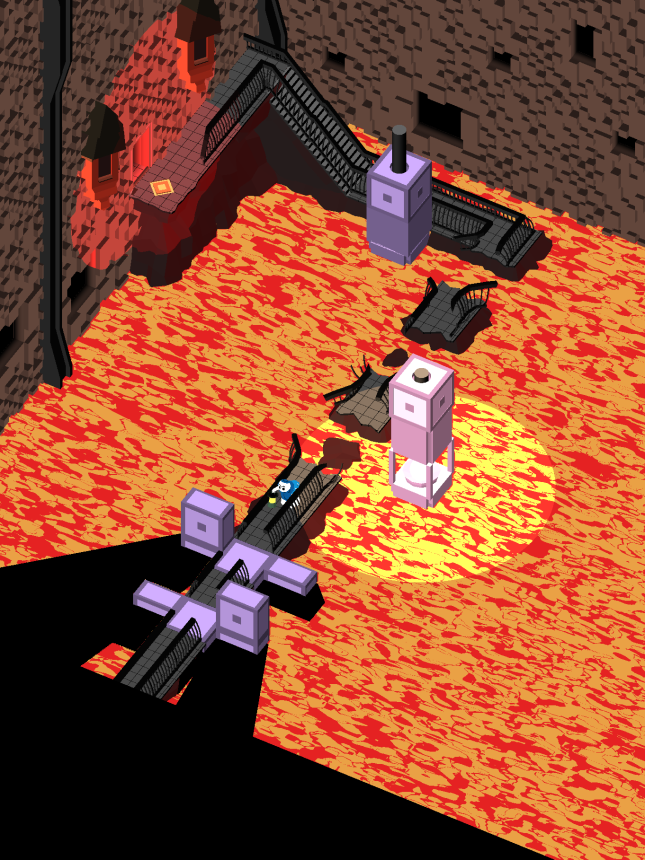
Welcome to State Of The Art, July 2017 edition! This monthly progress report is written by Frank DiCola and is focused entirely on how the game’s visuals have improved in the past month. Without further ado, let’s explore the major leaps forward we took in July!

Pictured above is our classic scene where Obe throws the ring into Mt. Doom
World 1 (The Jail) Is Ready
It looks like the entire first real World, our volcanic prison that you must escape from, is ready! I say “ready” and not “finished” because nothing in the art world is ever truly finished. But these five Levels are “ready” because I’m ready to move on to something else without worrying about these all the time. They look good. They look pretty done. Will I need to tune them up later? Absolutely. But I’m not going to spend more time getting these Levels from 90% to 100% when there are some Levels at 0%.
Having said that, bask in the molten glory that is World 1!

Level 1-1, “Light” is the first Level of the Jail World.

Level 1-2, “Detour” shows off some of the cell blocks in this prison.

Level 1-3, “Lock” contains a rarely used side-exit door.

Level 1-4, “Pressure” needs a different back wall than the one currently shown.

Level 1-5, “Ascent” has a lot of annoying overlapping lights and we’ll fix those later.
What do you think of these Levels? Please leave a comment with your feedback, as I have a few concerns of my own and I want to see if casual observers would notice them. Maybe I’m just paranoid!

Obe’s Clothing Is Ready
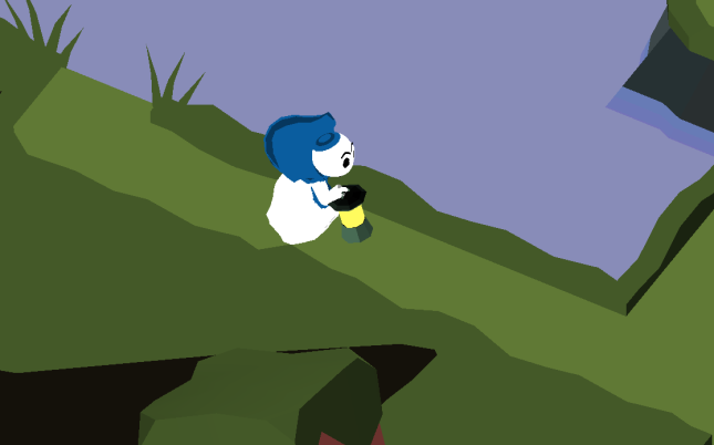
Our main character has quite the wardrobe. He’s wearing a lot of complicated clothing! Some of it is made from animated mesh, but other parts are physically based cloth that Unity simulates in real-time.
Getting this right has taken me a long time. But now I’m done messing with it and I’m ready to give it the ultimate stress test – cutscenes, weather (wind and rain!), and lots of animation. I believe his accessories can withstand the stress and remain looking cool.

Dude what happened to your pants?!
Undoubtedly, his clothing is going to get messed up sometimes. We’ll just need to identify those situations and preempt them with special scripts that manage his robes and keep them from going haywire.

Currently, the robe can clip through his white alb and skirt. This should be fixed by launch.
What do you think of his clothing? Is it worth it to have such a detailed robe on such a small character? I promise, for these close up cutscenes, it will look great!

What To Expect In August
This month, I’m going to aggressively go after the Levels in the River World. I’ve been so excited to work on that one for a long time! It’s wide open (as opposed to the claustrophobic Forest and Jail) which is a nice change of pace. The color scheme is totally unique, and the assets are really interesting. There’s some creepy story stuff happening there as well.
I also want to get cutscenes rolling, probably the first two (Intro to Forest, Finale to Forest) since they are the first things players will see. I don’t like the idea of waiting until the very end of the development cycle to start cranking out cutscenes. These things are going to be trailer-fodder and they need to look awesome. A rushed cutscene is probably going to end up being a cut cutscene 😛
See you again on September 1st!
= = = = = = = = = = = = = = = = = = = = = = = = = = = = = = = = = = = =
We hope you enjoyed this update about the game’s artwork. Have a question about aesthetics that wasn’t mentioned here? You can find out more about our game at WhereShadowsSlumber.com, ask us on Twitter (@GameRevenant), Facebook, itch.io, or Twitch, and feel free to email us directly at contact@GameRevenant.com.
Frank DiCola is the founder of Game Revenant and the artist for Where Shadows Slumber.

I really like the consistent color palette you used in the Jail world. None of the colors clash and specific objects and structures stand out when they need to. Overall it’s really clean and easy to look at. On a personal note, I think the lava is much easier to look at in “Pressure” than in “Lock” and “Detour”. It could maybe use a little more solid blotches of yellow in “Pressure”, but in “Lock” and “Detour” it can be a little distracting.
I also think small details, such as the robe, are not wasted at all, even though the perspective and small model size don’t exactly highlight these details. With cutscenes and the ability to zoom or change player perspective, there are plenty of opportunities to see the work you put into the clothing and such.
It looks like it’s coming together nicely! I’m excited to see wht you have in store for the River.
LikeLiked by 1 person
Thanks Mogey
I agree with you about the lava. The more “busy” the lava is, the more annoying it is to look at. Will look into changing it in those other Levels.
The River is coming along! But I should mention: the game doesn’t let you pinch to zoom. We didn’t think it was necessary. Maybe testing will prove us wrong, but for now we’ve found it is playable without it. Each Level takes up 1 screen.
LikeLike