After PAX East this year, Jack and I spent the entire car ride taking a critical look at our game based on the feedback we received. It may seem weird to continue iteration on a game that’s already been released, but we wanted to make the game as perfect as possible before it heads to new platforms later this year.
Many of these changes are substantial – altering the solutions to puzzles, the artwork, and even the order in which you solve puzzles. Some changes are so small you wouldn’t notice unless I told you, which is precisely the point of this post!
Here’s all the changes you can expect in the latest patch, which we hope will go live sometime early next week:
10 Artistic Changes
Some of the design problems with Where Shadows Slumber are actually just bad artistic cues – which is to say, these are things I made that looked cool to me but ended up communicating the wrong ideas to our players.
Most of these fixes are focused on the beginning of the game, since that’s the “make or break” period for gamers. If players aren’t impressed after the first five minutes, or the game is frustrating, we’re destined for a 1-star review. So here’s a visual walk-through of all of these changes, with the old versions on the left and the new versions on the right.
The Forest Levels


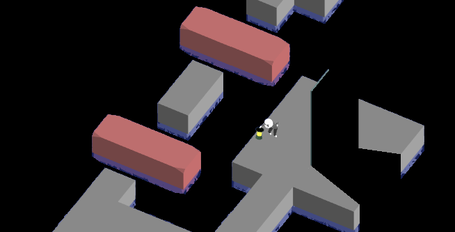
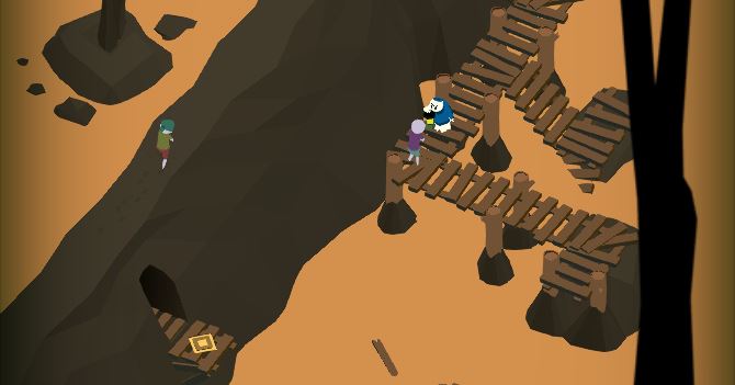
Forest Level 2, “Bridge”
This is the player’s first interaction with the design pattern we use for Draggable objects, but sadly it’s on two Non-Draggable objects that appear Draggable. (The ancient, crumbling bridges in the water) We decided to cover them with moss so they don’t look interactable.
The Jail Levels


Jail Level 1, “Light”
Before we changed this puzzle, it was very difficult for players to tell when the bridge was being repaired by the shadow. Now the bridge is much longer, which gives you more space to explore and see what the shadow is doing to the bridge.

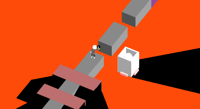
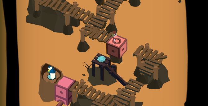
Jail Level 3, “Lock”
This Level badly needed clarity and simplification. My earlier attempt at color-coding the different gaps in the bridge with really dark, indistinguishable colors and incredibly small little gemstones did not work. The new version has bold colors, big pieces that still connect the bridge even when it’s broken, and one fewer draggable light source.

Jail Level 5, “Pressure”
Similar to the puzzle I just mentioned above, 1-5 needed a lot of color to clarify what’s going on with different shadows affecting different objects. I like how it turned out!
The River Levels


River Level 1, “Docks”
The corner of the land mass above is not traversable. As you can see in the old version, it’s not clear that there’s a gap in the walkway. (We put a gap there because we only want players to see this shadow illusion in a specific way) This fix makes the gap more obvious.

This Draggable raft was giving players a lot of trouble, too. The square pieces are halfway into the water, so it’s not obvious that you can drag them. We want to try the new design, where the Draggable squares lie on top of the surface so they’re visible.


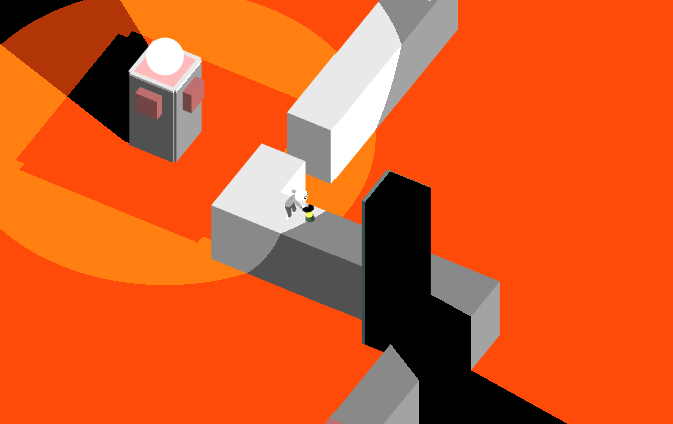
River Level 3, “Guide”
This Level featured a large tree that had some kind of light inside of it, and you could close the shutter to hide the light. This shadow was used to change the bridge in the center. Ultimately, this puzzle had too many elements going on in it. We can keep the same design without requiring players to figure out what’s going on with the tree.


River Level 4, “Ebb”
The shadow-casting wall in this Level is really big now, because it was awkward how you could shine your light as you walked down the steps here. Some people accidentally solved the puzzle on their way down the staircase!
The Hills Levels

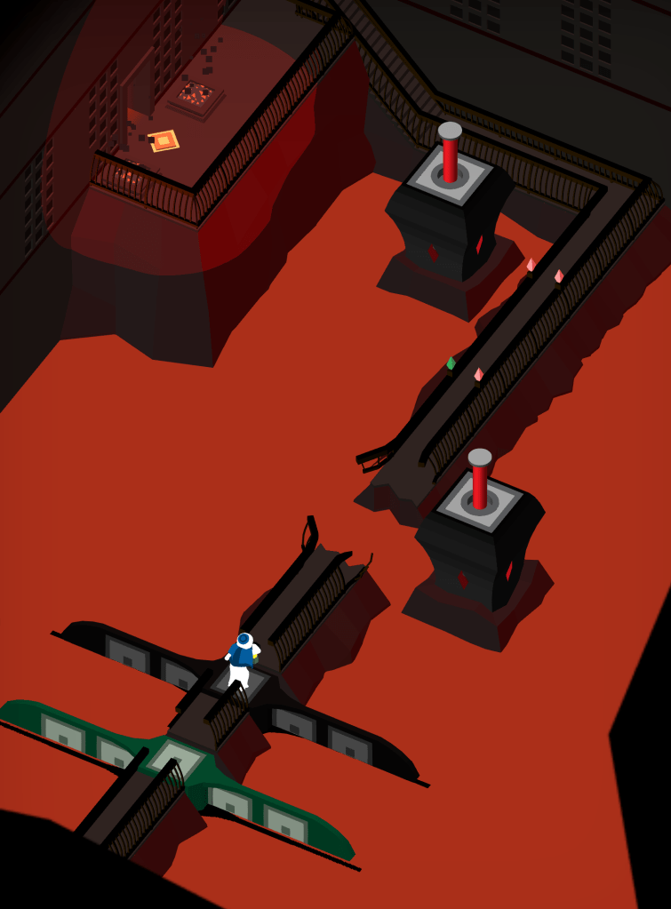
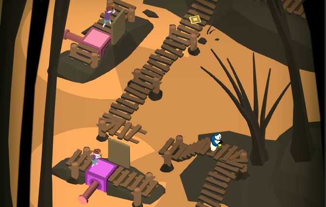
Hills Level 5, “Rest”
This Level received a huge change, as well as numerous small ones. The most noticeable change is that the center island is no longer one big draggable, but instead is a platform with a draggable pillar on it that slides freely. We feel that this will allow players to more easily solve the puzzle, though the solution remains the same. There are also a bunch of small changes to where pillars come up to stop you along your path.
The Summit Levels

Summit Level 2, “Blind”
This one is super subtle. Can you see it? We added some footsteps for the invisible ghostly Knight who is patrolling around inside the shadow realm. (If you’ve never played the game before, I’m sure that made no sense at all.) We hope this helps players determine where he is as they try to solve this difficult puzzle!
Six Design Changes
Not everything we’re changing in this patch has to do with artwork. One of the largest changes is really subtle – you’d only notice it if you played the game a lot. New players would never even realize what we did.
These changes were made based on lots of user feedback with the final product, as well as in preparation for a future version of Where Shadows Slumber that’s free to download and has paywalls interspersed. Here are six non-aesthetic changes happening in Patch 1.0.10…
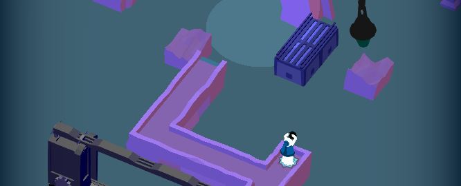
No More Riding Draggables
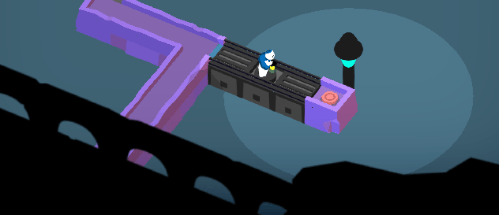
The largest change, and one that spawned a whole bunch of other changes, is a clarification to the way draggable objects work. Obe can no longer stand on these while they move, so a few puzzles had to be updated. Now you’ll always see the image above when Obe is standing on a draggable bridge, and we hope this is less confusing.


Forest Level 3, “Monolith”
The draggable pillar now begins raised out of the water instead of submerged. We felt like it was not obvious that it could be dragged, since it was so well hidden by the rock and moss.
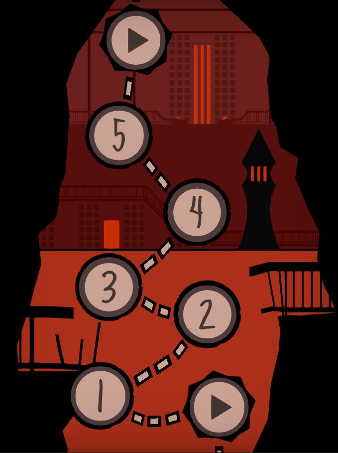
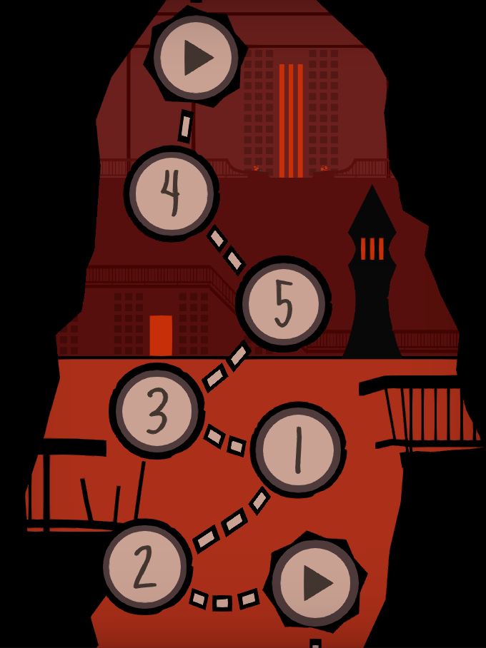
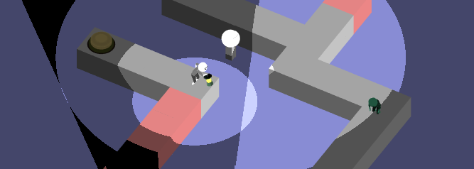
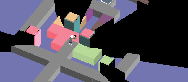
World 1 Order of Levels
We’re rearranging this World in order to make the introduced mechanics flow better. (The actual screen won’t look as it does on the right, that’s just a diagram I made to show you how the puzzles are moving around.) The previous section used the old World 1 numbers.
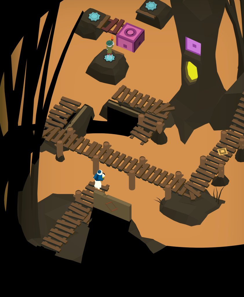

River Level 3, “Guide”
In this Level, you used raised walls to cast shadows on the center bridge. This involved “dipping” the center in shadow briefly either by letting the walls go up and down, or by walking Obe in and out of the corner to see the change. In the end, it was a relic of a way shadows used to work very early on in the game’s history. We eventually changed the walls into pillars you can walk around, to be more consistent with the rest of the game.

Title on Device
We’re changing the build name from Shadows to Where Shadows Slumber. I chose “Shadows” because I knew it would fit nicely on everyone’s phone screens. But it seems like poor branding to have everyone refer to our game as “Shadows” from here to eternity. We also considered “WSS” but that seemed to cryptic. Let me know how it looks on your phone screens!

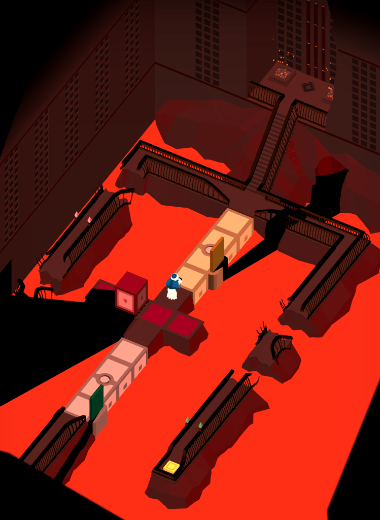
Paradise Level 5, “Gates”
Last but not least, the most difficult puzzle in the game just got a whole lot less tedious. Now there are doorways to any of the four colors in this puzzle, available from any color area. No need to keep going back to the yellow zone!
Coming Soon To A Phone Near You…
I had hoped to get the patch out already, but there are still some tiny fixes left to do and a lot more testing. But once it’s all ready and this patch is uploaded to the App Store and Google Play, you’ll get a push notification to notify you that it’s been downloaded. Please try it and let us know what you think of the alterations!
= = = = = = = = = = = = = = = = = = = = = = = = = = = = = = = = = = = =
Where Shadows Slumber is now available for purchase on the App Store, Google Play, and the Amazon App Store!
Find out more about our game at WhereShadowsSlumber.com, ask us on Twitter (@GameRevenant), Facebook, itch.io, and feel free to email us directly at contact@GameRevenant.com.
Frank DiCola is the founder of Game Revenant and the artist for Where Shadows Slumber.


.png)