
As the completion date of Where Shadows Slumber draws near, Jack and I are coming to terms with just how much work it takes to finish a game. This means we’re revisiting old tasks that we didn’t have to deal with for a while, including the game’s app icon.
It may seem like a small detail, but your game’s icon is very important. It isn’t exactly the same as your game’s logo, but in certain contexts it plays the same role. The app icon is the rounded square button on your customer’s phone menu that they have to press to start playing your game. More importantly, this icon is on prominent display on marketplaces like the App Store and is often a potential customer’s first impression of your game.
Viewed through that lens, the app icon is immensely important and I regret not working on it sooner. It’s just a small graphic, though… how difficult could it be?
Fortunately, I’ve been researching this topic for a little while now. Below, I’ve compiled a gallery of some of my favorite app icons. We’ll also discuss in this blog post my personal “do’s and don’ts” for these graphics, inspired by both previous iterations of the Where Shadows Slumber app icon.
Inspiring Icons
I played a lot of mobile games during the creation of Where Shadows Slumber. That’s not because I’m lazy! I wanted to see what successful mobile games did. I spent a long time looking at their store listings, reading reviews, poring over their descriptions, and – of course – checking out app icons. It wouldn’t be a Where Shadows Slumber blog post if we didn’t gush over Monument Valley, so let’s start there.

The app icon for Monument Valley is really beautiful and shows off what the in-game art looks like. When you look at the icon on your device, the scale of Ida here probably matches her scale in the game. That makes this graphic one of the most honest app icons in the business! From a distance, you can clearly make out her shape because her white body contrasts starkly with the green backdrop. I also love that this picture shows the isometric angle and color shading that they use in the game. Sadly, this image does not communicate the game’s M.C. Escher inspired puzzles… but how the heck could you even show that? Maybe I shouldn’t worry too much about showing “shadow puzzles” in a tiny square image. It would just never fit!

The app icon for Monument Valley 2 was constrained somewhat by the first. The artist likely felt the need to match the style of the previous icon. Now that they’ve got a pattern established, expect to see something like this if they ever make Monument Valley 3. Still, the fact that this icon communicates the relationship between a mother and daughter tells you a lot about the game’s story and mechanics.
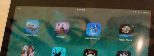
The real reason I bring up Monument Valley 2 is because of something I noticed when I was in an Apple Store the other day, getting a new iPad for my Dad. On their demo devices, the game is labeled simply as “Monument 2,” because the name is too long. Notice also that the game Alto’s Odyssey is just named “Odyssey.” I’ve wondered what Jack and I should do with our lengthy title Where Shadows Slumber… should it be listed as “Slumber,” “Shadows Slumber,” or “Shadows?”

Speaking of Alto’s Odyssey, both games in the Alto series have very beautiful app icons. However, it seems to me that the original is better because it actually communicates the mechanics of the game. Take a look at the icon above, and then look at Alto’s Odyssey below. Remember that these games have identical gameplay: both are side-scrolling snowboarding simulators. Notice anything?

Alto’s Odyssey doesn’t have an image of a dude flipping over a windmill like the first game did! That’s pretty important because the whole game is about jumping over stuff, getting airtime, and doing tricks. But when I see the icon above for Alto’s Odyssey, I imagine a different game where I can actually go into some of those ruins or fly in that hot air balloon. It doesn’t set up expectations the way you might expect. Even so, the image is gorgeous and communicates the art style faithfully.

Of all the games I researched, my favorite app icon is probably the one for Prune. Look at this beautiful picture! Since I played the game, I happen to know that this app icon is actually a perfect rendition of what every Level looks like, too. Now that’s honesty! Prune is a game where you swipe away branches from a tree to help it grow the right way. I think you wanted to avoid the big red suns because they killed your tree. It’s a beautiful game, and the simple nature of this app icon does it justice.
We’ve looked at a lot of great artwork, but I don’t feel like comparing them to a list of “bad examples” in this blog post. I feel uncomfortable putting down other people’s work besides my own. There is no point in searching the App Store for apps that performed poorly and then ripping their icons apart. Instead, let’s just criticize the two icons I made earlier in the project cycle!
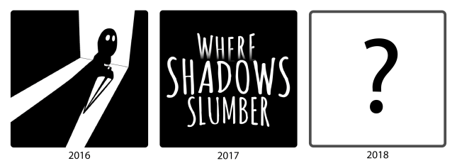
Learning From My Mistakes
If you’ve ever played our free iOS Demo before, or if you are one of our beta testers, or even if you’re just a diehard follower of this blog, you’ve seen one of our app icons before. We aren’t going to use either of these for the final game’s release, so I’d like to write about them in this space.

Our first app icon was created just for the Demo. I whipped this up in Adobe Illustrator over a year ago. The idea was to show a silhouette of Obe in a doorway, with the lantern clearly visible. Looking back on it now, this fails for a variety of reasons:
- This image is very detailed, so the intricacies are hard to make out at small sizes
- This icon requires pre-existing knowledge about what Obe looks like
- The lantern looked weirder back then, so it’s not immediately recognizable
- This looks like an icon for a horror game, almost like Amnesia for mobile phones
- This doesn’t really look like the art in the game at all
- This doesn’t really look like an app icon for a mobile puzzle game
- This is misleading because Obe’s body never actually casts shadows
I’m not saying I hate it or I regret making it – it seemed cool at the time! Our Demo drew in over 310,000 free installs on Android alone, so we did something right. But I wouldn’t go for this kind of style for the final game. It’s too much of a departure from the real game’s art, tone, and genre.

Our next app icon was made much faster and was basically an unofficial app icon. I just did this for the beta, and I didn’t put much effort into it. This one fails on two levels – first of all, it’s not very unique or inspiring. It’s just text. Anybody could make this, and it tells customers nothing about our game. Second, it includes English text. That means I’d need to make a different app icon for every language we release the game in! Why bother doing that when I can just create a cool image like ustwo did?
So for the game’s final icon I need one square image that contains no text, but communicates the following to the player:
- The game’s reflective tone, with some ominous terror looming in the periphery
- The game’s crisp light shading model
- The importance of the lantern to the story
- The idea that this is a puzzle game and not some other genre
- The idea that this is a mobile game
- A warning that this game is not for preteen children
Yikes! Wish me luck. I’ll take a shot at this during the week, in between animating the game’s remaining cutscenes and putting out other fires. Jack and I have spoken about our app icon informally in the past, so I have a pretty good idea of what we want. This analysis helped me crystallize my plan going forward.
We’ll have some exciting news to announce in the coming weeks, so stay tuned to this blog and thanks for reading!
= = = = = = = = = = = = = = = = = = = = = = = = = = = = = = = = = = = =
We hope you enjoyed this update about the game’s graphic design. Have a question about aesthetics that wasn’t mentioned here? You can find out more about our game at WhereShadowsSlumber.com, ask us on Twitter (@GameRevenant), Facebook, itch.io, or Twitch, and feel free to email us directly at contact@GameRevenant.com.
Frank DiCola is the founder of Game Revenant and the artist for Where Shadows Slumber.
