Level Design

We’ve put a lot of work into designing, building, and testing our levels. In particular, now that we’ve got a lot of the other pieces in place and a good amount of user-testing done, we’ve been focusing quite a bit on level design. After all, as a puzzle game, the most important part of our gameplay is the puzzles themselves. An incredible game can end up flopping due to bad puzzle design, and a mediocre one can actually do really well, if the level design is good.

But how does level design actually happen? We have a bunch of levels, but how did we come up with them? What’s the process?
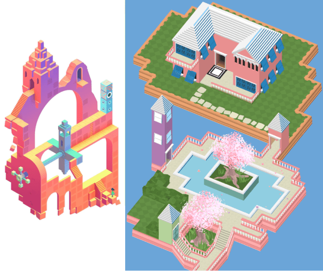
 

Design Process

4-3 design

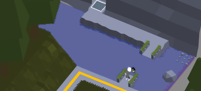
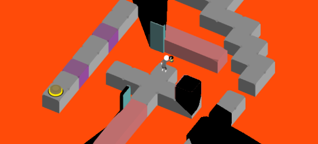
Design of an upcoming level, Fountain!

The problem with level design is that it’s an inherently creative endeavor. I’ve always had trouble with this type of task – if I sit down and work on something for an hour, I want to see some measurable progress. But if I try to work on level design for an hour, I could literally just be sitting there thinking the whole time, with nothing to show for it. This (at least for me) is one of the reasons that level design often gets pushed to the proverbial back burner. I always want to work on game features, because I know I can make some progress on them, so I opt to do that rather than level design. However, this can be a dangerous prospect, as this is a great way to end up scrambling for levels, putting too little thought into their design, and releasing a great game with bad puzzles.

You can’t just say “I’m gonna go design a level!” I mean, you can (and sometimes I do), but that’s not the best way to go about it. Unfortunately, you’re really at the whim of your own brain – you have to be struck with inspiration. The best levels I’ve designed didn’t happen during a ‘level-designing brainstorm’. They happened when I was walking down the street, or sitting down at dinner, or pretty much anywhere, when I noticed something that made me think of a cool level. Inspiration isn’t something you can schedule, work hard at, and then just do. It has to come to you, which, for me at least, is terribly annoying.


Designing for Where Shadows Slumber

All of this gets even more difficult when it comes to designing puzzles specifically for Where Shadows Slumber. Any innovative puzzle game has a sort of quirky concept, a hook to get users to take notice and to make the puzzles more unique and interesting. For us, of course, it’s the shadows and the ever-changing nature of the world, and those aspects of the game are what make it the hardest to design for.

So you sit down and design a level. It looks pretty cool, it’s got a nice flow, it seems challenging and fun. You show it to your team, or you start to implement it, and suddenly you realize – it just doesn’t work. There’s one small thing that prevents the level from working, whether it be a light in the wrong place, an object that should cast shadows but can’t, or maybe it’s just too difficult for a user to get. These aren’t great examples, but this type of situation comes up all the time. We designed around 30 levels for Where Shadows Slumber at the beginning of the year, and now we only have around 15. What happened to the other half? There was something small that prevented them from being good levels – and it’s hard to notice any of these issues until you implement the level and test it out.

The other difficult part of designing these intricate levels is actually communicating them to each other. Every level design, no matter how great, needs to withstand the feedback of its peers. The problem is – how can we show these crazy levels to each other?

IMAG0625

Notice how my drawing style is a more clinical, overhead view than Frank’s (above)

We’ve tried drawing them and sending them to each other, but they’re often too intricate to really ‘get’ from a drawing. In the end, the only process we’ve found for sharing levels is to sit down in the same room together and talk through what the level consists of, along with the drawings. Even this isn’t good enough for a lot of the more complex levels – sometimes the only way to show your team the level is to build it! This is very frustrating, especially when you build a level that’s no good, and you have to throw it out, but sometimes it’s a necessary part of the process.


Taking the User into Account

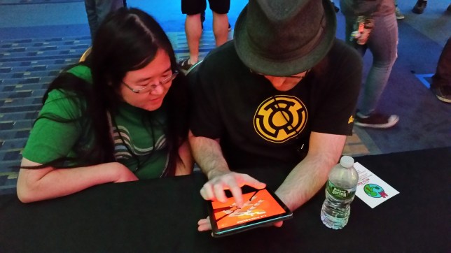
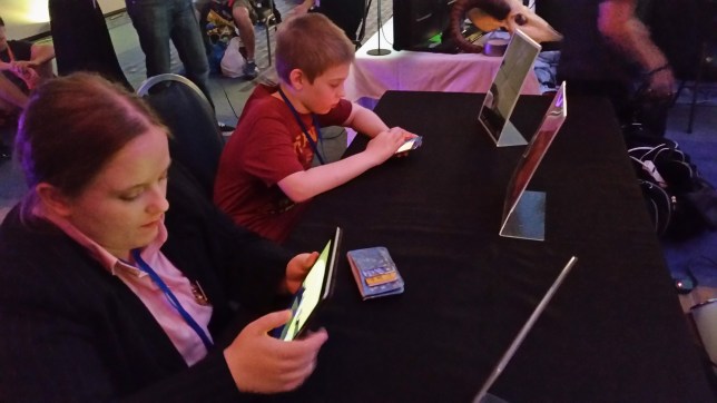
Of course, the real judge of level design is the user. It doesn’t matter if every one of your levels is a masterful blend of elegant design and game mechanics if your users don’t enjoy playing it. This is a pitfall that I continually see people falling into, and, as I recently realized, one in which I lived for a good portion of the development of Where Shadows Slumber. But no longer! Throughout our testing, the users have spoken, and we are listening!

feedback

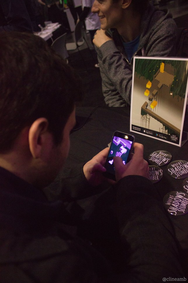
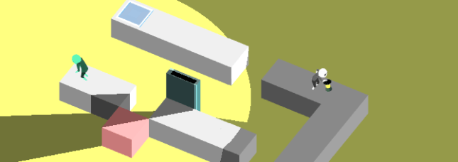
Getting some feedback on level design!

What does it meant to design for the user? How do we know what they will and won’t like? That’s a difficult question without an easy answer, but I will share some of the tips that I try to stick to.

Listen to your users. This should be obvious, but sometimes it’s not. You have to get your game in the users’ hands, get them playing the game, hear their feedback, and actually listen to it! You’ll never know that users don’t like one of your levels unless you let them test it out, and your level design won’t be good if you disregard their feedback.

Difficulty/learning curve. If your game has a crazy mechanic or concept, the user isn’t going to know how it works – it might seem intuitive to you, but that’s because you’ve been working on the game for so long! You have to make sure that you gently introduce them to the mechanic, in a way that shows how it works while also keeping them hooked. And you have to make sure the difficulty ramps up before too long, or they’ll just get bored of your everlasting tutorial.

Remember that the user doesn’t know what you know. Some people phrase this rule as “treat the user like they’re stupid”, but I think that’s an overstatement. Your users aren’t stupid, they just don’t understand the subtleties of your game the same way you do. They will never do exactly what you expect, and they will never understand the level as well as you do. You need to keep that in mind, examine your level design with an objective eye, and make sure that the experience is enjoyable for the user no matter how they go about solving your puzzles.

Users want to feel smart. The people who pick up and play a puzzle game are usually pretty smart people, and they want to feel smart. This leads to an important design philosophy – make your levels hard, but not too hard. The user doesn’t want to just play an endless parade of easy levels – they won’t feel any satisfaction from beating them. On the other hand, the user doesn’t want to hit a near-impossible level – that’s just frustrating! Beating a level should be easy enough that your users will beat it without getting frustrated, but hard enough that they feel accomplished when they do.

Iterate and Re-use. Sometimes, your users won’t like a level – it happens. In this case, you shouldn’t simply throw the level out. An important part of design is iteration – if your users don’t like a level, figure out why. Figure out what you can do to improve the level. There are parts they don’t like, that you’ll probably end up taking out, but there are most likely some good things about the level, and you don’t want to waste them. Try to fix what the users disliked, and then head back to them and get another opinion.


If I Had to Skimp on Level Design…

Creating a game takes a long time, and there’s a lot to do. Sometimes, you just don’t have the time to pour your heart and soul into every level you design. Sometimes, you just have to put in a few ‘filler’ levels. When is it okay to do that, and what’s the best way to go about doing it?

20170627_124251

“Okay, hear me out: we open on a completely blank screen…”


As much as I’d like to say “all levels are created equal”, I can’t, because it’s not true. Frankly, there are some levels that are a lot more important than others. Which levels are most important? The early ones.

One of the biggest hurdles for a game is what I call the barrier to entry. If I pick up a new game, and the second level is really annoying, there’s a chance I’ll just put it down and never play it again, even if the rest of the game is phenomenal – I have no way of knowing that, and I assume the rest will be just as annoying. However, if I play the exact same game, but it’s the seventh level that’s really annoying, I’ve already played through six awesome levels. The game has earned some credit with me, so I’m willing to let one annoying level slide.

This is doubly true for puzzle games where the user has to learn the mechanics. If you don’t teach the user your mechanics very well in the first few levels, they’re not going to enjoy the rest of the game, because they won’t have learned how to solve the puzzles.

The third argument for this is simply a mathematical one. Every user who plays your game will play the first level. No matter how good your game is, there’s some rate of falloff – some people just stop playing. That means that almost every user plays level two, and most users play level three, and so on. So, the levels that will see the most playtime overall are the first levels, hands down (for any statistics nerds out there, this is basically the same premise as Benford’s Law).

So, if you’re running out of time for level design and you need to skimp on some levels, you should make it levels later in the game. Anyone who has gotten that far already likes the game (presumably), so you don’t need to sell it to them, and they’ll give you a little more leeway.

Now that we’ve tested some of our levels, we’re ramping up into more level design, and I though it would be a good opportunity to show you a little bit of our process. Hopefully you learned something about our level design process, and maybe you can even use it in your own projects!


= = = = = = = = = = = = = = = = = = = = = = = = = = = = = = = = = = = =

If you have questions about our game design process, feel free to contact us! You can always find out more about our game at WhereShadowsSlumber.com, find us on Twitter (@GameRevenant), Facebook, itch.io, or Twitch, and feel free to email us directly with any questions or feedback at contact@GameRevenant.com.

Jack Kelly is the head developer and designer for Where Shadows Slumber.

What We Learned From Testing At AwesomeCon 2017

Hey everybody, it’s Frank! I just got back from a trip to Washington D.C. for AwesomeCon 2017, a comic convention that’s expanding its selection of gaming exhibits. We were invited by the wonderful team that hosts the MAGFest Indie Videogame Showcase to take part in their giant indie booth – thanks to Lexi Urell and her team for allowing us to take part in such an awesome con!


20170617_211819

Why Did Frank Go To AwesomeCon?

That’s kind of a weird question, right? Is there ever a reason not to go to a convention? Besides, we were invited! Do you even need to ask?

Now that the Game Revenant official coffers are looking a little emptier, it’s important to evaluate every large expense. Travel is certainly one of them. While I’d love to go to every show on planet Earth that’s even remotely related to gaming, we don’t have that kind of cash to spend. Besides that, there’s the time cost involved. If I’m standing at a table showing off Where Shadows Slumber for 3 days straight, that’s 3 days I’m not spending doing animations or environment art for the game. Was it worth it?

We decided that the best way to get a return-on-investment for our time and money was to focus on one very specific thing during AwesomeCon 2017 – testing. Conventions are a great way to show your game to a lot of people. It may seem like this is purely a marketing activity where indies promote their game, but that’s a shallow view of what conventions can do for you. When you’re given the opportunity to sit down with nearly 100 people and focus on your game, that’s a great time to ask them critical questions about your work and get their honest feedback.

So before I left, Jack created a build of our Where Shadows Slumber alpha that had all 17 of our test Levels in it, along with a basic menu for easy navigation. I resolved to show this early alpha to as many people as possible, with a specific focus on these key issues:

  1. If I don’t tell Players how to play the game, what will they do?
  2. What do Players think of the first three Levels, which are meant as a tutorial?
  3. How far will Players go before they get stuck or bored?


20170616_182723

My Testing Procedure This Time Around

As you test your game at a convention, you begin to find a consistent testing method that works. Halfway through the first day (Friday), I had a pitch ready to go once people sat down at the Where Shadows Slumber table.

I was really straightforward with people. I told them that I wasn’t going to teach them how to play because I wanted to see how they performed on their own. (No one seemed to mind!) Then I told them that they could ask me questions if they got really stuck. I told them that the game’s artwork was a placeholder. The only information they were allowed to know was that it was a puzzle game called Where Shadows Slumber. With that, I just watched them play through Level 0-1 and noted their progress. This pitch accomplished a few key things.

This Is Only A Test: Setting up expectations right away is key. By telling people that the game is being tested (and not them) it put them in the proper mindset. They weren’t here to be entertained – they were here to break the game if possible, and try to beat it. I think that increased people’s enjoyment actually, and definitely led to finding some serious bugs.

Ask Me Questions: Getting people to talk while they play is really hard, but it’s very important. You can only glean so much from watching people. I didn’t give anyone that much information, but allowing them to ask questions is helpful. After all, if they ask a question, it means they don’t understand something. That “something” is what Jack and I have to go back and add to our tutorial.

Don’t Tell Me The Art Sucks: It’s important that you tell people what you don’t want to hear. Setting up this expectation decreased the amount of people who would complain about the art. Seeing this alpha next to screenshots of our beautiful demo was probably  a bit jarring, but once I explained it to testers it wasn’t an issue anymore. When you’re testing, you don’t have much time with each person so you need to make it count. Make sure that people know what you already know, so they focus on different issues.


20170616_173920

The Results

To my surprise, people loved the alpha! I only say I am surprised because this is the first time I’ve seen people play it with my own eyes. And although the artwork is all just placeholders and the Levels are brand new, people gave it glowing reviews:

Thor

Having said that, not everything is sunshine and rainbows. We found a few bugs over the weekend, and there are some Levels that may need to be redesigned or cut from the game entirely. Here are all my notes from AwesomeCon 2017:


  • People don’t realize they can’t drag something if the Player is in the way. Draggable objects should smack into the protagonist to give them feedback on this matter.
  • Someone suggested a mechanic where torches (lights) are only on for a fixed amount of time before they shut off.
  • Someone requested a Reset button (which our demo has, but the alpha does not – even though you can just re-select the current Level from the menu).
  • MAJOR ISSUE: People didn’t realize they could drag red objects. Many suggested that they “shimmer” when they are dormant to encourage dragging. Perhaps there should be a handle on the Draggable object to indicate that it is interactive, and show the direction it moves. They should glow when they are being dragged as well.
  • Someone suggested a UI indicator that shows how a Draggable moves, since some objects rotate but others slide across the floor.
  • When the Player is following closely behind a Walker, he stutters and stops, producing an awkward floating animation.
  • The protagonist’s light should grow out from him and stop at the predetermined radius needed to solve this Level.
  • MAJOR ISSUE: Every single Player (with few exceptions) dragged-to-move if I didn’t tell them the controls. Our game is tap-to-move, so dragging is not an optimal way to play. People assume the controls are bad, but they’re just doing it wrong. Without a way to correct them, they make it harder on themselves.
  • Someone suggested charting a path (like in StarCraft) when you drag-to-move, a possible solution to those who find that way more comfortable. This would basically be like connecting the dots between every space you dragged over.
  • IDEA FOR A LEVEL: Level 1-3’s “Lock”, but the Light Switches are connected to some of the Rotating Draggable blocks.
  • MAJOR ISSUE: People tried to drag the purple blocks, but couldn’t. This stopped them from trying things in the future.
  • Glyphs are really just buttons that can be pressed infinite times, right?
  • Draggable Light Switches need to be turned off when they’re off. They still appear on, which is impairing people’s understanding of the light mechanic.
  • The age when players seem able to understand the game is 12 – younger children could trudge through it by trial and error, but with limited understanding.
  • MAJOR ISSUE: “Why is there a shadow?” People do not realize the main character has a lantern with a massive radius and it’s the only light in the scene. This is understandable because our game is super weird. We need to find a way to show this constantly, or they’ll think the shadows have a mind of their own.
  • Someone suggested a mechanic where the main character’s lantern is a spotlight, instead of a point light, for a few Levels.
  • Someone suggested a mechanic where the main character can lower their lantern’s light radius and then reset it, for a few Levels.
  • A businesswoman with knowledge of the Indian market suggested that we lower the price from $5 for that particular market. She felt strongly that Indian mobile gamers wanted free games or something much cheaper.

Here are my notes that are specific to each Level in the alpha.


0-1.PNG

Level 0-1, Fallen

There’s a bug in this level where there bridge (which should fall after you press a trigger) stays exactly where it is. Players who drag-to-move skip right over the trigger, and they never trigger the bridge sequence, so basically they miss the puzzle.

The Draggable box on this level doesn’t have much weight to it. People fling it around like crazy. They also really want to drag it down (onto the dirt path), up (onto the dirt path), or onto the bridge to drop it into the water as a makeshift bridge. None of that is possible but there’s no feedback for that and they don’t know how shadows work yet so it doesn’t register.

Half of the people who play this Level don’t quite understand that the shadow makes the bridge appear.

It’s possible to walk past the Goal Space, and go to a spot on the Level that is beyond the door.

This level is not idiot-proof, like the first Level in our demo.

I think this is our weakest Level. I suggest cutting it and replacing it with a walking tutorial similar to the first Level in the demo. This Level is just throwing way too much at Players all at once.


0-2

Level 0-2, Bridge

An excellent Level. This serves as a perfect introduction to 3 key mechanics: walking, shadow revelation, and dragging.

The Rotatable bridges here should probably wobble after a while to indicate they can be dragged. I can also make a circular pivot point in the center, cut into the stone. That would be a good indication that these are on a swivel.

Draggables can also have parts on them that suck in when Players hold them down. Having parts of the stone depress inward is a good sign that you’re controlling the object with your finger.


0-3.PNG

Level 0-3, Monolith

This Level is perfect teaching. It’s a great gateway – you will never beat this if you do not understand how shadows work in our game.

“The purple box moved!” We need to make sure people don’t think the shadows merely move things. They make things appear and disappear… the visual style of the purple box makes it seem like it’s jumping around.

Why can’t Players make the farthest purple block appear if they are standing all the way at the entrance of the Level?

The Draggable Block here should be on some kind of a flagpole so that the vertical movement appears to be a natural fit to Players. (Many tried to move it horizontally.)


1-1

Level 1-1, Recovery

The name of this Level ought to be “Protection” or even just “Light”.

Why is the Light Switch casting a shadow? Does that shadow do anything? That may be a visual error.


1-2.PNG

Level 1-2, Detour

This Level can be broken to make both Goal Spaces appear at the same time. Players usually move the Draggable Block back and forth so rapidly that it causes both to be visible. However, the fake Goal Space does not work. If we can’t fix this bug… we should make it work! Why not reward Players for their trickery?

If there was a Light Switch near the space where the Goal Space is revealed, this Level would be a bit harder. You’d have to make sure the Light Switch was off. That may make it more interesting for the Players who figure it out in two seconds – and it keeps the World’s atmosphere consistent, since we use a lot of lights here.

The shadow needs to change more of the Level when it swipes across the screen, to give Players a clue that something weird is going on.

There ought to be two Shadow Eyes on the Draggable Block.


1-3.PNG

Level 1-3, Lock

Let’s make the sides of the Rotating Blocks sloped here, or at least spiked. People consistently try to walk on the sides of them when they are down, but that would break the Lights. It must appear unwalkable.


1-4.PNG

Level 1-4, Pressure

Extremely hard Level. That’s a good thing to have at this point in the game.

“I didn’t know I could stand on the box and rotate it.” Are we being consistent with when Players can do this and when they cannot?

How will Shadow Eyes work here? How can we align them with the object they are changing?

Someone found a bug where both buttons were pressed and they beat the Level, but they could not walk on the green path. (This is a soft crash I guess, since the Level is broken but the game still works fine.)


1-5.PNG

Level 1-5, Wolf

This Level should be renamed to something that indicates how to solve the puzzle, like “Doors” or “Black” or “Pitch”.

People don’t know they can drag these pillars.

The effect of pressing a Button here was not always obvious. I need to make an animation and we ought to have a clear sound attached to it.

On the iPhone, there was a bug where the sliding pillars could not be dragged. We had to reset the Level. I suspect Glyphs have something to do with this.


2-1.PNG

Level 2-1, Docks

Literally every tester thought the Walkers would hurt them and everyone called them “zombies”. My use of the color green was foolish!

We should start this Level with a Walker coming toward you that you can’t avoid, so people see that they aren’t bad.

People LOVE the reveal with the pillar sweeping across the Level. We should do more.

People tried to reverse the reveal and they couldn’t do that, which upset them. I think they wanted to see it more than once. When we get it set up properly, let’s consider this. It’s about consistency and Players enjoying the game for its toys rather than its puzzles.


2-2.PNG

Level 2-2, Test

We can call this Level “Elevator” or something. Maybe “Switch”, because you press a switch, but you also need to change places with the Walker.

Walkers flip around when you rotate Draggable Bridges, and this really annoys Players who are trying to guide his path. Also sometimes the Walkers float, breaking immersion.


2-3.PNG

Level 2-3, Guide

Pressed Buttons really ought to look pressed. I need to redo the art and then I’ll need help setting the states properly. We can also drain them of color once pressed.

For some reason I think buttons should be octagons. Why did I write this?


2-4.PNG

Level 2-4, Ebb

These Walkers cast a light, but they don’t have an obvious light source. I can make them holding torches, but what happened to their little light bulbs? Did I delete them?


3-2

Level 3-2, Tradeoff

The main light in this Level looks like it’s off because it’s so dark. The Player’s lantern doesn’t always need to be the brightest light in the scene! This sliding light is way more important to the mechanics of the Level. We can dim the Player’s light in favor of the other one.


3-3

Level 3-3, Anchor

Rectangles can pass through each other.

The right side Button node was briefly unwalkable, due to a multiple reality error.

After leaving a node, the state of a Button was still pressed. This made the Level unbeatable.


3-4.PNG

Level 3-4, Torus

“Is that it?” Torus looks more intimidating than it is. Can we bring up the difficulty on this one somehow? I think people are disappointed that you don’t need to find a way to navigate back and forth using the rotating segments. It is solved quite easily.


3-5.PNG

Level 3-5, Island

This Level can be broken by drag-dashing back and forth until the pillars remain upright. Then, walk into the island, the pillars lower, and you beat the puzzle without really solving anything.


It’s incredible how much insight you can get from just a few days of testing! These kind of testing moments are hard to come by, so it’s important to make the most of them. I hope you appreciated seeing how your feedback will impact the game, and this gave you an insight into what indie developers are looking for from testers.

We’ve got a lot of work cut out for us this month, so expect to see these changes reflected in my post at the end of June where I update you on the state of the game’s artwork.


= = = = = = = = = = = = = = = = = = = = = = = = = = = = = = = = = = = =

We hope you enjoyed this insight into our testing methods. Do you have any feedback for us about the game’s alpha? You can reach out to us at WhereShadowsSlumber.com, tweet at us on Twitter (@GameRevenant), message us on Facebook, leave a comment on itch.io, jump into chat on Twitch, and email us directly at contact@GameRevenant.com.

Frank DiCola is the founder of Game Revenant and the artist for Where Shadows Slumber.

Inspirations

Almost everyone involved in indie game development these days gets into it for the same reason – we played games, we liked those games, and they inspired us to make our own games. We want to capture whatever it was that made us love the games we played when we were younger. Whether it was the storyline, the art style, or the gameplay itself, these games made us who we are, and they influence every decision we make in our own games.

A few weeks ago, I was discussing game development with a friend when they asked me “what are your favorite video games?” After I rattled off a few, they asked another question – “Why?” This was followed by a really interesting conversation, because the games I chose were so different, and yet they all influenced the way that I design and make games now.

So I’m going to share that list with you now. I’m going to tell you my favorite video games and how they have affected my own game development, and I hope you’ll think about your own answer to the question as well; what games make you want to make games?


Monument Valley

Image result for monument valley game

When screenshots of your game are good enough to be your part of your marketing material, you know you have a beautiful game

I’m gonna start here, because I mentioned it last week, and because everyone is expecting it. If you’ve played Where Shadows Slumber, then it probably reminds you of Monument Valley. This isn’t exactly intentional, but I would be lying if I said that we weren’t inspired by Monument Valley in a lot of our design decisions.

There are a few things that Monument Valley did that were very important. First and foremost, it’s beautiful. I’m not one who really focuses on how the games I play look, but Monument Valley manages to be beautiful beyond the point of ‘good graphics’ and actually into the realm of ‘art’. This aesthetic quality is something that isn’t necessary for a game, but if you go for it, it definitely wins some points.

Secondly, Monument Valley showed that you can have a game with an incredibly simple concept, yet still have intricate, mind-bending puzzles. Additionally, it does so on a form-factor (mobile) that doesn’t lend itself nicely to this type of intricate, high-quality game, and still managed to do well, despite the industry’s focus on the ‘freemium’ monetization model. Monument Valley showed, most of all, that if you really put a lot of work into making a truly incredible game, you can be rewarded for it.


StarCraft: Brood War

Image result for starcraft brood war

Graphics aside, still one of the best games out there

Ah, StarCraft. This is really where it all began for me. This was one of the first games I really got into, and it became a very important part of my childhood. If I had to pick one game on this list as my all-time favorite, it would have to be StarCraft.

When I was talking about my favorite games and StarCraft came up, I tried to think of why it was my favorite game, from a game design perspective. StarCraft is a very complex and strategic game. The skill cap is incredibly high, and there’s always room for mind games and counter-play. I played a lot of competitive games of StarCraft, and I spent hours perfecting my worker split (for those of you who don’t know what that means, just be glad you didn’t have to do it). The depth this game has is fantastic – but are any of those really the reason I loved StarCraft so much?

No – the reason I loved StarCraft so much was the way it created memories of playing with friends. It wasn’t the game itself that made it fun, it was the people I played it with. When I think of StarCraft, I think of the 5-player game where one friend had nothing but a single pylon and about 40 Corsairs – every time someone else won a battle, those corsairs would arrive to finish off his fleet. I think of the time I won a game by building nothing but Ghosts and Valkyries, for some reason. I think of the EMP-Nuke rushes, the epic micro battles, and the mind games. Most of all, I think of laughing with my friends as it all went down, and even occasionally loading up a few replays and just watching them.

Children’s special on the meaning of friendship aside, these stories and interactions are the reason I love StarCraft. Unfortunately, that doesn’t really inform any of our game design decisions – you can’t build any of that stuff into a game. What you can do is make a game that has the potential for these stories. Make it so that your players can do crazy, funny, awesome things. Your game may be strategic, intense, and mind-blowing, but, above all else, you need to make sure that it’s fun.


Cave Story

Image result for cave story

I can’t think of a quote for this picture

Cave Story is a testament to what indie games can accomplish. Cave Story was created, music, art, gameplay, and all, start to finish, by one guy in his spare time. And, aside from being an inspiring story, it’s also an incredibly great game!

In my mind, the reason that Cave Story is so good is that it doesn’t make any concessions. Every part of the game is great. The storyline? Funky, but really cool. The gameplay? Skill-testing and engaging. The music? Amazing! For almost any facet of a game that you might ask about, the answer for Cave Story would be “yeah, it has that, and it’s awesome!” It just feels like an absolutely complete game. Comparing a game like Cave Story to a lot of the pretty good, mostly-finished games you see really drives home the importance of actually finishing your game. Rather than saying “yeah, the controls are a little off, but it’s not a big deal”, get in there and fix them!

The other big reason to talk about Cave Story on a game development blog is because of its development. Cave Story has become a sort of cult classic, in a good way. It’s so incredibly inspiring that one guy can make such a great game in his spare time.


Rocket League

RL

Calculated.

Rocket League, also known as Hot-Wheels soccer, is the game I’ve been playing the most recently. As such, I have a pretty good feeling for why I like it so much. There are really two reasons.


(1) The controls in Rocket League are phenomenal. Imagine you’re playing some other game, and you miss an objective (whether it be a goal or a kill or whatever). Inside your head you’ll end up saying “I would have had it if the controls were better”, or “I was trying to move to the left, but my guy didn’t go where I wanted”, or something like that. You can always blame the game, rather than yourself.

In Rocket League, you don’t have that luxury. Once you figure out the controls, it’s all on you – when you tell your car to do something, your car does exactly that. This can lead to a little frustration, but it also leads to some absolutely incredible plays from the pros, and it means that every time you do something right, you feel that much better about it. There’s no better feeling than flying through the air, using your boost and turning you car in exactly the right way to score a crazy goal, and knowing that it was all you. That feeling wouldn’t be possible without the most finely-tuned controls.


(2) The other great thing about Rocket League is what I’m going to call it’s ‘skill curve’. This is different from a ‘learning curve’ – a learning curve implies that the game gets harder as you go, so you have to learn in order to beat it. The ‘skill curve’ is the inverse of this. You’re never ‘not good enough’ for a game; rather, as you play, you get better. This is true of most games, but it feels the most rewarding in Rocket League.

When you first start to play, you have a hard time hitting the ball. With enough practice, you start to hit it pretty consistently – that advance in skill is noticeable, and it feels great. Just as you’re getting good at that, you realize you’re not rotating properly. When you start to master that, you begin doing aerials. You’re always getting better, and you always feel like you’re getting better – your skill level never plateaus, you just keep getting good at the game.


Rocket League isn’t what I would call a deep game. There’s no storyline, no (or very few) different levels, nothing really new about the game. Psyonix does release different game modes and new maps from time to time, but the core gameplay remains mostly unchanged. And yet, despite this, it’s the game I keep returning to. It never really gets stale, thanks to its controls and skill curve, which is incredible for such a straightforward game. Rocket League shows that you can give any game a lot of replay value just by making it well.


Portal

Image result for portal

In search of cake

Portal is just an incredibly solid example of a well-put-together game. At the time, it seemed to be a sort of ‘add-on’ game, a little nugget that Valve added into The Orange Box. While the other titles in The Orange Box (Team Fortress 2 and Half Life 2) were really awesome, it was Portal that stood out to me, and to most people that I talk to.

Why? Well, Portal wasn’t just another game. The thing that excites me most about any game is when it explores new design space, and that’s exactly what Portal did. There were no guns to shoot (well, no real guns), no enemies to destroy, no princesses to rescue. You’re simply introduced to the world and the theory of portals, and you have to make your way through it. Your only weapon is the portal gun, and your only enemies are the levels themselves. It’s a very simple distillation of the essence of a puzzle. This is something that I aim for when designing my own puzzles – if you still have design space to explore, there’s no need to complicate your levels.

Portal really provides us with a master class on not overstaying your welcome. Really, it was the perfect length for what it was. You learn the mechanic, you get to used it, and you advance through puzzles with it. By the time you reach the end, you’ve explored most of the design space, but haven’t gotten to a point where it’s become timesome or tedious.

Plus, Portal does a great job of indicating its short, jolly mood through the use of its witty writing. This combination of very pure puzzles and inviting storyline is a design marvel, as it makes it very easy to draw a player into your game. The biggest takeaway from Portal, for me, is that more game doesn’t necessarily make for a better game. Content is king, and having more gameplay is usually a good thing, but it is possible to focus too much on length, rather than good design or implementation, and end up ‘overstaying your welcome’.


What I’m Most Looking Forward To

In addition to games from the past, let’s take a look at a game from the future! The future game I’m most looking forward to (other than Where Shadows Slumber) is a game I saw at PAX East this year. I only got to play the demo for a few minutes, but I’ve been really excited for it ever since. And the winner is… The Gardens Between!

Image result for the gardens between

Check out the haunting cell-shaded indie goodness!

After checking this game out, I’m sure you’re not surprised that I chose it. After all, it’s an indie game with a cell-shaded art style, a slight metaphysical twist, and gameplay based at least in part on lanterns! How could I not love it?

Parallels with Where Shadows Slumber aside, this game looks awesome. The controls are very simple and intuitive, and yet the puzzles show a depth that promises very interesting and challenging interactions. The game looks relaxing, sleek, and challenging, which, to me, makes for an awesome upcoming game. Props to The Voxel Agents on what looks to be a great title!


That’s Not All…

This list is by no means exhaustive. In fact, in an effort to pick my favorite games, I’ve left out some games that perhaps played an even bigger role in turning me into a game developer. There’s the first game that really got me into gaming (Runescape), the game that first got me interested in making games (Block Dude), and the game that I probably spent the most time playing (World of Warcraft), but, as important as these games were to me, I don’t really consider any of them to be in my top 5 favorite games.

Despite their differences, each of these games (and any game I’ve ever played, really) has had an effect on the decisions I make when working on Where Shadows Slumber or anything else. These games are all very important to me personally, and I hope I’ve done a decent job of explaining what each of them brings to the table, design-wise. Hopefully you’ll be inspired to examine your favorite games, and the design patterns involved in them!


= = = = = = = = = = = = = = = = = = = = = = = = = = = = = = = = = = = =

If you have questions about my favorite games, or just want to share your own, feel free to contact us on social media! You can always find out more about our game at WhereShadowsSlumber.com, find us on Twitter (@GameRevenant), Facebook, itch.io, or Twitch, and feel free to email us directly with any questions or feedback at contact@GameRevenant.com.

Jack Kelly is the head developer and designer for Where Shadows Slumber.

Monument Valley 2 and Its Implications

On Monday, Apple and ustwo games nonchalantly made an announcement that could forever change the development of Where Shadows Slumber. If you haven’t heard (or figured it out from the title), then I’m glad I get to be the one to tell you – Monument Valley 2 has just been released for iOS devices, with Android coming “soon”!

If you’ve ever played the original Monument Valley, then you’ve probably noticed that it was a big inspiration for Where Shadows Slumber (in fact, you might remember that I mentioned something to that effect in my first blog post). Monument Valley is one of my favorite games of all time, and I’m super excited to be able to return to that world for another round!

As awesome as this announcement is, it’s also a little bit scary. Monument Valley 2 is gonna make a big splash, and people are going to be paying attention to it. The development, production, and eventual release of Where Shadows Slumber will all be happening in its wake, and so this announcement is very important to the future of Where Shadows Slumber.

How does this announcement affect our development, you ask? Well, let’s take a look!


There Can Only Be One

Monument Valley was awesome. I mean, it changed the face of mobile gaming as we know it. It was genre-defining and laid a lot of ground for future games like Where Shadows Slumber.

The problem with using a game as inspiration is that your game becomes pretty similar to that game. Since Monument Valley was such a hit, that’s not really a bad thing. Until you consider the fact that two very similar games are inherently competitors. We feel pretty confident in Where Shadows Slumber, and we felt that four years would definitely be enough to set us apart. A new Monument Valley game really changes the equation, for a number of reasons.

screen_263x350_2017-06-06_08-24-37

Ro vs. Grongus: Deathmatch

The first reason is pretty obvious – there are only so many people buying puzzle games. A giant like Monument Valley 2 takes up a lot of that demand. If Joe Puzzlegamer pulls up to the App Store and wants to get an artsy puzzle game, he’ll have a lot of choices. Even if he only had two choices, which would he choose – Where Shadows Slumber or Monument Valley 2?

Monument Valley 2 has a pedigree. It has a wildly successful predecessor. It was made by a studio with a real budget, decently-sized teams, and the know-how to bring a successful game to market. Where Shadows Slumber is awesome, but we’re just two random guys with little money and even less experience. Even if that’s not how we see it, that’s how everyone else will. Monument Valley 2 is the clear choice for the random outside observer.

In addition to losing out on potential sales, there are other things we could lose to Monument Valley 2. For a team without a large advertising budget, one of the best ways for us to get publicity is through conventions and awards. With Monument Valley 2 crowding the beautiful Unity-based puzzle genre, we could also lose chances to attend conventions and win awards. Again, people will have to choose between us and them. Will Unity invite us to represent them at an event? Will Apple shower us with promotions? Will we be anyone’s pick for best puzzle game? Probably not, if they can get Monument Valley 2.


Puzzle Mania

While there are some negative takeaways to Monument Valley 2, there are definitely quite a few positives (in addition to the fact that we have another awesome game to play). As they say, a rising tide lifts all boats.

When Monument Valley first hit the mobile gaming scene three years ago, it made quite a big splash. People absolutely loved it, and they clamored for more – I know when I finished Monument Valley, I wished for nothing but more levels. Imagine if we had been able to release Where Shadows Slumber 8 months or so after that – just when people are done with Monument Valley, but still want a similar experience, we provide them with exactly that!

Monument-Valley-2-Main-by-Ustwo-games

Bringing people back to puzzle games

We’re hoping for a similar situation to unfurl here. People will play Monument Valley 2, and it’ll get their brains working. They’ll (presumably) love the puzzles, the art, the brooding atmosphere. They’ll be all warmed up to the genre, and they’ll be on the lookout for anything similar. We’ll be ready to pounce on that crowd, and hopefully it’ll help us release into a bit more hype than we might otherwise.

Basically, we’re hoping that Monument Valley 2 will revitalize the moody puzzle game market. Not to sound too utilitarian, but we plan to use Monument Valley 2 as a sort of springboard to success!


Timing

There are a few things about this announcement that could be bad for Where Shadows Slumber, as I mentioned, but I think that there is an important factor worth mentioning, and that is the timing. We’re planning on releasing Where Shadows Slumber in early 2018. So, all things considered, I think this timing is just about perfect for us. If Monument Valley 2 had to be released sometime soon, now is probably the best time.

timing

Perfect timing.

If Monument Valley 2 were to be released a month or so after Where Shadows Slumber, we wouldn’t even stand a chance. As soon as people were starting to get excited about our game, a much more acclaimed game would come along and steal all our thunder! A similar story plays out if we release shortly after them – our release simply goes unnoticed.

So why is this the best time? Wouldn’t it be better if they had released a long time ago, to keep our release as far away from theirs as possible? While that makes a lot of sense, I think that Monument Valley 2 will inspire more interest in puzzle games overall, and eight months seems like a pretty good timeframe for the MV2 hype to die down, but for the puzzle fever to still be strong.

Additionally, the fact that Monument Valley 2 has been released in a different calendar year from Where Shadows Slumber works in our favor as well. A lot of awards are of the form ‘game of the year‘, and Monument Valley 2 is a shoo-in for many of those awards. With our biggest competitor releasing in a different year, we won’t have to compete directly with them for ‘of the year’ awards. Not that we expect to win these awards, but it’s always nice to feel like you have a chance.


Changes To Development

So how does this actually change our development plans for Where Shadows Slumber?

Since the timing of Monument Valley 2 is working in our favor, we’ve decided that we’re going to stay the course. We’re still aiming for an early 2018 release, which we feel puts us far enough away from this release. If Monument Valley 2 announced their release in early 2018, we would have no choice but to push our release back a few months. As of now, we aren’t making any changes to our schedule, but we’re definitely keeping our eyes open – if they release an expansion of some sort in early 2018, we might have to reconsider our own release date.

Since Where Shadows Slumber was so inspired by the original Monument Valley, we’re also looking at this as an opportunity to be inspired again. People have, and will continue to make comparisons between our game and Monument Valley, but now they’ll have a newer, sleeker version to compare us to – we have to try and keep up! We get to see another take on the Monument Valley style of puzzler, and we get to see a bunch of new mind-bending puzzles. Perhaps some of them will strike inspiration in our hearts, and help us make Where Shadows Slumber that much better!

inspiration

Can you feel the inspiration?

On the other side of that coin, we’ll also be playing Monument Valley 2 and looking for anything that’s a little too similar to Where Shadows Slumber. If we find that one of our levels is very similar to one of theirs, we may have to change it – even though we didn’t steal it from them originally, that’s what it will look like to the outside observer. We want to be similar to Monument Valley, but not too similar.


Takeaways

Most of the above musings on the implications of Monument Valley 2 are pretty specific, and overall, they’re pretty far beside the point. This is one of the most exciting announcements I’ve heard in a long time, and I can’t wait to get my hands on the new game! That’s the biggest takeaway you should have from this post – no matter what the implications, I’m super excited, and you should be too!


= = = = = = = = = = = = = = = = = = = = = = = = = = = = = = = = = = = =

If you finish Monument Valley 2 and are looking for more puzzle-y goodness, you can always find out more about our game at WhereShadowsSlumber.com, find us on Twitter (@GameRevenant), Facebook, itch.io, or Twitch, and feel free to email us directly with any questions or feedback at contact@GameRevenant.com.

Jack Kelly is the head developer and designer for Where Shadows Slumber.