Creating a Level: From Concept to Finished Product

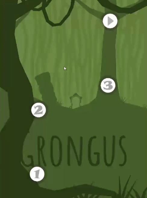
For a long time, I’ve wanted to write a post about how we make Levels when working on Where Shadows Slumber. The only problem was a lack of documentation. I forgot to take screenshots of the early stages of the Levels we’ve completed so far. What I really wanted to do was show our audience the growth of a Level, from it’s earliest conception and then show the various stages of the design process along the way.

When I thought of this idea, I tabled the blog and decided to wait until I started on a new batch of Levels… and here we are! We’re going to take an inside look at Level 3-1, Noria, the first Level of the Aqueduct World.


Maker:S,Date:2017-8-17,Ver:6,Lens:Kan03,Act:Lar02,E:Y

Step 1: Draw The Level

Every Level has a reason for being in the game. Noria is the first Level in the Aqueduct World, which makes it extra special. Whenever we design the first Level of a World, we like to communicate to the Player:

  • Why the World is going to feel different from the other Worlds in the game
  • What mechanics you’ll be dealing with in this World – especially new ideas

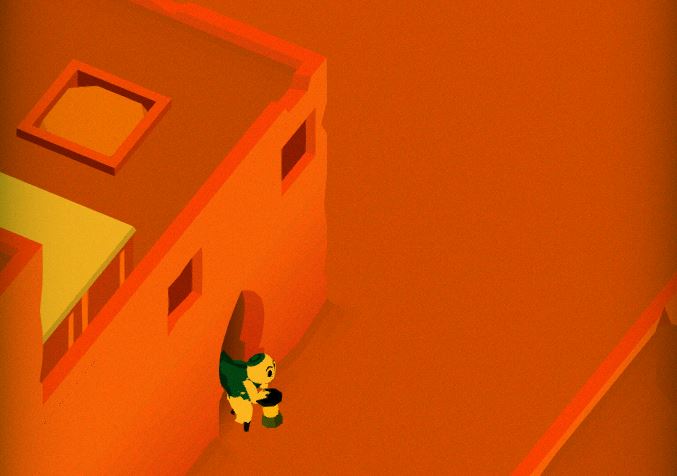
For the Aqueduct, we wanted to make it all about mechanical devices, switches, rotating things and whirring machines. Our game doesn’t exactly have a precise historical setting, but it’s fair to say it isn’t modern day. This gives us some leeway with technology. It has to work, but it can look really old.

MVIMG_20171025_141620.jpg

Jack’s notebook!

The Aqueduct World is all about Buttons. Buttons are Nodes that do something when you step onto them. There are all kinds of Buttons, but the most basic Button does a thing every time you step on it, no matter how many times you step on it.

To show that off, Jack designed a Level (above) where the only way to cast shadows and move the light was with a single Button. In addition to that, there are Buttons near each light in the Level to turn them on and off. The proximity of the light to the Button it’s attached to is an intuitive connection. These Buttons work like regular domestic light switches too, so it’s a cheap way of using existing Player knowledge about the real world and transmuting it into knowledge of our game.

When a Level exists in this form, the only thing we can really do is discuss it. Jack will attempt to guide a very confused Frank through the mechanics of the Level. I’ll try to poke holes in it (literally, with my pencil) and find problems with the design. We’ve never shown these sketches to testers because it’s too high-level for them to understand. If we like the idea of the Level, Jack makes a grey box prototype of it in Unity for us to test.


Noria-Greybox

This Level doesn’t look too special yet, huh? Just wait!

Step 2: Make A Grey-Box Prototype Level

With a design solidified, now we’re ready to make a version of the Level that can be played and tested. It doesn’t need to look pretty yet, so we use basic template cubes to represent walkable space. Affectionately called grey box prototypes, this technique is how we prototype every Level in the game. Watch a video of me beating the Level below:

As you can see, it’s playable in this stage, and everything works. You can solve the puzzle, which means testers can assess the strength of our design. (We just tell them to ignore the visuals.) We brought this Level, in this format, to AwesomeCon 2017 looking for feedback from players. When we show grey box prototypes to people, we want to make sure they can complete the puzzle. More than that, we want to make sure that they solved it on purpose instead of just by brute force. If we get good feedback, we proceed to Step 3.


Noria.png

Step 3: Draw Some Concept Art

This might seem backward, but this is the time when I draw a concept image of the Level. Why do I do this after the Level has been prototyped, and not before? It’s because Jack knows best which Nodes need to go where, and I don’t. I need to take cues from him about where everything must be, which often includes the actual length and width of shadow casting objects.

This is actually beneficial. It gives me good constraints to work with. I draw a paper sketch and say, “OK, if everything absolutely has to be in this location, what can I do with it? What makes sense for the setting [Aqueduct] whether it’s man-made or organic?” As you can see in the drawing, the following ideas have been spawned:

  • Obe should enter from a pipe (bottom right) to match the cutscene that plays directly before this Level.
  • The pillar now looks like it belongs – it’s a crumbling structural element of the Aqueduct, a man-made structure in disrepair.
  • The mechanism by which the lamp moves left to right is not just a magical back-and-forth switch. Now it’s a waterwheel! Why a wheel? Google “Noria”…
  • The lights need to look like actual man-made lights since they are powered by Buttons on the ground. Why not lamps?
  • There are stone pathways going horizontally that have crumbled over time. Those need to be repaired by shadows.
  • The bridges going vertically are metal grates that allow water to pass under them. This is an Aqueduct, we can’t just have standing water blocked in!
  • There’s a back wall with a door. I like to give the Player as many visual cues as possible that the finish line is an actual exit.

The concept art phase is another chance for us to critique the design. If we know the puzzle is good, but it produces an awkward-looking Level, we have the opportunity to reconfigure things. Perhaps the exit needs to be in a different place? Maybe objects should be closer or further apart? Now is the time to match the design to the intended context, the Aqueduct. Once I have good concept art to work from, I proceed to Step 4!


DesignBlog-Noria-FirstPass.png

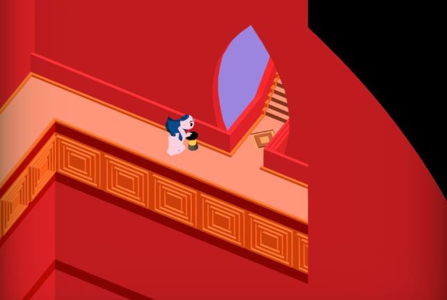
Step 4: First Aesthetic Pass

Now it’s time to take that ugly grey box prototype (sorry Jack) and make it look and sound beautiful! I’m ready to apply my toolkit of Aqueduct paths, walls and bridges to the design. Once the art is laid down, Alba and Noah have their first chance to put some audio effects into the Level and set the mood. It makes a huge difference: now the Level doesn’t sound like it takes place in a silent death vacuum! Creepy chimes and rushing water converge to give the Level a sense of place. Here’s a video of it all in action:

The Level doesn’t look grey anymore! That’s awesome. But… it also doesn’t look finished, does it? This kind of art would pass for a student game or something in a game jam, but we want to be an App Store Editor’s Pick and win a ton of awards. That means the art needs to be worth the price people paid to download the game. It needs to be extraordinary! It needs to be… polished.


DesignBlog-Noria-Polished

Step 5: Aesthetic Polish

Polish is a game design term for taking your finished product and finishing it again so it’s even better – much like shining a shoe with shoe polish. You want to make your Level shine! If you’re making an island paradise, it needs to be the most relaxing paradise the player has ever experienced. If it’s a scummy slum in a city, you need to make that slum as dirty as possible. Everything needs to be pushed to the extreme.

My personal philosophy is that I want to turn every Level in the game into my favorite one. Obviously, I know that can’t happen. But at least while I’m working on it, I can take something boring and give it life. Speaking of which, this is usually where animation enters the picture.

animate (verb)

1530s, “to fill with boldness or courage,” from Latin animatus past participle of animare “give breath to,” also “to endow with a particular spirit, to give courage to, enliven,” from anima “life, breath”

Animation is the most time-consuming part of aesthetic design, and it requires a lot of setup as well. It makes sense for this to come last. But it’s definitely the most important artistic layer. Bad video games tend to feel frozen and stale: great games are always in motion, even when everything appears still. I think our modern brains are conditioned to assume that a screen containing no motion is frozen, as if the app crashed. If you look at games with a high level of polish (Blizzard’s Hearthstone comes to mind), there’s always something moving around to give the player the illusion of life. The goal of polish is to make your game appear to crackle with the spark of life. See for yourself:

Pretty different, huh? Our water shader adds some much needed liveliness to the water, and makes it feel like a rushing stream. Buttons now move and bounce under Obe’s weight. An animated glyph on the ground lets you know where you’ve just clicked. The lamp posts are now chains dangling from the ceiling, which lets them sway gently on a loop.

The other perk of animation is that it allows you to add a third sense to the game: touch (or, feel). In a very real sense, players can only experience your game using their eyes and ears. But if you do your job right as a game designer, certain elements in your game will make the player feel things. Have you ever gotten hit in a video game and exclaimed out loud “ow!” after seeing what happened to your avatar? You didn’t actually feel pain, but something about the experience was immersive enough that it made you connect with your character. That’s what polish is for. That’s how games rise to the top!


yellow-happy-smile-526968

forever and ever and ever and ever and ever and ever and ever

Step 6: You Never Finish, This Goes On Forever

Here’s the dirty little secret about my strategy for artistic polish: I’ll never be finished. I will never finish this game. I will work on this game every day until I am dead. It doesn’t even matter if I’m improving the artwork, even if I’m actively making everything worse I will never finish anything in this game.

Whoops! That’s not what I meant to say. Where was I?

Eventually, you need to stop working on a Level so you can move on. This is always a heartbreaking moment in game development. If I could choose any superpower, I would choose a very specific one – the ability to do things on my computer without time slipping through my fingers like grains of sand into an endless void.

[  . _ . ]

You have to move on so you can finish the rest of your game, so when do you do that? It’s at the point where your hours of input are only reaping very marginal gains. People won’t spend an eternity looking at your Levels, so you shouldn’t spend an eternity working on them either. If anything looks truly awful at launch, you can always sneakily patch in fixes that you missed. Just say you’re fixing bugs. and blame the programmer!

Besides, I can always improve the artwork again when we remaster Where Shadows Slumber for BlackBerry…


I’ve been working on this blog post for too long, and now my hours of writing input are reaping only marginal gains. Time to end this post. Thanks for looking at this inside scoop into our process! If you’re wondering why game development takes so long, imagine doing this for all 38 Levels in the game. That’s not even including the cutscenes…

Say, that gives me an idea for another blog post!


= = = = = = = = = = = = = = = = = = = = = = = = = = = = = = = = = = = =

We hope you enjoyed this deep dive into our development process. You can find out more about our game at WhereShadowsSlumber.com, ask us on Twitter directly using the handle @GameRevenant, find us on Facebookitch.io, or Twitch, and feel free to email us directly at contact@GameRevenant.com.

Frank DiCola is the founder of Game Revenant and the artist for Where Shadows Slumber.


Menus

I’ve been talking a lot about less technical stuff recently. Let’s mix it up – today, I’m gonna talk all about the design and implementation of an important part of our game. If you couldn’t guess from the title, today we’re gonna talk about menus!

Design

Menus are a pretty important part of your game. Most people make a game and then just “slap” a menu down on top of it. Since the menu is the first thing users will see, it can be pretty make-or-break, so it seems like poor form to spend the least amount of time on it! That’s why it’s so important to actually put some thought into your menu design.

Early on, Frank and I decided that we wanted to have as little text in Where Shadows Slumber as possible. There were a number of reasons for this, the most obvious being:

  • We have to do less work to translate the game into other languages
  • It adds to the “mysterious” vibe we’ve been going for
  • The user isn’t burdened with a bunch of text they have to read
  • The text-based menus were possibly the worst part of SkyRunner (our previous game)

To go along with this choice, we also aimed to make the menus as transient as possible – rather than opening to a menu, where the player must choose to start playing, the game itself would just start playing immediately. That’s what the user is here for, after all! This “game-focused” menu model is an attempt to reduce the user’s barrier to entry, making it as easy as possible to actually start playing the game.

So what does that look like? Our menu design breaks down into four small parts:

  1. The first thing the user will see is the splash screen. This is just a quick little screen that shows the Where Shadows Slumber logo. It’s not really a menu, since it doesn’t do anything, but it’s worth mentioning (and it’s important for implementation purposes).
  2. Before starting a level, the user is met with a level title card. This tells the user what level they’re on, which provides important context, as it’s the only menu interaction they’ll have before they get to the game itself. After tapping through this menu, the user is dropped right into the game.
  3. During the game, the user can press the pause button, which will bring them to the pause menu. This is where most of the interaction is – you can restart the level, mess with the settings, etc. In order to move from “menu-focused” to “game-focused”, we’ve moved everything you would see in a “main menu” into the pause menu.
  4. The only exception to the “game-focused” menu design is our level select menu. Coming here will actually take you out of the game – but for good reason. This menu is by far the most complex, as the user can choose from any of our levels or cutscenes.

After textlessness and transience, a big driving force behind our menu design was incorporating game elements. For example, a quick description of our game’s mechanics might read like “things change when they’re in shadow”. So, wherever possible, we wanted to have a menu where things changed in shadow. The only place where we had the freedom to do something like this was in the level select menu. We thought about it a bit, and ended up with this beauty:

LevelSelect

This idea came up after about a million attempts at a menu design that showed off our mechanics a bit, but I think it was worth it. It’s pretty subtle, and uses a relatively standard swiping interaction.

Implementation

For those of you looking to make your own games, or just curious what our process was, lets take a look at how we actually brought these menus to life.

This is an area of development that really benefited from our three-phase process, in which we made a demo version of the game, and then started over when we began on the full game. This allowed us to iterate on our first approach to implementing the menus, without having to go through and update the existing menus. There are three interesting things that we did to create these menus.

Splash Screen and Pause Menu

In the demo version of the game, we created a pause menu prefab, and made an instance of it in each level. That way, we could update the prefab, and it would apply to every level. Seems pretty cool, right?

pausemenu

Because Where Shadows Slumber isn’t reflex-based, it can continue to play in the background!

While this is a pretty good pattern, and we’ve used it for a lot of other things, it didn’t really work for menus. The biggest reason for this was that we found ourselves going through every single level to update the individual menu objects with small, level-specific changes. While this might work for the demo, which only had ten levels, it’s a lot more work for the final game, which will have 38 levels.

Rather than have a menu object in each level, we decided to have a single menu object that persists throughout the entire game. After all, the menus themselves don’t change much from level to level. This is where the splash screen comes in – when the game loads up, the first scene is always the splash screen. This scene has the single menu object, and we simply tell Unity to allow it to persist from scene to scene (using DontDestroyOnLoad()). Any changes that need to be made to the overall menu text are made per level, as the level is loaded.

Level Title Cards and Translation

One part of the menu system that often gets overlooked during design is translation. For example, we decided to provide different languages for the demo, but we didn’t consider it or add it in until close to the release. This left us with a half-hearted translation system that was hard to update.

titlecard

I don’t think we need outside translators – my skills should suffice

The second time around, we decided to think about translation from the beginning of menu implementation, and we were determined to come up with something easy to work with. What we realized was that, for a foreign language, all text should be loaded from somewhere else – why should English be any different? Instead of creating an English menu and then applying translations, we started with an “empty” menu, and used our translation system to populate it with whatever language we wanted, English included! This forced us to take translation into account much earlier – so we can be much more sure that our translation system will work nicely with our menus.

But what does that translation system look like? Pretty much all of our other scripts are given values through the Unity editor. We did this for translation as well in the demo, and it was a complete disaster – even with our low-text menus, there was still a lot to add! We realized pretty quickly that we didn’t want to include the translations as part of the Unity scenes – we decided to have them loaded in separately, using JSON.

JSON, or JavaScript Object Notation, is a pretty cool file format used to organize values into a set structure. By storing all of our menu text (and translations of that text) in a JSON file, we can pretty easily read it into the game as it’s loading, thus allowing us to populate menu text objects with the correct language. It’s easy to read, easy to backup, and easy to update (unlike the Unity editor script fields), which makes it perfectly suited to this type of use-case.

json

A small sample of our JSON

The end process is pretty simple – when the game loads, parse the JSON file (which has all of the game’s text in “every” language). During the splash screen, where the menus are created, populate their text fields with the correct text from the JSON file. If we need to update the text, it’s as simple as changing the text in the JSON file, and everything just works!

The Level Select Menu

While the other subsections here describe ways that we learned from a bad implementation to make a good one, the level select menu is just a cool menu design.

Whille toying with menu ideas, Frank created a few of these “world tableaus”, and we knew that we wanted to have them in the level select menu. The coolest thing about them is that they aren’t just textures – they’re 3D scenes, which allows us to give them subtle movement (this kind of effect really helps make a game look “polished”). The question becomes – how can we display these scenes in such a way that they can interact with each other in two dimensions, while acting as completely separate scenes?

Unity has a pretty awesome feature called a RenderTexture, which allows a texture to display the live view of a Camera object (for the curious among you, that’s how you could make a CCTV screen or a mirror in a Unity game). Using a RenderTexture basically allows us to “flatten” the moving tableau scene into a moving texture, which we can then manipulate as we please. And, as it turns out, it pleases us to use math and angles to create the “sweeping shadow” effect.

You see, I’m a pretty big fan of math on the whole, and this was a perfect place to apply some trigonometry. Using complicated concepts (like “sinusoidal”, and “minus”), I came up with an algorithm that  would put two RenderTextures and a shadow triangle together in such a way that it created the desired effect:

Level Select Transition

theta = (3 * atan(h / 2x) – atan(h / (2 * (x + w)))) / 2

What you’re seeing here is that each RenderTexture is angled (and stretched appropriately), and then positioned in such a way that the line where they cross is exactly covered by the moving shadow. This gives the illusion of the menu behind the shadow magically changing from one image to the other.

This menu is my favorite part of the menu system, because it’s the most interesting, both from a technical, implementation perspective, and from an outside, aesthetic perspective. That said, I think we ended up with a pretty sweet menu system all around, thanks in no small part to our past failures in this area.

Looking Ahead

Unfortunately, no part of the game is ever really done. The menus are in pretty good shape, but there’s still some polish we need to do, and I’m sure there will be small changes we want to make as we move forward. In fact, this was one of the more important concepts behind a lot of our decisions – any changes we want to make should be pretty easy!

= = = = = = = = = = = = = = = = = = = = = = = = = = = = = = = = = = = =

Hopefully you enjoyed this peek at the menus for Where Shadows Slumber! If you have any questions about our menus, or if you have any other questions about Where Shadows Slumber, feel free to contact us! You can always find out more about our game at WhereShadowsSlumber.com, find us on Twitter (@GameRevenant), Facebookitch.io, or Twitch, join the Game Revenant Discord, and feel free to email us directly with any questions or feedback at contact@GameRevenant.com.

Jack Kelly is the head developer and designer for Where Shadows Slumber.

Just Do It

No, Where Shadows Slumber hasn’t received any funding from a mysterious shoe company. Rather, I want to discuss an aspect of working on a personal project that I’ve seen a lot of people struggle with, and that I’ve had trouble with in the past. Yes, this post touches on a few of the topics that I talked about in a previous blog post about ‘drive’, but today I want to focus more on a specific facet of the process: forcing yourself to work on something that you don’t want to.

Every project is difficult. In particular, every project begins to drag as you get closer and closer to the end. You find it more and more difficult to keep working on it. At the beginning of your project, there’s a whole bunch of stuff you’re excited to work on. As you reach the end, you find that you’ve done all of the fun things, and the only things left are boring tasks and difficult decisions. This is the point where you’re really being put to the test, and in this situation, I have one piece of advice for you – buckle down and just do it.

Let’s take a quick look at the different kinds of things you should just force yourself to do, and how to actually do so.


Doing Things You Don’t Want to Do

The most obvious kind of thing you don’t want to do is, well, something you just don’t want to do. These things are different for everyone, and come up for various reasons. For me, these are the cleanup/polish kinds of tasks. For other programmers, it might be the mathy, trig-related stuff. For an artist, maybe it’s animating hands or something (I hear that’s really hard…). Whatever it is, everyone has something they consider ‘dreg work’, and those tasks start to pile up.

taxes

Tax  season is coming up, and I’m already putting it off

If you’re anything like me, when you come upon one of these tasks, you briefly consider doing it, and then you move on to something easier or more interesting. After all, there’s no shortage of work in your project! This happens a lot with teams as well, especially less organized teams – “if I go work on something else instead, somebody will probably take care of this by the time I get back to it”.

Unfortunately, these two base assumptions fall apart when it comes to indie game development (or any similar venture). In most cases, your project has to come to an end eventually, which means that you can’t simply keep putting these tasks off. And with a smaller, indie-sized team, it’s unlikely that you can just put that responsibility on someone else. It’s pretty cool to be the arbiter of your own success by taking charge of your own game development project, but it also involves other responsibilities.

I know quite a  few people who check their email regularly – until they see that one email that prompts them to do something. They know they have to do it, but they simply don’t want to. Rather than just doing it, getting it out of the way, and having some peace of mind, they close their email and proceed to ignore it for the better part of a week. Inevitably, this doesn’t cause the task to go away, but just gives them less time to do it, and a boatload of stress while they’re avoiding it anyway.

The bottom line is that these tasks must be done – you’ll come across them, and you’ll simply have to do them. The most important thing is to have a positive attitude in these instances. You come upon a task that you don’t want to do – acknowledge that you have to do it, take a deep breath, and just get started. Once you’ve begun, you’ll probably find that it’s not as bad as you thought – simply starting the task is usually the hardest part. And hey, if it ends up being an awful task, at least you got it out of the way!


Committing to an End

Another area where it’s very important to embrace a “just do it” attitude is when it comes to actually finishing your project. As an indie game developer, it’s perfectly natural to be apprehensive of your eventual release. After all, you’re just a small group of people (or even just one!), but your game will still have to compete with games made by giant studios. It makes sense to want to make sure your game is absolutely perfect before committing to a release.

The problem with this plan is the use of the word perfect. Your game will never be perfect. In fact, your game will never even be “good enough”, especially considering your own perfectionist perspective. Waiting for perfection leads you to a phase of endless polish, which can delay your project for years, or even indefinitely. The only thing worse than releasing an imperfect game is not releasing one at all.

There’s a pretty common attitude of “I’ll release it when it’s done”, or “I’ll know when I get closer to the end”. While these make sense at first blush, and are good mentalities to have toward the very beginning of a project, they quickly turn against you, causing your project to become more and more delayed.

duedate

Red marker. That’s how you know it’s serious.

Unfortunately, as introspective as we may consider ourselves, there’s a significant amount of stuff going on under the hood that we’re not even aware of. One of the more annoying of these is that, if there’s no “due date” for your project, your brain will subconsciously de-prioritize working on it. Similarly, there’s a well-known adage that work expands to fill the space its given – if you have twice the time to do something, you’ll just subconsciously work half as hard at it. For example, at the end of November, we were on schedule to release Where Shadows Slumber by April. We recently pushed that date back by a few months, without increasing the project’s scope. You would think that this would give us some breathing room, but the new “deadline” feels like it will somehow be even harder to meet!

Managing the timeline of an entire project is an incredibly difficult task. One important piece of advice I would give would be to pick a target release date. Even if it’s not public, picking a date, committing to it, and doing everything you can to meet it will definitely help you prioritize the work you’re doing, frame it appropriately, and avoid the project stretching into infinity.

Don’t get me wrong, you shouldn’t choose a release date willy-nilly; you should realistically estimate when you can complete the project, and choose accordingly. Similarly, there’s no need to have a specific end date in mind when you start the project. Your target date is a great motivational tool, but it only works if it’s at least somewhat accurate. Even if you miss your release date (or realize you’re going to, like we did), it’s not a problem. You just have to reassess the work that’s left, and choose a new date. As long as you don’t keep extending the project, you’ll be fine.


Decision-Making

While there are tasks that you don’t want to do because they’re difficult or time-consuming, there are other reasons to not want to do something. In particular, making decisions is a real sticking point for a lot of people. If you implement something incorrectly, you can always redo it, but many of the decisions you have to make for your game have an irreversible effect. This is really daunting, and since decisions themselves don’t take a lot of actual physical effort, the natural response is to simply put off making the decision for a bit.

DecisionMaking

When faced with a choice between success and failure, I hope you’ll always choose Where Shadows Slumber!

This is similar to the “end date” discussion above. While many of these decisions are very important and require a great deal of thought, they still have to be made. It’s important to never forget this fact, as decision paralysis is another great way to destroy your game.

When you find yourself facing one of these decisions, make sure you don’t back off, at least not repeatedly. You have to make the decision eventually, so you might as well do it now. In fact, in the case of some difficult, important decisions, you might even lock yourself in a room until you’ve made the decision. That’s exactly what we did when picking out the name for Where Shadows Slumber – Frank and I sat down, and neither of us was allowed to leave until we had picked a name. It ended up taking a few hours, but we had managed to nail down the answer to a very difficult decision.


Just Do It

There are a lot of places in game development where you find it hard to do what you have to do. These moments are gateways to stagnating development and endless work. When the time comes, you often must act. Don’t make half-hearted decisions or poor implementations, but really force yourself to do what needs to be done. Just do it.


= = = = = = = = = = = = = = = = = = = = = = = = = = = = = = = = = = = =

If you have any questions about any of our development struggles, or if you have any other questions about Where Shadows Slumber, feel free to contact us! You can always find out more about our game at WhereShadowsSlumber.com, find us on Twitter (@GameRevenant), Facebookitch.io, or Twitch, join the Game Revenant Discord, and feel free to email us directly with any questions or feedback at contact@GameRevenant.com.

Jack Kelly is the head developer and designer for Where Shadows Slumber.

State of the Art – February 2018

Welcome to State Of The Art, February 2018 edition! This monthly* progress report is written by Frank DiCola and is focused entirely on how the game’s visuals have improved in the past month. If you are one of our beta testers, you’ve probably already seen this artwork firsthand. (Looking to sign up? Email me at contact@GameRevenant.com if you’re on iOS, or just go here to download if you’re on Android)

(*It’s been a while since I did one of these! We got so caught up in a bunch of year-end stuff with MAGFest 2018, I decided to wait until February to discuss the state of the game’s aesthetics. The good news is, this is a double helping of art updates!)

Without further excuses, let’s explore the major leaps forward we took since December!


Header-Forest

The Forest is Now Polished

Polish is a strange thing. You’re never really finished – you just keep making smaller and smaller increments towards perfection, never quite reaching it. Eventually you hit a point where the small changes aren’t worth it because they take too long and have very little payoff.

Check out this video of me walking through the game’s prologue:

The Forest is polished to the point where it’s worth polishing it! I only say that because there is an entire game still left to finish, so we can’t spend forever on the first few Levels. I will say though, I paid particular attention to these Levels because they are the first morsels of gameplay people will experience with Where Shadows Slumber. Leaving a bad impression here can permanently color people’s mental model of the game in a negative way, so it’s important to get it right.


Header-Jail

The Jail is Now Really Different

The next World in our “first time user experience” is a scary, lava filled jail where Obe has been taken prisoner. As he makes his escape, we teach the player about lights and the way they interact with shadows.

This World was quite difficult to get right. I still think some of it needs to be changed, but here’s where it’s at right now:

If you remember the blog post where I showed off the Jail World last time, you might be shocked to see that a lot has changed. I never liked the boxy, protruding walls I created for this World. It made it impossible to define complex shapes, and it cost a lot of polygons. As we polish the game, we also seek to optimize it, and that means giving your phones less information to compute each frame. Now the walls are much simpler, but still have a brutal “government building” quality to them.

Hopefully you support this drastic change! It’s the only World that’s undergoing such a dramatic shift, but I think it’s for the best.


Header-City

The City is Still Unfinished

To my great shame, the City World is still not polished. Some Levels (one in particular) don’t even look passable. That’s a problem I’ll try to rectify immediately, as the World is already late, even by our newly revised schedule.

What I can show you are two Levels still in polish-development, because I would like feedback from the general Game Revenant fanbase! Here’s the first City Level, called “Slum”, which got a big overhaul:

City-Slum.JPG

And below is Level four in the City, called “Fountain”, which I don’t think I ever showed because it wasn’t in great shape. It’s still missing two key components that require very specific artwork: plants and statues for the fountain. Right now it looks very sterile, but this is supposed to be a luxury fountain / garden fit for a king! Check it out:

City-Fountain.JPG

This red color is a deep callback only diehard WSS fans will recognize [ ^_^]!

Comment below this post about these changes, please! This World needed a lot removed from it in order to look good. It had way too many colors before, as well as misleading stuff on the screen. It’s not done just yet, as I said, but it’s in way better shape.


Header-Spoilers.JPG

Spoilers Ahead

As we near the completion of the final game, I’m going to get a bit more secretive with these updates. I realize now that although some sections of the game look awesome, players may want to experience them for the first time inside the game instead of in a blog post. That doesn’t mean I’ll stop posting, but it does mean you can expect to see spoiler tags in these art posts from now on. I’m waiving that this time around since most of the updates are in the first 10 minutes of gameplay, but be warned!

In the future, read on at your own peril…


= = = = = = = = = = = = = = = = = = = = = = = = = = = = = = = = = = = =

We hope you enjoyed this update about the game’s artwork. Have a question about aesthetics that wasn’t mentioned here? You can find out more about our game at WhereShadowsSlumber.com, ask us on Twitter (@GameRevenant), Facebookitch.io, or Twitch, and feel free to email us directly at contact@GameRevenant.com.

Frank DiCola is the founder of Game Revenant and the artist for Where Shadows Slumber.