If you remember last month’s blog post about an upcoming patch to Where Shadows Slumber, and you’ve been eagerly awaiting it since then, I have good news for you. The wait is finally over! Kind of… for some of you!
Android users with access to the Google Play store can access this patch right now. Please leave a comment if you run into any problems with the puzzle redesigns, or saving / progress issues. I’ll respond as soon as I can!
The patch is coming to iOS later this week once it makes it’s way through Apple’s approval process.
While we have no plans to add more puzzles to the game (a frequent request from fans of the game) we’ll obviously continue to support the game via bugfixes and quality of life improvements as we see fit. Thanks for all the helpful feedback over the past few months on that end!
Stay tuned to this page for more announcements regarding Where Shadows Slumber. While we don’t have anything concrete to announce just yet, a cool experiment is in progress…
What’s Where Shadows Slumber?
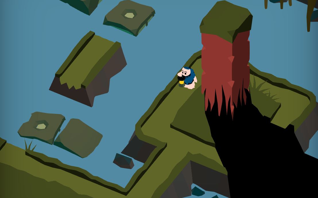
I always assume that I’m writing these posts for an audience that reads them regularly, but if you just found out about our game because of this post… welcome! Where Shadows Slumber is a mobile puzzle adventure game for iOS and Android. As the name implies, the driving force of the game’s puzzles center on the shadows your character casts from his bright handheld lantern.
Incidentally, this GIF is slightly out of date now that Patch 1.0.10 is out…
As these shadows move across the landscape of the environment, they can cause objects to appear and disappear from reality. These changes can happen to entire sections of the puzzle or tiny pieces of a single pathway. Shadows from two different objects may have two different effects on the level. Your character’s position matters since Obe is holding the light – he’s more than just a passenger meant to be carted from point A to point B. Where Shadows Slumber encourages outside-the-box thinking, exploration, and puzzle solving!
Try the new-and-improved version of the game at the links below:
After PAX East this year, Jack and I spent the entire car ride taking a critical look at our game based on the feedback we received. It may seem weird to continue iteration on a game that’s already been released, but we wanted to make the game as perfect as possible before it heads to new platforms later this year.
Many of these changes are substantial – altering the solutions to puzzles, the artwork, and even the order in which you solve puzzles. Some changes are so small you wouldn’t notice unless I told you, which is precisely the point of this post!
Here’s all the changes you can expect in the latest patch, which we hope will go live sometime early next week:
10 Artistic Changes
Some of the design problems with Where Shadows Slumber are actually just bad artistic cues – which is to say, these are things I made that looked cool to me but ended up communicating the wrong ideas to our players.
Most of these fixes are focused on the beginning of the game, since that’s the “make or break” period for gamers. If players aren’t impressed after the first five minutes, or the game is frustrating, we’re destined for a 1-star review. So here’s a visual walk-through of all of these changes, with the old versions on the left and the new versions on the right.
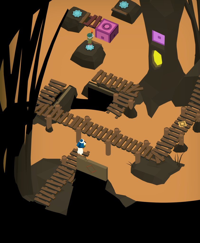
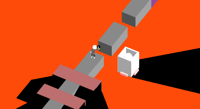
The Forest Levels
Forest Level 2, “Bridge”
This is the player’s first interaction with the design pattern we use for Draggable objects, but sadly it’s on two Non-Draggable objects that appear Draggable. (The ancient, crumbling bridges in the water) We decided to cover them with moss so they don’t look interactable.
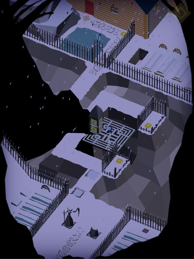
The Jail Levels
Jail Level 1, “Light”
Before we changed this puzzle, it was very difficult for players to tell when the bridge was being repaired by the shadow. Now the bridge is much longer, which gives you more space to explore and see what the shadow is doing to the bridge.
Jail Level 3, “Lock”
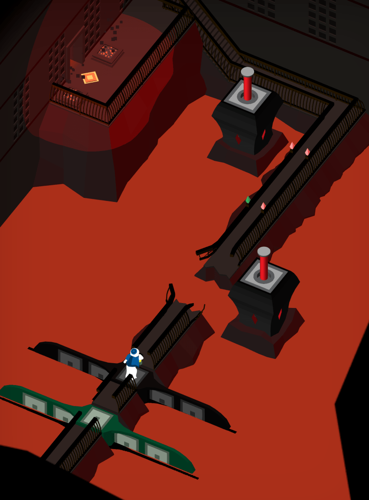
This Level badly needed clarity and simplification. My earlier attempt at color-coding the different gaps in the bridge with really dark, indistinguishable colors and incredibly small little gemstones did not work. The new version has bold colors, big pieces that still connect the bridge even when it’s broken, and one fewer draggable light source.
Jail Level 5, “Pressure”
Similar to the puzzle I just mentioned above, 1-5 needed a lot of color to clarify what’s going on with different shadows affecting different objects. I like how it turned out!
The River Levels
River Level 1, “Docks”
The corner of the land mass above is not traversable. As you can see in the old version, it’s not clear that there’s a gap in the walkway. (We put a gap there because we only want players to see this shadow illusion in a specific way) This fix makes the gap more obvious.
This Draggable raft was giving players a lot of trouble, too. The square pieces are halfway into the water, so it’s not obvious that you can drag them. We want to try the new design, where the Draggable squares lie on top of the surface so they’re visible.
River Level 3, “Guide”
This Level featured a large tree that had some kind of light inside of it, and you could close the shutter to hide the light. This shadow was used to change the bridge in the center. Ultimately, this puzzle had too many elements going on in it. We can keep the same design without requiring players to figure out what’s going on with the tree.
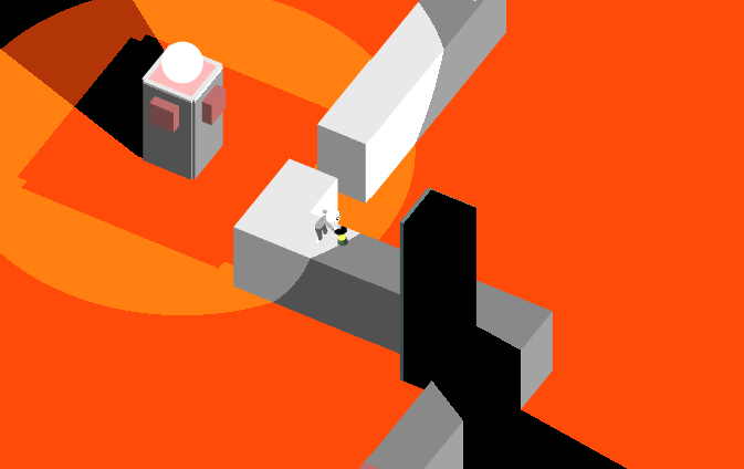
River Level 4, “Ebb”
The shadow-casting wall in this Level is really big now, because it was awkward how you could shine your light as you walked down the steps here. Some people accidentally solved the puzzle on their way down the staircase!
The Hills Levels
Hills Level 5, “Rest”
This Level received a huge change, as well as numerous small ones. The most noticeable change is that the center island is no longer one big draggable, but instead is a platform with a draggable pillar on it that slides freely. We feel that this will allow players to more easily solve the puzzle, though the solution remains the same. There are also a bunch of small changes to where pillars come up to stop you along your path.
The Summit Levels
Summit Level 2, “Blind”
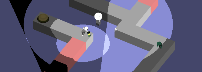
This one is super subtle. Can you see it? We added some footsteps for the invisible ghostly Knight who is patrolling around inside the shadow realm. (If you’ve never played the game before, I’m sure that made no sense at all.) We hope this helps players determine where he is as they try to solve this difficult puzzle!
Six Design Changes
Not everything we’re changing in this patch has to do with artwork. One of the largest changes is really subtle – you’d only notice it if you played the game a lot. New players would never even realize what we did.
These changes were made based on lots of user feedback with the final product, as well as in preparation for a future version of Where Shadows Slumber that’s free to download and has paywalls interspersed. Here are six non-aesthetic changes happening in Patch 1.0.10…
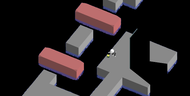
No More Riding Draggables
The largest change, and one that spawned a whole bunch of other changes, is a clarification to the way draggable objects work. Obe can no longer stand on these while they move, so a few puzzles had to be updated. Now you’ll always see the image above when Obe is standing on a draggable bridge, and we hope this is less confusing.
Forest Level 3, “Monolith”
The draggable pillar now begins raised out of the water instead of submerged. We felt like it was not obvious that it could be dragged, since it was so well hidden by the rock and moss.
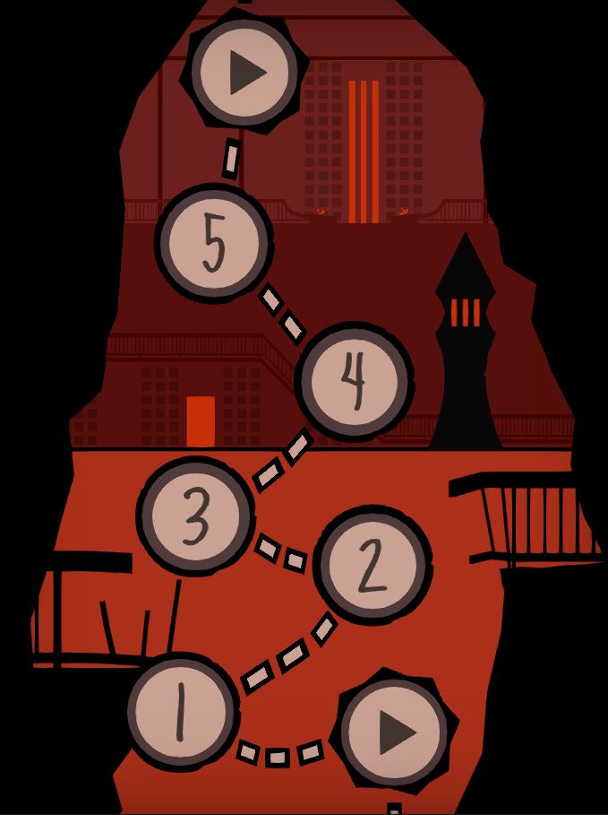
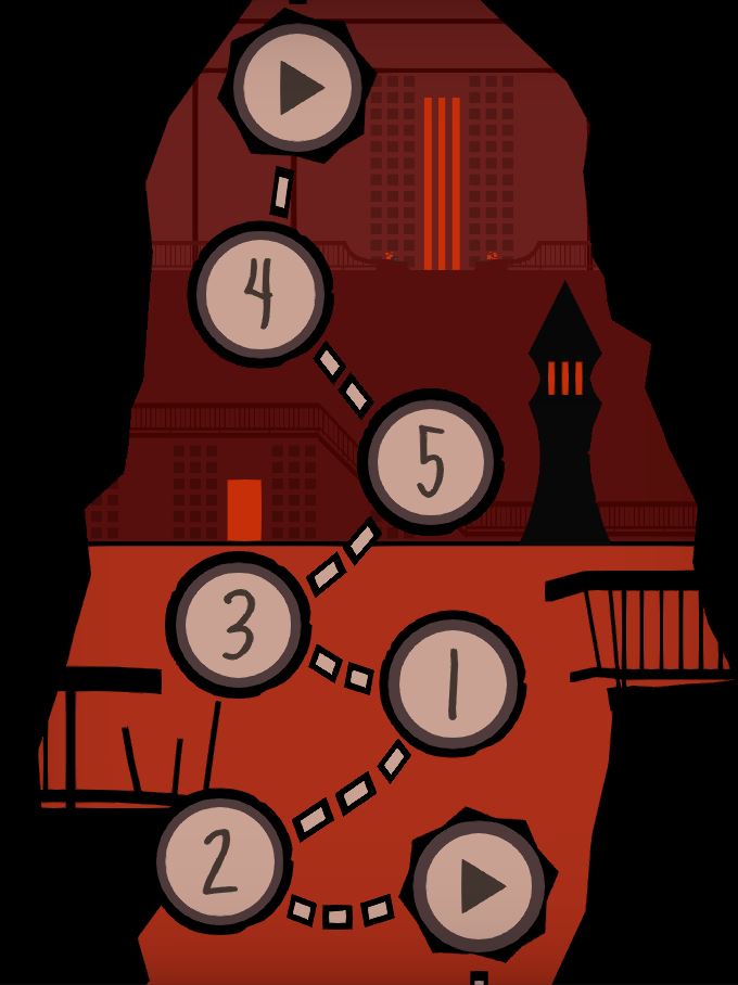
World 1 Order of Levels
We’re rearranging this World in order to make the introduced mechanics flow better. (The actual screen won’t look as it does on the right, that’s just a diagram I made to show you how the puzzles are moving around.) The previous section used the old World 1 numbers.
River Level 3, “Guide”
In this Level, you used raised walls to cast shadows on the center bridge. This involved “dipping” the center in shadow briefly either by letting the walls go up and down, or by walking Obe in and out of the corner to see the change. In the end, it was a relic of a way shadows used to work very early on in the game’s history. We eventually changed the walls into pillars you can walk around, to be more consistent with the rest of the game.
Title on Device
We’re changing the build name from Shadows to Where Shadows Slumber. I chose “Shadows” because I knew it would fit nicely on everyone’s phone screens. But it seems like poor branding to have everyone refer to our game as “Shadows” from here to eternity. We also considered “WSS” but that seemed to cryptic. Let me know how it looks on your phone screens!
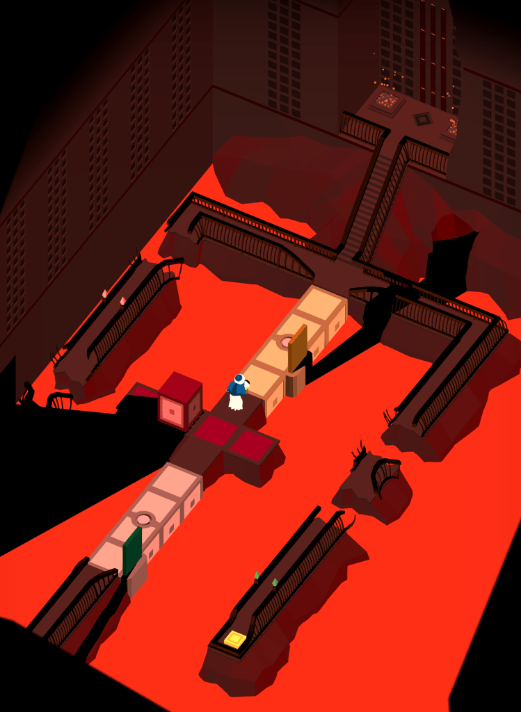
Paradise Level 5, “Gates”
Last but not least, the most difficult puzzle in the game just got a whole lot less tedious. Now there are doorways to any of the four colors in this puzzle, available from any color area. No need to keep going back to the yellow zone!
Coming Soon To A Phone Near You…
I had hoped to get the patch out already, but there are still some tiny fixes left to do and a lot more testing. But once it’s all ready and this patch is uploaded to the App Store and Google Play, you’ll get a push notification to notify you that it’s been downloaded. Please try it and let us know what you think of the alterations!
Since AwesomeCon 2019 is in just a few days, I wanted to do something different this week for our Tuesday blog post. This isn’t really an article – instead, it’s an awesome gallery of images comparing Where Shadows Slumber 2019 to Where Shadows Slumber 2017. The 2017 images are from the last time we went to AwesomeCon, which you can see in their original form in this ancient blog post.
These pictures are old! This is back when our character was essentially a bald Wii Fit Trainer with a lantern. For each set below, the top image is from 2017 and the bottom is ripped from the game as it is now on the App Store. If you haven’t purchased the game yet, please do so before reading the article. Otherwise, enjoy a trip down memory lane!
The Forest
The AwesomeCon 2019 build had an entirely different first Level, which proved to be just too much for testers. It was replaced with the walking tutorial below, which is now the game’s initial level.
On the other side, the second Level hardly changed. We did shorten the second rotating bridge to add another small puzzle, where players have to rotate the bridge while Obe is standing on it. The previous iteration just had two bridges with three blocks each.
This Level impressed us and didn’t really need that much alteration.
The Jail
I kind of prefer the old model I used for light towers here. It was more obvious what was happening. I regret covering the fireplace inside the tower so much…
This Level is so old, it was in our 2016 demo. We were pretty sure it would get into the game as is, it just needed an artistic makeover.
This Level didn’t change, but it probably should have. Those spinning draggables still give people a lot of trouble. Expect them to change in a future update!
Look at that old button! Circles were too hi-poly. We made this much more symmetrical, to my delight. It’s also now the fifth puzzle in the Jail instead of the fourth, though Jack and I discussed rearranging the order again in a future update. Stay tuned…
As I mentioned above, this is now the fourth Level in the Jail. Notice how the orientation changed entirely! I wasn’t happy with where those doors at the end led. Looking back now, I think the old design made it more obvious what you’re trying to do. Too late now… [<_< ]
The River
The big change in “Docks” is that the goal space was moved much further down the screen so that I could hide it and say that Obe was taking a different exit out of the Level. In the 2017 version, Obe lands on a magical square and the Level just ends, but it isn’t clear where he actually goes or how that gets him to the next Level. An old concept we had for this World was that Obe was trying to get his raft past a series of locks in the River, which we abandoned due to the difficulty of making it work across multiple Levels.
Another Level where we shortened a bridge from two spaces to three in order to prevent unwanted behavior from the Walker.
In this puzzle, the Walker actually used to be on the same pathways as Obe. He eventually ended up getting in your way more often than not, so we put him all the way at the top of the screen in his own private hell.
This Level went through too many changes to show in just this image, but one of them is obvious. The goal space moved higher on the screen and required you to get past yet another timing / Walker / shadow / bridge puzzle.
The Aqueduct
We knew this would be the second puzzle in the Aqueduct, meaning that our first Level was probably still in production and not ready for testing. This Level underwent a big change in orientation, as you can see from the position of Obe and the button below.
This Level lost some unnecessary blocks in Obe’s path as we streamlined it. You can see here that buttons didn’t have the functionality of being pressed down yet, as Obe’s legs are piercing through the ugly button as if it was a huge block of yellow Jell-O.
I need to explain this because it isn’t obvious from the images below, but in the 2017 version of this Level you could drag the torus whenever you wanted! (Hence, why it is slightly askew in the top image but perfectly aligned in the bottom one.) That change was made to make the puzzle more challenging.
I was never a fan of the crazy colors on this Level, but I ended up adding even more to the final version so that players could tell what was going on with the shadows. Note that we added the functionality for draggables to “go dark” when you aren’t allowed to drag them.
See You Soon!
Thanks so much for checking this blog out. It’s awesome to look back in time at how far the game has come now that it’s finished. I hope to see you this weekend for AwesomeCon 2019 [^_^ ]!
As the completion date of Where Shadows Slumber draws near, Jack and I are coming to terms with just how much work it takes to finish a game. This means we’re revisiting old tasks that we didn’t have to deal with for a while, including the game’s app icon.
It may seem like a small detail, but your game’s icon is very important. It isn’t exactly the same as your game’s logo, but in certain contexts it plays the same role. The app icon is the rounded square button on your customer’s phone menu that they have to press to start playing your game. More importantly, this icon is on prominent display on marketplaces like the App Store and is often a potential customer’s first impression of your game.
Viewed through that lens, the app icon is immensely important and I regret not working on it sooner. It’s just a small graphic, though… how difficult could it be?
Fortunately, I’ve been researching this topic for a little while now. Below, I’ve compiled a gallery of some of my favorite app icons. We’ll also discuss in this blog post my personal “do’s and don’ts” for these graphics, inspired by both previous iterations of the Where Shadows Slumber app icon.
Inspiring Icons
I played a lot of mobile games during the creation of Where Shadows Slumber. That’s not because I’m lazy! I wanted to see what successful mobile games did. I spent a long time looking at their store listings, reading reviews, poring over their descriptions, and – of course – checking out app icons. It wouldn’t be a Where Shadows Slumber blog post if we didn’t gush over Monument Valley, so let’s start there.
The app icon for Monument Valley is really beautiful and shows off what the in-game art looks like. When you look at the icon on your device, the scale of Ida here probably matches her scale in the game. That makes this graphic one of the most honest app icons in the business! From a distance, you can clearly make out her shape because her white body contrasts starkly with the green backdrop. I also love that this picture shows the isometric angle and color shading that they use in the game. Sadly, this image does not communicate the game’s M.C. Escher inspired puzzles… but how the heck could you even show that? Maybe I shouldn’t worry too much about showing “shadow puzzles” in a tiny square image. It would just never fit!
The app icon for Monument Valley 2 was constrained somewhat by the first. The artist likely felt the need to match the style of the previous icon. Now that they’ve got a pattern established, expect to see something like this if they ever make Monument Valley 3. Still, the fact that this icon communicates the relationship between a mother and daughter tells you a lot about the game’s story and mechanics.
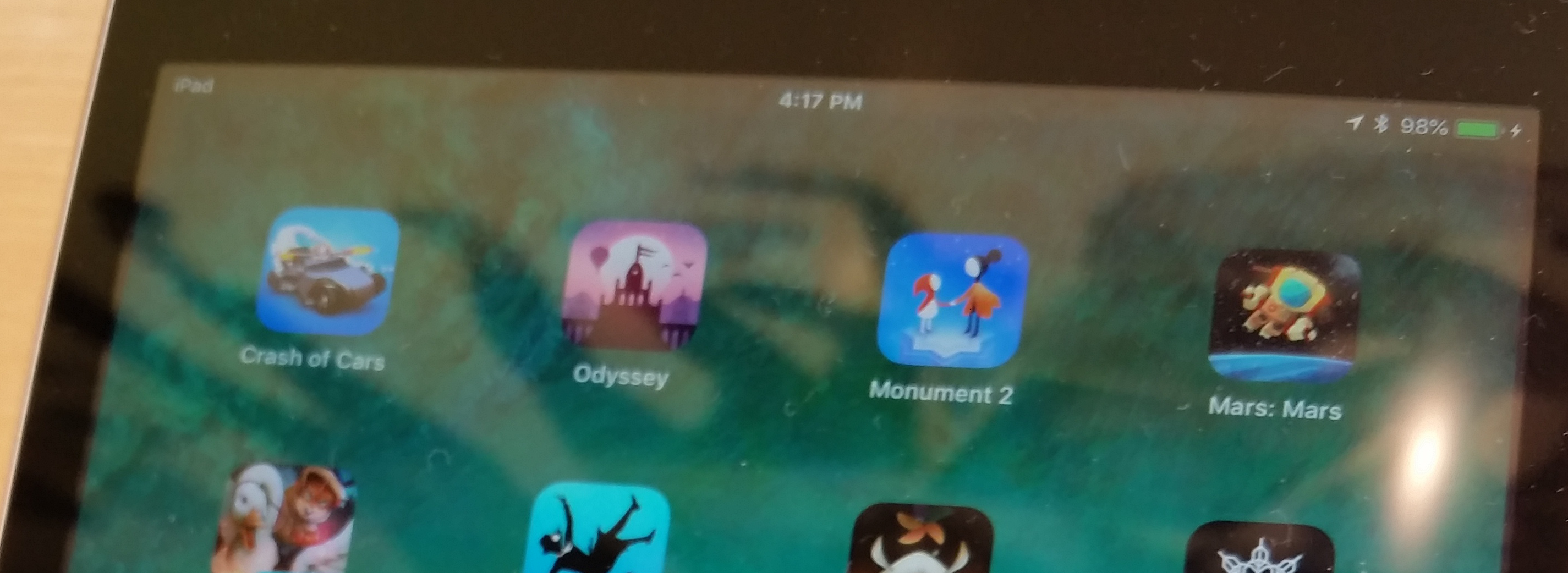
The real reason I bring up Monument Valley 2 is because of something I noticed when I was in an Apple Store the other day, getting a new iPad for my Dad. On their demo devices, the game is labeled simply as “Monument 2,” because the name is too long. Notice also that the game Alto’s Odyssey is just named “Odyssey.” I’ve wondered what Jack and I should do with our lengthy title Where Shadows Slumber… should it be listed as “Slumber,” “Shadows Slumber,” or “Shadows?”
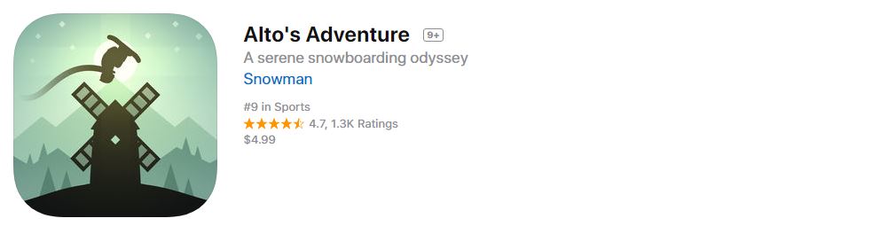
Speaking of Alto’s Odyssey, both games in the Alto series have very beautiful app icons. However, it seems to me that the original is better because it actually communicates the mechanics of the game. Take a look at the icon above, and then look at Alto’s Odyssey below. Remember that these games have identical gameplay: both are side-scrolling snowboarding simulators. Notice anything?
Alto’s Odyssey doesn’t have an image of a dude flipping over a windmill like the first game did! That’s pretty important because the whole game is about jumping over stuff, getting airtime, and doing tricks. But when I see the icon above for Alto’s Odyssey, I imagine a different game where I can actually go into some of those ruins or fly in that hot air balloon. It doesn’t set up expectations the way you might expect. Even so, the image is gorgeous and communicates the art style faithfully.
Of all the games I researched, my favorite app icon is probably the one for Prune. Look at this beautiful picture! Since I played the game, I happen to know that this app icon is actually a perfect rendition of what every Level looks like, too. Now that’s honesty! Prune is a game where you swipe away branches from a tree to help it grow the right way. I think you wanted to avoid the big red suns because they killed your tree. It’s a beautiful game, and the simple nature of this app icon does it justice.
We’ve looked at a lot of great artwork, but I don’t feel like comparing them to a list of “bad examples” in this blog post. I feel uncomfortable putting down other people’s work besides my own. There is no point in searching the App Store for apps that performed poorly and then ripping their icons apart. Instead, let’s just criticize the two icons I made earlier in the project cycle!
Learning From My Mistakes
If you’ve ever played our free iOS Demo before, or if you are one of our beta testers, or even if you’re just a diehard follower of this blog, you’ve seen one of our app icons before. We aren’t going to use either of these for the final game’s release, so I’d like to write about them in this space.
Our first app icon was created just for the Demo. I whipped this up in Adobe Illustrator over a year ago. The idea was to show a silhouette of Obe in a doorway, with the lantern clearly visible. Looking back on it now, this fails for a variety of reasons:
This image is very detailed, so the intricacies are hard to make out at small sizes
This icon requires pre-existing knowledge about what Obe looks like
The lantern looked weirder back then, so it’s not immediately recognizable
This looks like an icon for a horror game, almost like Amnesia for mobile phones
This doesn’t really look like the art in the game at all
This doesn’t really look like an app icon for a mobile puzzle game
This is misleading because Obe’s body never actually casts shadows
I’m not saying I hate it or I regret making it – it seemed cool at the time! Our Demo drew in over 310,000 free installs on Android alone, so we did something right. But I wouldn’t go for this kind of style for the final game. It’s too much of a departure from the real game’s art, tone, and genre.
Our next app icon was made much faster and was basically an unofficial app icon. I just did this for the beta, and I didn’t put much effort into it. This one fails on two levels – first of all, it’s not very unique or inspiring. It’s just text. Anybody could make this, and it tells customers nothing about our game. Second, it includes English text. That means I’d need to make a different app icon for every language we release the game in! Why bother doing that when I can just create a cool image like ustwo did?
So for the game’s final icon I need one square image that contains no text, but communicates the following to the player:
The game’s reflective tone, with some ominous terror looming in the periphery
The game’s crisp light shading model
The importance of the lantern to the story
The idea that this is a puzzle game and not some other genre
The idea that this is a mobile game
A warning that this game is not for preteen children
Yikes! Wish me luck. I’ll take a shot at this during the week, in between animating the game’s remaining cutscenes and putting out other fires. Jack and I have spoken about our app icon informally in the past, so I have a pretty good idea of what we want. This analysis helped me crystallize my plan going forward.
We’ll have some exciting news to announce in the coming weeks, so stay tuned to this blog and thanks for reading!
We hope you enjoyed this update about the game’s graphic design. Have a question about aesthetics that wasn’t mentioned here? You can find out more about our game at WhereShadowsSlumber.com, ask us on Twitter (@GameRevenant), Facebook, itch.io, or Twitch, and feel free to email us directly at contact@GameRevenant.com.
Frank DiCola is the founder of Game Revenant and the artist for Where Shadows Slumber.


.png)