
Welcome to State Of The Art, April 2018 edition! This monthly progress report is written by Frank DiCola and is focused entirely on how the game’s visuals have improved in the past month.
Missed last month’s State of the Art? The March edition is right here.
Also, don’t be fooled by our last blog post. The “Easter edition” of our blog was actually just the Where Shadows Slumber April Fool’s gag for the year. We hope it gave you a few laughs! Don’t worry, we aren’t adding any of that stuff to the game.
Sorry Caroline – no skins!
We all had fun making that, but now it’s back to work. Here’s the State of the Art!
SPOILER WARNING: This post contains screenshots, GIFs and videos of later sections of the game. If you want to experience them in all their majesty for the first time on your mobile device when the game launches, don’t read on!

Mustard River
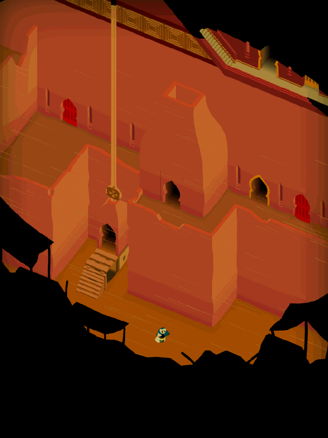
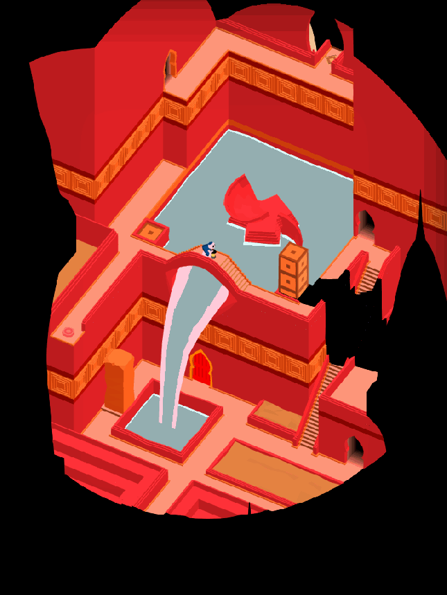
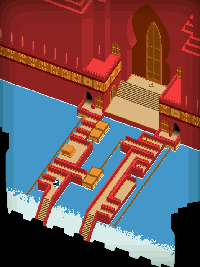
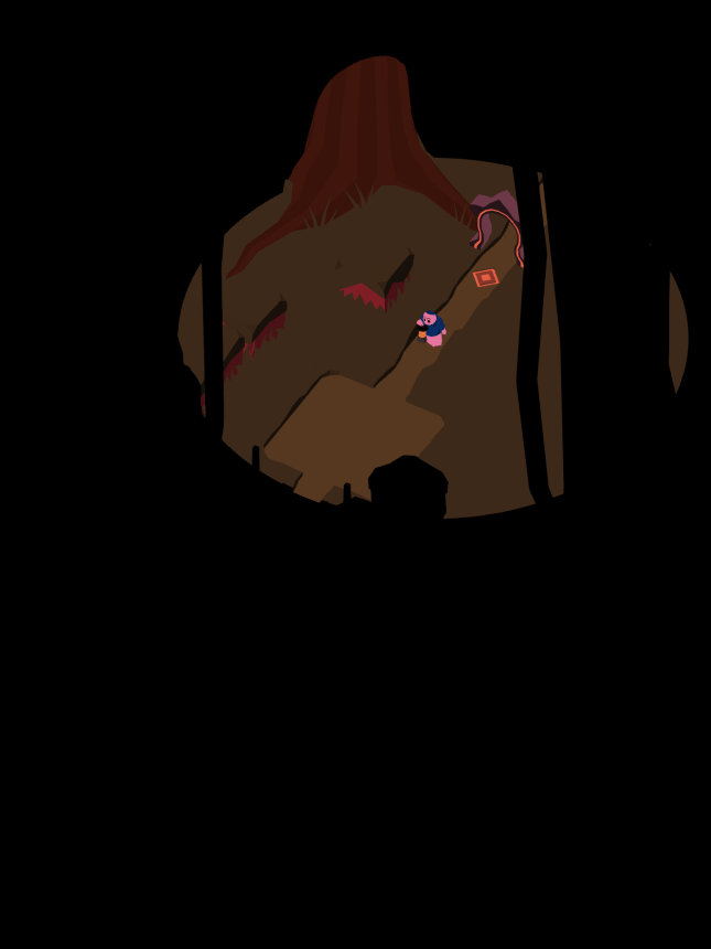
The infamous “mustard river” is now complete! These Levels used to be in real rough shape, but now I love the way our ashen rocks contrast with the yellow of the water. This World is home to Walkers, a mechanic we introduce in the first River Level. I won’t drone on too long, because I think these GIFs speak for themselves. Enjoy!

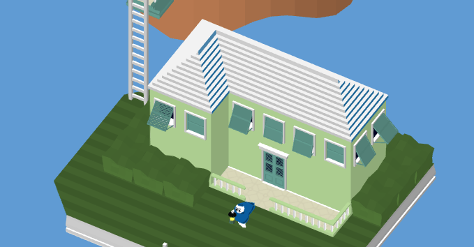
Level 2-1, “Docks”

Level 2-2, “Cage”

Level 2-3, “Guide”

Level 2-4, “Ebb”
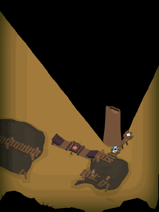
Level 2-5, “Ferry”
There are new Walkers, too! For a long time, the denizens of the River were weird copies of Obe in scraggly shorts. As you may have noticed from the GIFs above, I gave them a bit more unique personal features, such as different hats or clothing. Overall, they probably still look too much like generic video game zombies. Regardless, I hope people will realize as they play the game that these Walkers are to be pitied, not feared.
Check Out Our Snazzy Level Select Menu
I’m really proud of the Level Select menu that Jack and I have been working on together. Rather than just do a few buttons with numbers on them, we really went all out to create a beautiful experience that takes you through the story of the game as you choose what Level you’d like to play. Check them out in action!
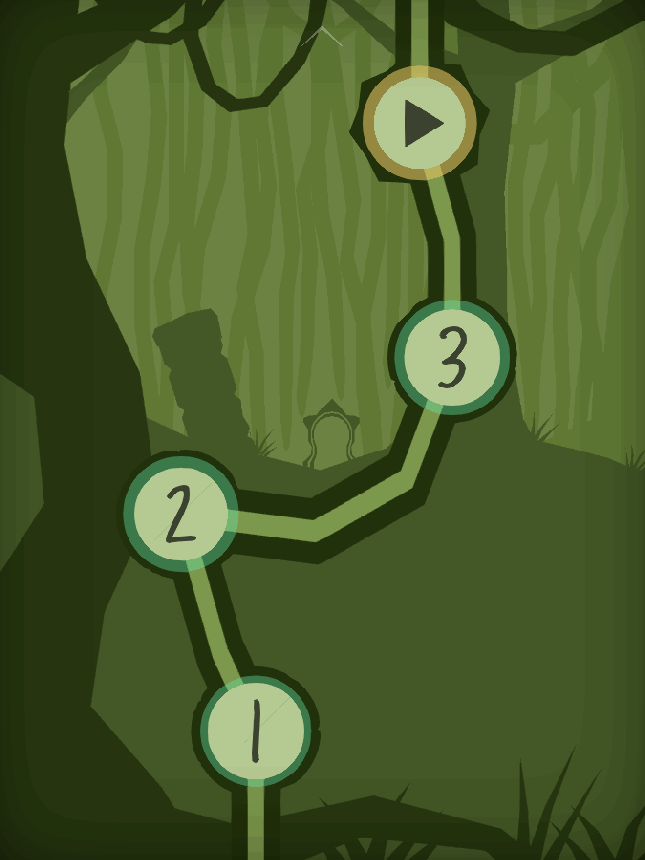
When the full game is done, this menu will be the best place to track your progress. How many Levels have you completed? How many are left? Which ones would you like to return to, to show your friends? During gameplay however, the Player won’t be directed here too often, since Levels flow directly from one into the other.
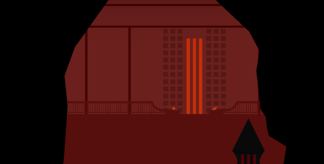
Polish: The Home Stretch
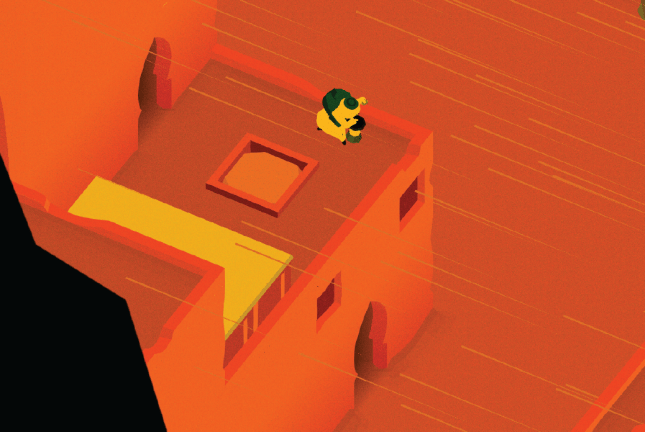
I have begun the process of finishing the game’s final 15 Levels. These puzzles have been finished for a while, and they even have some “first draft” art. However, as I say all the time, my goal for each Level is to make it look like my favorite Level, and make the player say “oh wow, I love the look of this one.” That’s a delicate process that takes a lot of time – many, many hours spent per Level!

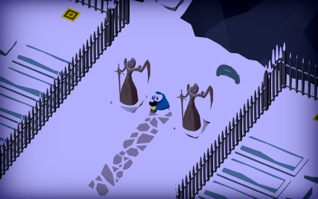
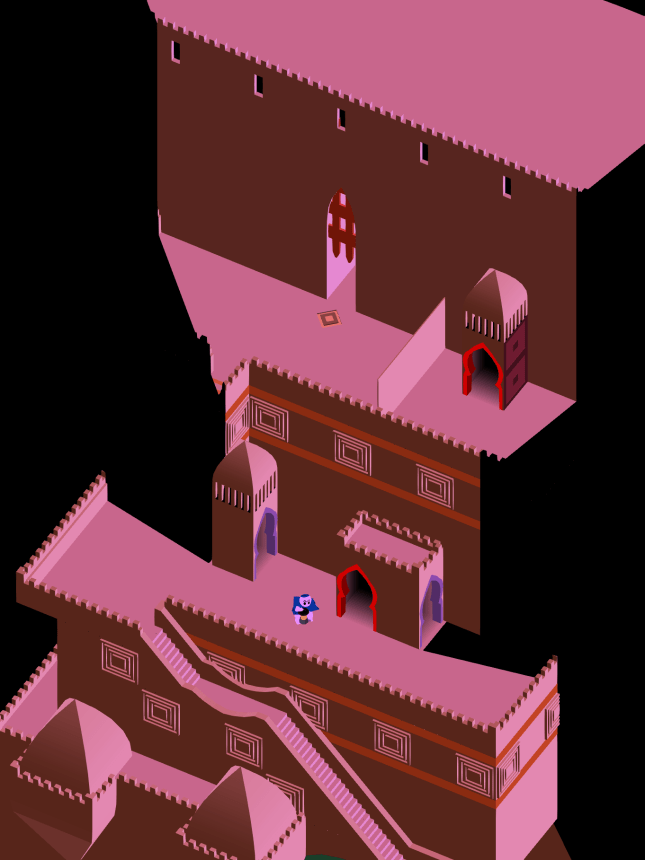
So right now I have just one of the final 15 to show you today, and you can see it above. This is in World 5, The Hills, and it’s called Cemetery. It features tombstones that turn into ghosts when you cover them in shadow. The theme of the World is putting these spirits to rest in their graves.
This Level is nearly complete – there are two tiny touches I’m dying to put in. First, I want to give that Draggable pillar a bit more personality. Right now it’s just a green hyperrectangle (Jack taught me that’s what a 3D rectangle is) but it should feel like it belongs more. Second, I want to add animated blades of grass that bounce and bob along with the rhythm of the falling rain. Personally, I think making convincing rain is more about the effect the raindrops have on the ground rather than seeing actual particles in midair. When it rains in real life, what’s easier to see: the rain in midair as it falls to Earth, or the water collecting in puddles on the ground or forming little rivers? Observe the world around you next time there’s a storm. I’m right!
Anyway, those changes all take a lot of love so I’ll be poring over it more this week before I head off to PAX East!

Last But Not Least – The iPhone X!
I finally bit the bullet and purchased the iPhone X so we can test how the game works on its sleeker, thinner, taller (!) screen. The phone is beautiful and feels great, and you can see a proof of life photo above. Jack will probably have to do some programmer-fu to make the camera zoom out a bit on these phones, but that’s fine. I love playing on the iPhone X because of how smooth it is, so a little camera troubles are no problem at all!
That’s about it for this month’s art update. I wish I could have gotten a bit more done, but we had to attend SXSW earlier this month and I spent a lot of time preparing the art for that build. It was a great show, but travel always takes time away from being in the “flow” of creating artwork. Since I’ll be at PAX East this weekend, you can expect the same lame excuse next time!
We’re nearing the final days of working on Where Shadows Slumber, which is a really weird thing to think about. I suppose we’ll still be doing a lot of post-launch stuff, but I’m not sure what I’ll do all day, every day once the game is done. Anyway, I know what I’ll be doing all day, every day in April… [ o_o] ART!
See you next month for another update!
= = = = = = = = = = = = = = = = = = = = = = = = = = = = = = = = = = = =
We hope you enjoyed this update about the game’s artwork. Have a question about aesthetics that wasn’t mentioned here? You can find out more about our game at WhereShadowsSlumber.com, ask us on Twitter (@GameRevenant), Facebook, itch.io, or Twitch, and feel free to email us directly at contact@GameRevenant.com.
Frank DiCola is the founder of Game Revenant and the artist for Where Shadows Slumber.


")
")

