State Of The Art – July 2017

Welcome to State Of The Art, July 2017 edition! This monthly progress report is written by Frank DiCola and is focused entirely on how the game’s visuals have improved in the past month. Without further ado, let’s explore the major leaps forward we took in July!


MountDoom

Pictured above is our classic scene where Obe throws the ring into Mt. Doom

World 1 (The Jail) Is Ready

It looks like the entire first real World, our volcanic prison that you must escape from, is ready! I say “ready” and not “finished” because nothing in the art world is ever truly finished. But these five Levels are “ready” because I’m ready to move on to something else without worrying about these all the time. They look good. They look pretty done. Will I need to tune them up later? Absolutely. But I’m not going to spend more time getting these Levels from 90% to 100% when there are some Levels at 0%.

Having said that, bask in the molten glory that is World 1!

1-1.png

Level 1-1, “Light” is the first Level of the Jail World.

1-2.png

Level 1-2, “Detour” shows off some of the cell blocks in this prison.

1-3.png

Level 1-3, “Lock” contains a rarely used side-exit door.

1-4.png

Level 1-4, “Pressure” needs a different back wall than the one currently shown.

1-5

Level 1-5, “Ascent” has a lot of annoying overlapping lights and we’ll fix those later.

What do you think of these Levels? Please leave a comment with your feedback, as I have a few concerns of my own and I want to see if casual observers would notice them. Maybe I’m just paranoid!


Obe

Obe’s Clothing Is Ready

Our main character has quite the wardrobe. He’s wearing a lot of complicated clothing! Some of it is made from animated mesh, but other parts are physically based cloth that Unity simulates in real-time.

Getting this right has taken me a long time. But now I’m done messing with it and I’m ready to give it the ultimate stress test – cutscenes, weather (wind and rain!), and lots of animation. I believe his accessories can withstand the stress and remain looking cool.

Obe-Pants.PNG

Dude what happened to your pants?!

Undoubtedly, his clothing is going to get messed up sometimes. We’ll just need to identify those situations and preempt them with special scripts that manage his robes and keep them from going haywire.

Obe-Detail.PNG

Currently, the robe can clip through his white alb and skirt. This should be fixed by launch.

What do you think of his clothing? Is it worth it to have such a detailed robe on such a small character? I promise, for these close up cutscenes, it will look great!


River

What To Expect In August

This month, I’m going to aggressively go after the Levels in the River World. I’ve been so excited to work on that one for a long time! It’s wide open (as opposed to the claustrophobic Forest and Jail) which is a nice change of pace. The color scheme is totally unique, and the assets are really interesting. There’s some creepy story stuff happening there as well.

I also want to get cutscenes rolling, probably the first two (Intro to Forest, Finale to Forest) since they are the first things players will see. I don’t like the idea of waiting until the very end of the development cycle to start cranking out cutscenes. These things are going to be trailer-fodder and they need to look awesome. A rushed cutscene is probably going to end up being a cut cutscene 😛

See you again on September 1st!


= = = = = = = = = = = = = = = = = = = = = = = = = = = = = = = = = = = =

We hope you enjoyed this update about the game’s artwork. Have a question about aesthetics that wasn’t mentioned here? You can find out more about our game at WhereShadowsSlumber.com, ask us on Twitter (@GameRevenant), Facebookitch.io, or Twitch, and feel free to email us directly at contact@GameRevenant.com.

Frank DiCola is the founder of Game Revenant and the artist for Where Shadows Slumber.

Designing Obe, The Mysterious Protagonist of Where Shadows Slumber

For years, Jack and I have been referring to the main character of Where Shadows Slumber by euphemisms such as “the main character”, “the protagonist”, and “little lantern dude”. Now that the game’s story is coming together, we have finally given him a name! In this blog post, we’re going to do a deep dive into how we gradually got to this point in the character design process.


Obe

Meet Obe (oh-bee)

In Where Shadows Slumber, you guide Obe on his journey using magical shadows that emanate from a mysterious lantern. But the lantern is not the only thing that’s full of mystery. Who is Obe? Why has he come to this strange land? And is that a yarmulke?

We can’t give too much of the story away at this time. You’ll have to play the game when it comes out next year to find out the full story. Suffice it to say, Obe is an elderly man at the end of his life on a quest to set things right. (We would have called the game Old Man’s Journey, but someone beat us to the punch.) Obe didn’t ask for his lantern, but he would be lost without it.

The artwork above is the final rendering of how the character will appear in-game. Once I rig his cloth chasuble to work properly, I’ll post some videos of him in action. Before I do that, let’s take a journey through time to see how we got to this point.


thresh_by_predator95-d6zmsh6

You Inspire Me!

From the beginning, Jack and I knew that we would need a character that the Player could guide through the world. Something about our game’s shadow mechanics made us feel that it had to take place in a dark, mysterious landscape. We couldn’t go “full abstract” and make the main character a capsule or something. (Though, that would have made my job as an artist much easier!) We needed to show the shadows interacting with real objects in a real place, which meant the protagonist needed to be an actual humanoid. Moreover, the protagonist either needed to emit light or carry some kind of light source with them. We decided a lantern would look cool, and started exploring characters in popular culture that would inspire our character’s design.

maxresdefault

Jack suggested Thresh from the online game League of Legends. A sinister character, Thresh uses a lantern and a hooked chain to grab his enemies and pull them to their doom. He traps people’s souls in his lantern and tortures them for all eternity.

This was a bit too evil for an indie puzzle game. Thresh looks like a take on the grim reaper, and his lantern isn’t even in the forefront of his design. But still, it was an inspiration! If you ever get creeped out by Obe, that’s because of the Thresh-y part of his design.

tonberry___color

Then I suggested to Jack the design of Tonberry, a strange little green character from the Final Fantasy series. This enemy is apparently quite rare and super dangerous, despite its innocent appearance. Though it has many abilities across multiple Final Fantasy games, the recurring theme is that he slowly advances toward a party member until he is close enough. Then, he stabs them with his knife, delivering an instant kill.

I’m not sure why every character with a lantern in video games is a psycho murderer. That’s a little weird, don’t you think? Surely Where Shadows Slumber will change that perception!

What we enjoyed about Tonberry’s design was the simple, monk-like burlap robes and a nondescript lantern. His disarming appearance was also a huge inspiration for Obe. Now, Obe doesn’t carry a weapon around and he also isn’t a lizard, but his design was heavily influenced by this character.


ConceptArt-Inhabitants_Body

The Drawing Board

With a few key characters in mind, I set about drawing lots of pictures of what the game’s protagonist could look like. I began by deconstructing Thresh and Tonberry and distilling them into “mobile” versions. Remember, our game takes place on a small screen, so the character’s key elements must be clearly visible from far away.

ConceptArt-Protagonist-Sketches

What would chibi-Thresh look like? What elements can be stripped away and still retain the design? What elements are not necessary for a peaceful puzzle game?

ConceptArt-GhostCharacter.png

Simple designs for the character. Bottom Left: an unused design for a horrifying shadow creature that only appears in darkness and eats the souls of its victims.

ConceptArt-Protagonist-Body.jpg

The character’s robe became a central part of the design here, acting like Thresh’s gathering shadows and unearthly aura.

As you can see from the drawings, I tried to straddle the line between “cute and disarming” and “somehow a little sinister”. It was important to us that the Player trust the character in the beginning of the game, and then question their motives a little later on. Also pictured above, you can see the beginnings of some other character designs that would use our humanoid model. From an early stage we knew that if there were other humanoids in this universe, they would look like the main character – just slightly altered.


boat

First Character: Rayman-like

While this was happening, Jack and I were working on the very first iteration of Where Shadows Slumber. It was still just called “Light / Shadow Game” and we needed a character. Based on my drawings – but too scared to actually try using Unity Cloth – I created a simple character in 3DS Max.

Check out the character in action in the video above. He has a little cone shaped lantern, nubby little arms and legs, a fake robe and hood, one rhombus-shaped eye (!), and fingers. While this design is still near and dear to me, it had a lot of flaws.

One Eye Messes With Depth Perception: So apparently when a character only has one eye, it’s super difficult to tell where they are looking or when their head is turning. As humans, we’re much more used to the human face. We subconsciously compare both eyes to each other and make a judgment call about the way the head is turned based on that. A single eye made it difficult to animate the character properly.

Rayman Limbs Mess With Shadows: I love Rayman limbs. By this, I mean “floating hands and feet that aren’t attached to the torso in a visible way”. I think it’s an underused design. However, as much as I love it, it doesn’t work in a game where characters need to cast shadows and have silhouettes that make sense. We had to cut it.


screen_2432x1368_2017-01-24_13-34-45

If At First You Don’t Succeed…

For the next draft of our character model, I took the chibi style to heart and tried to think of a purpose for the character’s robes. It’s not enough to say “he’s wearing robes because he’s traveling and it’s a cloak”. I wanted to give them some kind of a purpose or possible religious significance. Now the character looks more like a cardinal or some kind of priest. This fits with his nondescript age of “old” and allows the Player to begin projecting their beliefs onto the character.

CharacterDesign

This model ended up being really close to the final design, but it just wasn’t there yet. Troubles with rigging the arms, face, and clothing meant that I needed to take one more shot at it. Still, we’re getting there! This character model appears in our Demo. Check out how the character looks in the Demo’s finale cutscene:

What were we saying about all lantern characters being really violent? Oh well… I guess some stereotypes really are true!


Happy.PNG

Welcome Home, Obe

Designing a character for this long almost feels like searching for a missing person. There are a lot of promising leads, but none of them pan out until finally you happen to stumble across what you’re looking for.

I feel that our main character has finally come home. He has a personality and feels like someone I can’t control anymore. It’s a strange feeling, but I take it as a sign that he will bring joy and intrigue to players around the world that want to unravel his mysterious story.


= = = = = = = = = = = = = = = = = = = = = = = = = = = = = = = = = = = =

We hope you enjoyed this update about the game’s character artwork. Have a question about Obe that wasn’t mentioned here? You can find out more about our game at WhereShadowsSlumber.com, ask us on Twitter (@GameRevenant), Facebookitch.io, or Twitch, and feel free to email us directly at contact@GameRevenant.com.

Frank DiCola is the founder of Game Revenant and the artist for Where Shadows Slumber.

State Of The Art – June 2017

Welcome to State Of The Art, June 2017 edition! This monthly progress report is written by Frank DiCola and is focused entirely on how the game’s visuals have improved in the past month. Without further ado, let’s explore the major leaps forward we took in June!


The Forest Is Starting To Look Finished

Where Shadows Slumber begins with a few short tutorial levels that teach the Player how to play and start the story off with a mysterious event. This takes place in the Forest, or “World 0”, as we’ve been calling it. I’ve recently begun calling it the game’s prelude, which sounds more profound and less technical.

Take a look at this video of the second Level of the game, “Bridge”, in action:

As you can see, the Level is entirely functional and artwork has been attached to every facet of the Level. The things that are missing are either out of my hands (audio, footfall particles when the protagonist walks) or things Jack and I want to leave for the end of the development process (polish on the Draggable “grab” effect).

The toolkit of 3D models I use to build Forest Levels is really coming together. Level 2 served as a good model for how I’m going to decorate Levels 1 and 3. Those have not been started yet, but you can expect them next month!


World Select and Level Select Menus

Where Shadows Slumber is a journey that takes you across a desolate world with a variety of biomes. You begin in a Forest, but you’re soon kidnapped and put into a volcanic Jail. You escape, but only by traveling down a haunted, marshy River… and that’s just the game’s first act!

We found it necessary to group these biomes into Worlds. Furthermore, each puzzle in the game is its own Level. So we needed a screen that allowed Players to view each World and then select the Level they want to play. I wanted to make each World screen inviting, yet spooky. I also wanted to use as much of the existing art in the game as possible.

Below is a video of the World Select Menu in action, including transitions:

Notice how the transitions from World-to-World mirror the shadow mechanic of our game. Including that was extremely important to us!

Please know that this menu is not finished yet. The decorations for this menu are entirely downstream of the actual art in the Levels. That’s why I’ve only finished a few of them so far. Believe it or not, while these screens may seem flat, they’re actually produced with 3D models and camera trickery!

Blog-BTS

It’s a cool effect… but that means I need to finish all of the Levels in a World before I can go on to the menu. Dependencies in game development are annoying, but it’s more annoying to ignore them and then come back to find a lot of your work was erased or made worthless because too many underlying elements changed.


We Built This City

The toolkit for the City (World 4) is one of my favorites in the game. The inspiration for this slum town environment was a combination of the poorest regions of India mixed with the pueblo towns of South America. The result is a city that looks hewn out of a mountainside and packed to the gills – once I add the people, that is! During your travels, you’ll go from the poorest area of the City all the way to the King’s palace. Who knows what you’ll find there?

Here’s a screenshot of Level 4-1, where we introduce the concept of Doors that teleport the main character. Check it out:


Over time, this toolkit will grow to include fancier parts of town, including a really cool Level we have planned where you ascend one of the city’s towers. Stay tuned!


Wolf Attack

Last time we saw the Wolf he had just been modeled. This month, I gave his face a fresh coat of paint and worked on his animations. Now he can express a wide range of emotions, from “angry” to “really mad” and even “about to kill someone”! Check it out:

Blog-Wolf.PNG


Works In Progress

Worlds 3 (Aqueduct) and 5 (Hills) have progressed slowly over the past month. Whenever we’re not sure of how a World’s puzzles will look, it’s harder to focus on the art for that World. I like to pick out a really solid puzzle and work to get it to a professional place, but the level design for these two Worlds is still very much a work in progress.

Blog-Aqueduct.PNG

Having said that, I have at least started both of these Worlds using dummy scenes. This design is subject to change, however. I’m still deciding on the key colors for the Aqueduct. Blue feels a bit too obvious. The Aqueduct should be dark and cavernous, but I also want it to be a departure from the two Worlds (Jail and River) the Player just experienced, which are kind of depressing and muddy.

Blog-Hills

As for the Hills, it’s very difficult to create a scene from nature using entirely modular pieces. Sometimes you just need to make something that specifically works for a certain puzzle – especially background mountains. The Hills have a lot of moss-covered rocks and grassy cliff faces. I’m having trouble making puzzle-piece 3D models that can be assembled to look like they fit together to form the rolling hills of Ireland. Expect progress on this World to be quite slow.


Thanks For Reading!

That’s all for now. In the future I’d like to make this update strictly contain videos of the game in action. Screenshots are great, but this is a game, and I want to push myself to film more sections of it and analyze it from every angle (animation, color, sound, feedback). Look out for that in July’s update!


= = = = = = = = = = = = = = = = = = = = = = = = = = = = = = = = = = = =

We hope you enjoyed this update about the game’s artwork. Have a question about aesthetics that wasn’t mentioned here? You can find out more about our game at WhereShadowsSlumber.com, ask us on Twitter (@GameRevenant), Facebookitch.io, or Twitch, and feel free to email us directly at contact@GameRevenant.com.

Frank DiCola is the founder of Game Revenant and the artist for Where Shadows Slumber.

What We Learned From Testing At AwesomeCon 2017

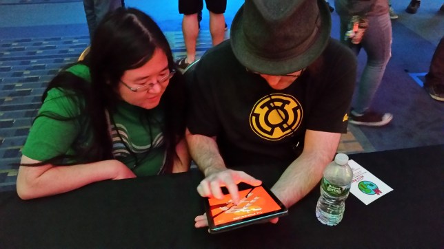
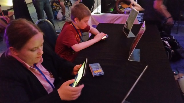
Hey everybody, it’s Frank! I just got back from a trip to Washington D.C. for AwesomeCon 2017, a comic convention that’s expanding its selection of gaming exhibits. We were invited by the wonderful team that hosts the MAGFest Indie Videogame Showcase to take part in their giant indie booth – thanks to Lexi Urell and her team for allowing us to take part in such an awesome con!


20170617_211819

Why Did Frank Go To AwesomeCon?

That’s kind of a weird question, right? Is there ever a reason not to go to a convention? Besides, we were invited! Do you even need to ask?

Now that the Game Revenant official coffers are looking a little emptier, it’s important to evaluate every large expense. Travel is certainly one of them. While I’d love to go to every show on planet Earth that’s even remotely related to gaming, we don’t have that kind of cash to spend. Besides that, there’s the time cost involved. If I’m standing at a table showing off Where Shadows Slumber for 3 days straight, that’s 3 days I’m not spending doing animations or environment art for the game. Was it worth it?

We decided that the best way to get a return-on-investment for our time and money was to focus on one very specific thing during AwesomeCon 2017 – testing. Conventions are a great way to show your game to a lot of people. It may seem like this is purely a marketing activity where indies promote their game, but that’s a shallow view of what conventions can do for you. When you’re given the opportunity to sit down with nearly 100 people and focus on your game, that’s a great time to ask them critical questions about your work and get their honest feedback.

So before I left, Jack created a build of our Where Shadows Slumber alpha that had all 17 of our test Levels in it, along with a basic menu for easy navigation. I resolved to show this early alpha to as many people as possible, with a specific focus on these key issues:

  1. If I don’t tell Players how to play the game, what will they do?
  2. What do Players think of the first three Levels, which are meant as a tutorial?
  3. How far will Players go before they get stuck or bored?


20170616_182723

My Testing Procedure This Time Around

As you test your game at a convention, you begin to find a consistent testing method that works. Halfway through the first day (Friday), I had a pitch ready to go once people sat down at the Where Shadows Slumber table.

I was really straightforward with people. I told them that I wasn’t going to teach them how to play because I wanted to see how they performed on their own. (No one seemed to mind!) Then I told them that they could ask me questions if they got really stuck. I told them that the game’s artwork was a placeholder. The only information they were allowed to know was that it was a puzzle game called Where Shadows Slumber. With that, I just watched them play through Level 0-1 and noted their progress. This pitch accomplished a few key things.

This Is Only A Test: Setting up expectations right away is key. By telling people that the game is being tested (and not them) it put them in the proper mindset. They weren’t here to be entertained – they were here to break the game if possible, and try to beat it. I think that increased people’s enjoyment actually, and definitely led to finding some serious bugs.

Ask Me Questions: Getting people to talk while they play is really hard, but it’s very important. You can only glean so much from watching people. I didn’t give anyone that much information, but allowing them to ask questions is helpful. After all, if they ask a question, it means they don’t understand something. That “something” is what Jack and I have to go back and add to our tutorial.

Don’t Tell Me The Art Sucks: It’s important that you tell people what you don’t want to hear. Setting up this expectation decreased the amount of people who would complain about the art. Seeing this alpha next to screenshots of our beautiful demo was probably  a bit jarring, but once I explained it to testers it wasn’t an issue anymore. When you’re testing, you don’t have much time with each person so you need to make it count. Make sure that people know what you already know, so they focus on different issues.


20170616_173920

The Results

To my surprise, people loved the alpha! I only say I am surprised because this is the first time I’ve seen people play it with my own eyes. And although the artwork is all just placeholders and the Levels are brand new, people gave it glowing reviews:

Thor

Having said that, not everything is sunshine and rainbows. We found a few bugs over the weekend, and there are some Levels that may need to be redesigned or cut from the game entirely. Here are all my notes from AwesomeCon 2017:


  • People don’t realize they can’t drag something if the Player is in the way. Draggable objects should smack into the protagonist to give them feedback on this matter.
  • Someone suggested a mechanic where torches (lights) are only on for a fixed amount of time before they shut off.
  • Someone requested a Reset button (which our demo has, but the alpha does not – even though you can just re-select the current Level from the menu).
  • MAJOR ISSUE: People didn’t realize they could drag red objects. Many suggested that they “shimmer” when they are dormant to encourage dragging. Perhaps there should be a handle on the Draggable object to indicate that it is interactive, and show the direction it moves. They should glow when they are being dragged as well.
  • Someone suggested a UI indicator that shows how a Draggable moves, since some objects rotate but others slide across the floor.
  • When the Player is following closely behind a Walker, he stutters and stops, producing an awkward floating animation.
  • The protagonist’s light should grow out from him and stop at the predetermined radius needed to solve this Level.
  • MAJOR ISSUE: Every single Player (with few exceptions) dragged-to-move if I didn’t tell them the controls. Our game is tap-to-move, so dragging is not an optimal way to play. People assume the controls are bad, but they’re just doing it wrong. Without a way to correct them, they make it harder on themselves.
  • Someone suggested charting a path (like in StarCraft) when you drag-to-move, a possible solution to those who find that way more comfortable. This would basically be like connecting the dots between every space you dragged over.
  • IDEA FOR A LEVEL: Level 1-3’s “Lock”, but the Light Switches are connected to some of the Rotating Draggable blocks.
  • MAJOR ISSUE: People tried to drag the purple blocks, but couldn’t. This stopped them from trying things in the future.
  • Glyphs are really just buttons that can be pressed infinite times, right?
  • Draggable Light Switches need to be turned off when they’re off. They still appear on, which is impairing people’s understanding of the light mechanic.
  • The age when players seem able to understand the game is 12 – younger children could trudge through it by trial and error, but with limited understanding.
  • MAJOR ISSUE: “Why is there a shadow?” People do not realize the main character has a lantern with a massive radius and it’s the only light in the scene. This is understandable because our game is super weird. We need to find a way to show this constantly, or they’ll think the shadows have a mind of their own.
  • Someone suggested a mechanic where the main character’s lantern is a spotlight, instead of a point light, for a few Levels.
  • Someone suggested a mechanic where the main character can lower their lantern’s light radius and then reset it, for a few Levels.
  • A businesswoman with knowledge of the Indian market suggested that we lower the price from $5 for that particular market. She felt strongly that Indian mobile gamers wanted free games or something much cheaper.

Here are my notes that are specific to each Level in the alpha.
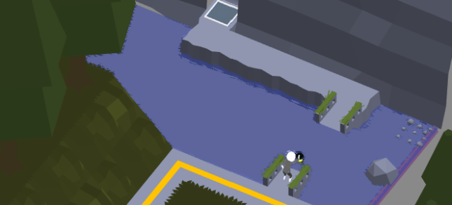
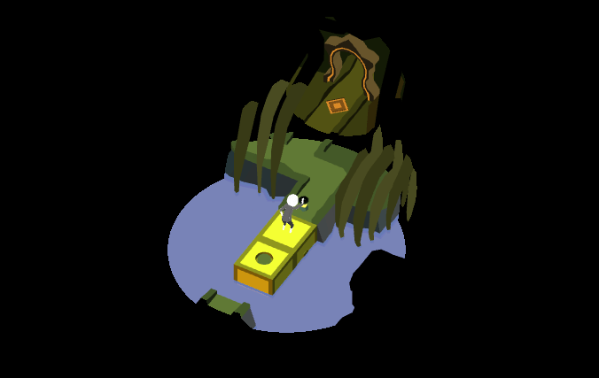
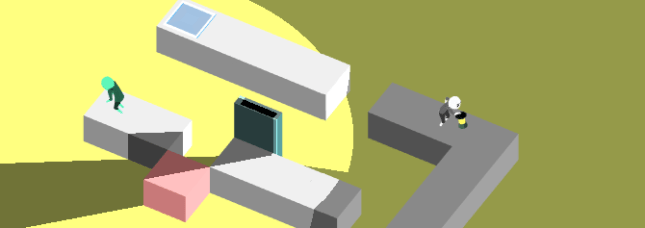
 

0-1.PNG

Level 0-1, Fallen

There’s a bug in this level where there bridge (which should fall after you press a trigger) stays exactly where it is. Players who drag-to-move skip right over the trigger, and they never trigger the bridge sequence, so basically they miss the puzzle.

The Draggable box on this level doesn’t have much weight to it. People fling it around like crazy. They also really want to drag it down (onto the dirt path), up (onto the dirt path), or onto the bridge to drop it into the water as a makeshift bridge. None of that is possible but there’s no feedback for that and they don’t know how shadows work yet so it doesn’t register.

Half of the people who play this Level don’t quite understand that the shadow makes the bridge appear.

It’s possible to walk past the Goal Space, and go to a spot on the Level that is beyond the door.

This level is not idiot-proof, like the first Level in our demo.

I think this is our weakest Level. I suggest cutting it and replacing it with a walking tutorial similar to the first Level in the demo. This Level is just throwing way too much at Players all at once.


0-2

Level 0-2, Bridge

An excellent Level. This serves as a perfect introduction to 3 key mechanics: walking, shadow revelation, and dragging.

The Rotatable bridges here should probably wobble after a while to indicate they can be dragged. I can also make a circular pivot point in the center, cut into the stone. That would be a good indication that these are on a swivel.

Draggables can also have parts on them that suck in when Players hold them down. Having parts of the stone depress inward is a good sign that you’re controlling the object with your finger.
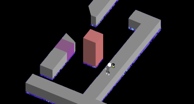
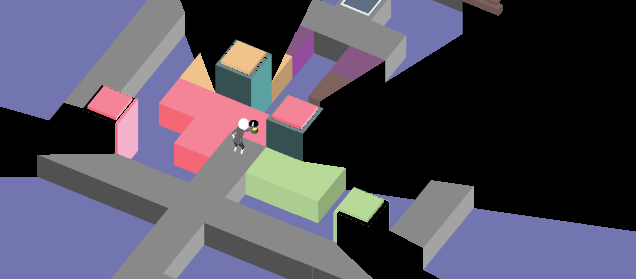
 

0-3.PNG

Level 0-3, Monolith

This Level is perfect teaching. It’s a great gateway – you will never beat this if you do not understand how shadows work in our game.

“The purple box moved!” We need to make sure people don’t think the shadows merely move things. They make things appear and disappear… the visual style of the purple box makes it seem like it’s jumping around.

Why can’t Players make the farthest purple block appear if they are standing all the way at the entrance of the Level?

The Draggable Block here should be on some kind of a flagpole so that the vertical movement appears to be a natural fit to Players. (Many tried to move it horizontally.)


1-1

Level 1-1, Recovery

The name of this Level ought to be “Protection” or even just “Light”.

Why is the Light Switch casting a shadow? Does that shadow do anything? That may be a visual error.


1-2.PNG

Level 1-2, Detour

This Level can be broken to make both Goal Spaces appear at the same time. Players usually move the Draggable Block back and forth so rapidly that it causes both to be visible. However, the fake Goal Space does not work. If we can’t fix this bug… we should make it work! Why not reward Players for their trickery?

If there was a Light Switch near the space where the Goal Space is revealed, this Level would be a bit harder. You’d have to make sure the Light Switch was off. That may make it more interesting for the Players who figure it out in two seconds – and it keeps the World’s atmosphere consistent, since we use a lot of lights here.

The shadow needs to change more of the Level when it swipes across the screen, to give Players a clue that something weird is going on.

There ought to be two Shadow Eyes on the Draggable Block.
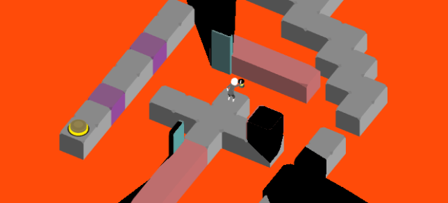
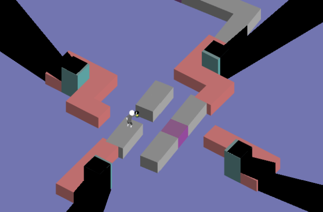
 

1-3.PNG

Level 1-3, Lock

Let’s make the sides of the Rotating Blocks sloped here, or at least spiked. People consistently try to walk on the sides of them when they are down, but that would break the Lights. It must appear unwalkable.


1-4.PNG

Level 1-4, Pressure

Extremely hard Level. That’s a good thing to have at this point in the game.

“I didn’t know I could stand on the box and rotate it.” Are we being consistent with when Players can do this and when they cannot?

How will Shadow Eyes work here? How can we align them with the object they are changing?

Someone found a bug where both buttons were pressed and they beat the Level, but they could not walk on the green path. (This is a soft crash I guess, since the Level is broken but the game still works fine.)


1-5.PNG

Level 1-5, Wolf

This Level should be renamed to something that indicates how to solve the puzzle, like “Doors” or “Black” or “Pitch”.

People don’t know they can drag these pillars.

The effect of pressing a Button here was not always obvious. I need to make an animation and we ought to have a clear sound attached to it.

On the iPhone, there was a bug where the sliding pillars could not be dragged. We had to reset the Level. I suspect Glyphs have something to do with this.


2-1.PNG

Level 2-1, Docks

Literally every tester thought the Walkers would hurt them and everyone called them “zombies”. My use of the color green was foolish!

We should start this Level with a Walker coming toward you that you can’t avoid, so people see that they aren’t bad.

People LOVE the reveal with the pillar sweeping across the Level. We should do more.

People tried to reverse the reveal and they couldn’t do that, which upset them. I think they wanted to see it more than once. When we get it set up properly, let’s consider this. It’s about consistency and Players enjoying the game for its toys rather than its puzzles.


2-2.PNG

Level 2-2, Test

We can call this Level “Elevator” or something. Maybe “Switch”, because you press a switch, but you also need to change places with the Walker.

Walkers flip around when you rotate Draggable Bridges, and this really annoys Players who are trying to guide his path. Also sometimes the Walkers float, breaking immersion.


2-3.PNG

Level 2-3, Guide

Pressed Buttons really ought to look pressed. I need to redo the art and then I’ll need help setting the states properly. We can also drain them of color once pressed.

For some reason I think buttons should be octagons. Why did I write this?


2-4.PNG

Level 2-4, Ebb

These Walkers cast a light, but they don’t have an obvious light source. I can make them holding torches, but what happened to their little light bulbs? Did I delete them?


3-2

Level 3-2, Tradeoff

The main light in this Level looks like it’s off because it’s so dark. The Player’s lantern doesn’t always need to be the brightest light in the scene! This sliding light is way more important to the mechanics of the Level. We can dim the Player’s light in favor of the other one.


3-3

Level 3-3, Anchor

Rectangles can pass through each other.

The right side Button node was briefly unwalkable, due to a multiple reality error.

After leaving a node, the state of a Button was still pressed. This made the Level unbeatable.


3-4.PNG

Level 3-4, Torus

“Is that it?” Torus looks more intimidating than it is. Can we bring up the difficulty on this one somehow? I think people are disappointed that you don’t need to find a way to navigate back and forth using the rotating segments. It is solved quite easily.


3-5.PNG

Level 3-5, Island

This Level can be broken by drag-dashing back and forth until the pillars remain upright. Then, walk into the island, the pillars lower, and you beat the puzzle without really solving anything.


It’s incredible how much insight you can get from just a few days of testing! These kind of testing moments are hard to come by, so it’s important to make the most of them. I hope you appreciated seeing how your feedback will impact the game, and this gave you an insight into what indie developers are looking for from testers.

We’ve got a lot of work cut out for us this month, so expect to see these changes reflected in my post at the end of June where I update you on the state of the game’s artwork.


= = = = = = = = = = = = = = = = = = = = = = = = = = = = = = = = = = = =

We hope you enjoyed this insight into our testing methods. Do you have any feedback for us about the game’s alpha? You can reach out to us at WhereShadowsSlumber.com, tweet at us on Twitter (@GameRevenant), message us on Facebook, leave a comment on itch.io, jump into chat on Twitch, and email us directly at contact@GameRevenant.com.

Frank DiCola is the founder of Game Revenant and the artist for Where Shadows Slumber.