State Of The Art – June 2017

Welcome to State Of The Art, June 2017 edition! This monthly progress report is written by Frank DiCola and is focused entirely on how the game’s visuals have improved in the past month. Without further ado, let’s explore the major leaps forward we took in June!


The Forest Is Starting To Look Finished

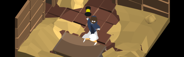
Where Shadows Slumber begins with a few short tutorial levels that teach the Player how to play and start the story off with a mysterious event. This takes place in the Forest, or “World 0”, as we’ve been calling it. I’ve recently begun calling it the game’s prelude, which sounds more profound and less technical.

Take a look at this video of the second Level of the game, “Bridge”, in action:

As you can see, the Level is entirely functional and artwork has been attached to every facet of the Level. The things that are missing are either out of my hands (audio, footfall particles when the protagonist walks) or things Jack and I want to leave for the end of the development process (polish on the Draggable “grab” effect).

The toolkit of 3D models I use to build Forest Levels is really coming together. Level 2 served as a good model for how I’m going to decorate Levels 1 and 3. Those have not been started yet, but you can expect them next month!


World Select and Level Select Menus

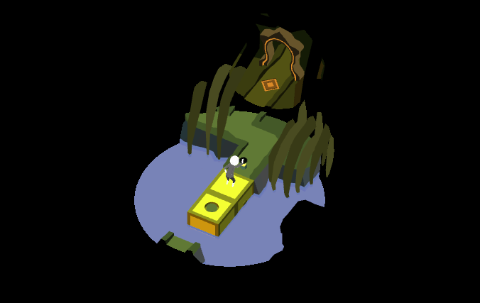
Where Shadows Slumber is a journey that takes you across a desolate world with a variety of biomes. You begin in a Forest, but you’re soon kidnapped and put into a volcanic Jail. You escape, but only by traveling down a haunted, marshy River… and that’s just the game’s first act!

We found it necessary to group these biomes into Worlds. Furthermore, each puzzle in the game is its own Level. So we needed a screen that allowed Players to view each World and then select the Level they want to play. I wanted to make each World screen inviting, yet spooky. I also wanted to use as much of the existing art in the game as possible.

Below is a video of the World Select Menu in action, including transitions:

Notice how the transitions from World-to-World mirror the shadow mechanic of our game. Including that was extremely important to us!

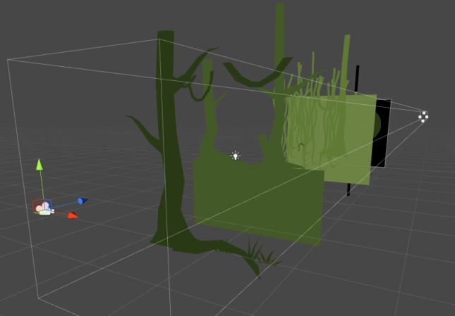
Please know that this menu is not finished yet. The decorations for this menu are entirely downstream of the actual art in the Levels. That’s why I’ve only finished a few of them so far. Believe it or not, while these screens may seem flat, they’re actually produced with 3D models and camera trickery!

Blog-BTS

It’s a cool effect… but that means I need to finish all of the Levels in a World before I can go on to the menu. Dependencies in game development are annoying, but it’s more annoying to ignore them and then come back to find a lot of your work was erased or made worthless because too many underlying elements changed.
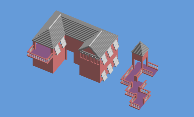
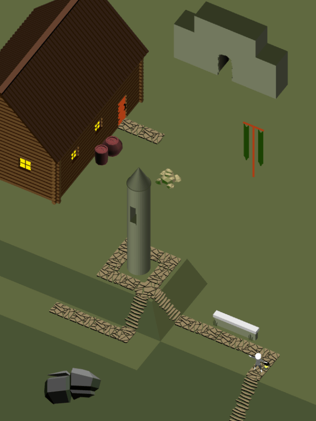
 

We Built This City

The toolkit for the City (World 4) is one of my favorites in the game. The inspiration for this slum town environment was a combination of the poorest regions of India mixed with the pueblo towns of South America. The result is a city that looks hewn out of a mountainside and packed to the gills – once I add the people, that is! During your travels, you’ll go from the poorest area of the City all the way to the King’s palace. Who knows what you’ll find there?

Here’s a screenshot of Level 4-1, where we introduce the concept of Doors that teleport the main character. Check it out:


Over time, this toolkit will grow to include fancier parts of town, including a really cool Level we have planned where you ascend one of the city’s towers. Stay tuned!
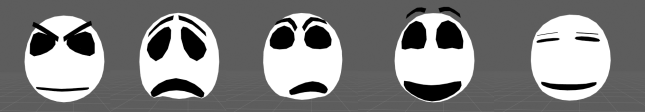
 

Wolf Attack

Last time we saw the Wolf he had just been modeled. This month, I gave his face a fresh coat of paint and worked on his animations. Now he can express a wide range of emotions, from “angry” to “really mad” and even “about to kill someone”! Check it out:

Blog-Wolf.PNG


Works In Progress

Worlds 3 (Aqueduct) and 5 (Hills) have progressed slowly over the past month. Whenever we’re not sure of how a World’s puzzles will look, it’s harder to focus on the art for that World. I like to pick out a really solid puzzle and work to get it to a professional place, but the level design for these two Worlds is still very much a work in progress.

Blog-Aqueduct.PNG

Having said that, I have at least started both of these Worlds using dummy scenes. This design is subject to change, however. I’m still deciding on the key colors for the Aqueduct. Blue feels a bit too obvious. The Aqueduct should be dark and cavernous, but I also want it to be a departure from the two Worlds (Jail and River) the Player just experienced, which are kind of depressing and muddy.

Blog-Hills

As for the Hills, it’s very difficult to create a scene from nature using entirely modular pieces. Sometimes you just need to make something that specifically works for a certain puzzle – especially background mountains. The Hills have a lot of moss-covered rocks and grassy cliff faces. I’m having trouble making puzzle-piece 3D models that can be assembled to look like they fit together to form the rolling hills of Ireland. Expect progress on this World to be quite slow.


Thanks For Reading!

That’s all for now. In the future I’d like to make this update strictly contain videos of the game in action. Screenshots are great, but this is a game, and I want to push myself to film more sections of it and analyze it from every angle (animation, color, sound, feedback). Look out for that in July’s update!


= = = = = = = = = = = = = = = = = = = = = = = = = = = = = = = = = = = =

We hope you enjoyed this update about the game’s artwork. Have a question about aesthetics that wasn’t mentioned here? You can find out more about our game at WhereShadowsSlumber.com, ask us on Twitter (@GameRevenant), Facebookitch.io, or Twitch, and feel free to email us directly at contact@GameRevenant.com.

Frank DiCola is the founder of Game Revenant and the artist for Where Shadows Slumber.

3 Ways Our Art Changed In May 2017

Last week, Jack wrote a general progress update about the game. We hadn’t done one in a while, and we’re trying to get our audience more informed about the process of game development. Inspired by his post, I’ve decided to dedicate the last post of every month to an update about the visual aesthetics in our game. We’ll review everything that got done in the previous month, with a small glimpse of the road ahead and how it relates to the larger goal of completing the game.


Getting The Ball Rolling On Five Worlds

Our game will feature 8 different Worlds by the time we’re done. Completing the artwork for all of those will take a while, so it’s never too early to get started. I had hoped to get more done this month, but I am glad to report that five of these Worlds have been started. They may never really be “finished” because I’m a perfectionist. Even when the game launches, I’ll still want to change things. But I might as well get them to a place where Jack can say “Frank, stop working! Step away from the computer!”. I’ve included some Work In Progress shots of each World below.

World-0-Forest

World 0 – Forest. This kit needs a lot of work. The bushes are too high-fidelity, and the trees are too low-fidelity. This is a screenshot of the game’s first Level.

World-1-Jail

World 1 – Jail. This kit exceeded my expectations. I wanted to convey the feeling of a claustrophobic, harsh volcanic prison. The brutalist-inspired walls really pull the aesthetic together.

World-2-River

World 2 – River. Inspired by the river styx, this is designed as a swampy, foreboding, gross river. Rickety wooden plank bridges contrast with log-cabin style barricades.

World-6-Summit

World 6 – Summit. One of the toughest to apply modular asset creation to so far. Blurring the grid lines was key to pulling this wintry, icy art kit together.

World-7-Paradise

World 7 – Paradise. This kit is complete, and looks gorgeous. I won’t actively work on it anymore unless something is missing in a Level we’re designing.

Please note that the screenshots included here don’t always reflect actual Levels in the game. Sometimes, to show off how pieces of artwork interact, I design fake Levels in the spirit of the game. Hopefully it gives you a good idea of my progress, and what needs to be done. I also decided to pawn off water effects onto Jack, so that’s why the fluids in these Levels just look like flat planes. (I built them with flat planes) Water will come later. Also coming later – the Worlds I haven’t started yet!

Expect to see screenshots of Worlds 3, 4, and 5 during next month’s update.


TwoHeads

Character Faces

One of the barriers I’ve been trying to break through is my Character Design issue. Every humanoid model I’ve created for Where Shadows Slumber so far has been hastily created for an upcoming deadline. The result is a slipshod model that looks nice from 1,000 feet away, but performs poorly when I need it to do something. In a previous blog post about cutscenes, I lamented at how terribly the Demo protagonist handled when I needed to animate him. His clothing had to be key-framed by hand, and his arms were bent out of whack.

But one of the biggest problems was his face. I modeled it the quick and easy way, and as the saying goes, you get what you pay for. I found it impossible to give him good facial expressions when the situation called for it.

HeadAnimations

The protagonist’s new head uses Morphs to smoothly transition between preset facial poses.

Flash forward to this month: I’m taking a new approach where I model character heads separately from their bodies so I can focus on facial animations using Morphs in 3DS Max. As long as no one notices that these heads are disconnected from their torsos, the effect works. Morphs allow me to model facial animations (frowns, smiles, surprise, anger) and move a slider from 0 – 100 to set the Intensity of the animation. How sad are you? Are you 35 sad, or 100 sad?

So far I modeled the main character’s head, along with a mysterious Wolf that no one knows about. The main character’s facial animations are done. In the future I’ll model two other mysterious figures that need facial animations… but I won’t give them away now!

Expect to see more character head animations during next month’s update. I’ll also do a more in-depth blog post about Facial Animation Using Morphs.


EveryUI.png

Main Menu User Interface

This piece of artwork is still in the planning stages. Unfortunately, I ran out of time this week and had to resort to paper-planning. I would have preferred to mock this up in Photoshop, but my computer died on me before I got around to it (more on that below).

HammerUI.png

Left: The main menu splash screen you see when loading up the game on your device. Right: The Settings and Junk page you see when you press the hammer button on the splash screen.

The plan for the UI is to make it as minimalist as possible, and refrain from using unnecessary text. To that end, I’m currently envisioning a bare bones splash page that just has the protagonist relaxing by a campfire and two buttons on it – a hammer and an arrow. The hammer is meant to indicate “Settings and Junk”. When pressed, it takes you to a side page where you can toggle various togglers™, such as the game language, in-game sound, and auto-skipping cutscenes. Team credits will be displayed there as well. An “X” at the bottom represents “go back” and I’ll try to keep that consistent throughout the whole game.

20170530_143221.jpg

Left: A screen of World 0. Center: A screen of World 1. Right: Half of a screen of World 2, which is locked and cannot be accessed.

The World menu is more involved. Pressing the arrow moves the camera to the right, where we see a 2D view of the first World, Forest. From there, players can swipe left and right to see the other Worlds. Worlds that they aren’t ready to play yet will be locked behind a padlock icon. (No need to reinvent the wheel there) When you’re looking at a World, I want the sounds of that World to play quietly in the background.

20170530_143238.jpg

Tiny overworld map of World 0, which begins with a cutscene “Level” and then has three real Levels. Some are blocked by the shadow.

Pressing the big juicy button with a number on it will take you to the Level Select menu for that World. This will look like a top-down map, with little circles representing the levels each connected by solid black pathways. As you beat more Levels, this map floods with more light. Pressing on a circle will take you to that Level.

That’s the flow I have in mind for the game’s menu. This doesn’t even cover menus that appear INSIDE the game’s Levels, such as when you press the pause button. But in any event, I believe I’ve covered everything the outer menu needs. I just hope this isn’t too much fiddling for a casual audience that isn’t used to games. Getting casual players over these hurdles is always a struggle!

Expect to see a digital version of this UI during next month’s update.


DAxOPKeVoAAK6FY

And now his watch is ended.

Tempus Fugit: Memento Mori

Normally in these blog posts, I showcase my cheery optimistic attitude. But not this time.

Late last week, my laptop suffered a blue screen crash and would not reboot to Windows when I tried turning it back on. I’ve been having rolling blue screen crashes for a while, but it usually restarted afterward. Now my computer is in the repair shop, and I’m getting the impression that it doesn’t look good. Probably because the technician told me “this doesn’t look good.” That’s what I get for ignoring the crashes all this time and refusing to pay for cutting-edge anti-virus software.

As I write this blog post on my old college ASUS laptop, I have mountains of artwork to do and very little time to do it. This laptop crash is going to set me back. The worst part is, it’s a waste of time that didn’t need to happen. Fortunately, no artwork was lost because everything is always on GitHub. I’m mostly worried about losing time.

My next update may be a little scarce, but hopefully it will include good news about my computer’s physical (and mental) health. Always back up your work online, kids! You never know when your next blue screen of death will be your last.


= = = = = = = = = = = = = = = = = = = = = = = = = = = = = = = = = = = =

We hope you enjoyed this update about the game’s artwork. Have a question about aesthetics that wasn’t mentioned here? You can find out more about our game at WhereShadowsSlumber.com, ask us on Twitter (@GameRevenant), Facebook, itch.io, or Twitch, and feel free to email us directly at contact@GameRevenant.com.

Frank DiCola is the founder of Game Revenant and the artist for Where Shadows Slumber.

Paradise Found

Now that artistic development of Where Shadows Slumber has begun in earnest, I have embarked on a long journey – creating each of the game’s Worlds. Up until now, we’ve been making demo levels strung together with a vague theme (Canyon, Aqueduct, Tomb) and worked backwards from design to find some kind of artistic through-line. But for the final game, Jack and I are taking a different approach. First, we planned out each of the game’s Worlds. Then, we designed Levels for those Worlds that fit their theme and orbited around a single mechanic. Now I’m at the part of the pipeline where it’s time to actually create modular art assets that can be used to create Levels inside each World.

Let’s unpack some of the jargon in that paragraph.

SPOILER WARNING: This blog post discusses the final World of “Where Shadows Slumber”, which is still in development. Although the game is subject to change, this can potentially ruin your experience if you intend to play the game without knowing where your journey leads. If you don’t want to have it spoiled, do not continue reading.

maxresdefault

What Are Worlds?

Call us old-fashioned, but Jack and I grew up playing games like Super Mario, which was organized around a World/Level paradigm. You had to beat each of the Levels in World 1 in order to progress to World 2.

Defining a Level is easy enough because our demo has 9 of them – a Level is a single screen of the game, with a large puzzle to complete. Often it is comprised of multiple smaller puzzles. Some Levels early in the game are designed to introduce Players to new concepts. Levels that come later serve as final exams, testing the Player. Can you put what you’ve learned to use in order to solve a really complex puzzle?

If Levels are just puzzles, Worlds are the aesthetic glue that bundles them together and gives the game a story. A game with 30 grey, silent puzzles is going to rapidly become boring and repetitive. How can you tell a story that way? By grouping our Levels into Worlds, we can indicate to our Player that your character is traveling on a journey. You start in a Forest World – eventually, you get to a City World. The developers are making a clear statement: this game exists in a physical space, and your character’s success in his journey is based on whether or not he reaches his destination.

Best of all, we don’t need to use a lot of words to communicate this during the game. Once you realize you’ve completed a World and moved on to a new one that looks radically different, there’s a sense of accomplishment. Even better, curiosity drives the Player’s engagement from this point onward. “What other Worlds did they put in the game?”, one wonders. “I have to beat this Level. It’s the last one in World 4, and I’m dying to see World 5!”

bermuda-after-xl

Inspirations For World 7 – “Paradise”

Now that we’ve defined what Worlds are, we can discuss my process for designing what each one looks like. For this blog post I decided to focus on my current project, World 7 – “Paradise”. Don’t get your hopes up here! I’m not working on these chronologically. I actually started with World 7. This is by no means an indication that I’m almost done with the game’s artwork. Not even close.

Most of the Worlds in our game are inspired by real life locations. The Forest World is obviously inspired by large wooded areas in temperate zones. Some Worlds have even more specific inspirations, however. World 7 is supposed to be a paradise – a floating garden in the clouds where your journey ends. I wanted to make it feel heavenly and relaxing without relying on tired mythological tropes like pearly gates and clouds. What to do?

“You go to heaven if you want to — I’d rather stay right here in Bermuda.”

– Mark Twain, during his final visit to the island shortly before his death.

I decided to use the unique architecture found on the island of Bermuda as a template. The tropical island is quite beautiful due to its crystal clear blue water, pink sand beaches, and lush vegetation. But in my many visits to the island (my family loves to travel there) I have found that the human architecture adds to the island’s beauty, rather than detract from it.

p532571176-3

Since Bermuda is an island in the ocean, fresh water is scarce. They must collect rain water from whatever storms pass by and hoard them in water tanks underneath their homes. Because of this technology, every single roof in Bermuda is made from white limestone and has a ridged pyramid-like shape, optimized for water collection. I’ve never seen it anywhere else, and I find the uniformity soothing – like small white mountains popping out amidst the island’s trees.

I’m not sure why, but home owners in Bermuda have also taken to painting their stone houses with bright pastel colors that really stand out. Everything from dark cerulean, pink, yellow, light red, teal, and even bright green can be found as you glance at a Bermudian city. It’s a welcome departure from the reddish brick of Hoboken, New Jersey – not to mention the grey steel glass of nearby Manhattan. The entire island of Bermuda is brimming with life, and the island’s human residents don’t mire the look of the tropical paradise one bit.

cherry-blossom-4

On a separate note, I’ve always found the Japanese cherry blossom to be both vibrantly beautiful and soothing. In full bloom, they have dazzling pink flowers at the tip of each branch. They fit better into this “Bermuda as heavenly paradise” design than palm trees do, so I’d like to include them as well.

bermuda-rooftops-houses-colorful

Picking Crayons – A Color Palette For Paradise

Once I decided that this tropical paradise would become our game’s final destination, I set out to capture the beauty in an organized fashion. I asked myself two important questions:

  1. If you could use no more than 10 colors, which ones best represent Bermuda?
  2. What is the best way to create a modular set of pieces that can be used to build similar architecture?

The result of the first question is found below. This is the color palette for World 7. It’s a bit like picking out only certain crayons from the box and sticking with them. Deciding on a color palette is a good way to rein in my creativity and make sure I’m not just picking random colors when it comes time to make the real game.

ColorPalettes_7_Paradise

I created this by using some images of Bermuda from Google Images and picking out colors with the eyedropper tool in Photoshop. It’s a good way of breaking out of my shell in order to use tones and hues I might otherwise not select from a color wheel. Snaking from top left, to bottom left, and then to the next row:

  • Limestone White: This white color will be used for rooftops in this World.
  • Limestone Blue: This blue is actually going to be used for when the limestone is in shadow, for a stark contrast.
  • Yellow, Purple, Green, Red: These four colors are going to be what houses are painted with. I picked the most Easter-ish ones I could find.
  • Sky Blue: Since this World is floating, you’ll be able to see the sky in the background. This solid color will serve that purpose.
  • Dark Green: The grass and trees in this World are a lush green.
  • Cherry Pink: I want to have cherry blossoms in full bloom in this World.
  • Cherry Brown: The cherry trees need to have a bark, after all. But not too dark!

There’s no way I’ll stick to just these colors, but it serves as a good baseline. You can tell just by looking at the grid of 10 above that this World is brighter and more peaceful than the ones preceding it. I hope it will be a welcome sight to Players who have reached the end of our game.

3DSMAX

Modeling Modular Members of Paradise

Say that 10 times fast.

Once we know what the final result will look like, and we have colors and reference images to guide us, it’s time to model some pieces in 3D. To build a Level in this grid-based puzzle game, we need 1×1 pieces that can snap together to form walkways, obstacles, and doorways.

As you can see from the Autodesk 3DS Max screenshot above, each piece is modeled separately and laid out in an organized manner. They are precisely the size they need to be, and their rotation is preset so that we don’t have to mess with them in Unity. With an organized set of tiles like this, even a non-artist member of the team can snap them together like jigsaw pieces.

It might not look like much, but when they are combined together in Unity, they can form complete shapes that resemble Bermuda:

Bermuda

Assembled in Unity entirely from modular World 7 pieces.

This process is not yet complete, but I feel confident in the direction I’m heading. The floor tiles all have beautiful banisters on them. The roof tiles (purely decorative) mirror the strange step-like quality of Bermuda’s. The open shutters give a sense that the island is prepared for the worst, but enjoying the calm before the storm.

I’ll post more process pictures as I complete more 3D models. But until then, I hope you’ve enjoyed this in-depth look at how much work goes into designing a single World of the game. Hopefully this front-loaded design work makes it easier to create beautiful Levels later down the road.


= = = = = = = = = = = = = = = = = = = = = = = = = = = = = = = = = = = =

Got a picture of Bermuda you’d like to share? Have a question about aesthetic design that was not answered here? You can find out more about our game at WhereShadowsSlumber.com, ask us on Twitter (@GameRevenant), Facebook, itch.io, or Twitch, and feel free to email us directly at contact@GameRevenant.com.

Frank DiCola is the founder of Game Revenant and the artist for Where Shadows Slumber.

Art Spotlight: Cutscenes, Part II

I’m happy to report that as of today, the demo’s final cutscene is complete. This signals the end of an era – we won’t be updating the demo much more after this. You’ll be able to see the cutscene when you beat Level 9, right before we roll the credits. The next time we update the demo will be when we add language support for multiple regions – and we’re only doing that so we have some practice before we do it for real in the final game.

You can watch the cutscene below, using this YouTube link. Forgive the resolution, but remember – this will be playing in portrait mode on phones and tablets. It’s not meant for a wide screen like your computer.


I suggest you watch it before reading the rest of this blog post! It’s 90 seconds long and includes sound, so get your headphones. It may be “safe for work”, depending on where you work I guess… more on that in the next section.


M

Why Is The Demo Rated “M” on Google Play?

You’re looking at it. The story of Where Shadows Slumber is rather grim, and includes some violent imagery. For this reason, I chose to give the game’s demo an M rating when I uploaded it to Google Play. It’s entirely possible that I overshot things. Perhaps this is more of a “T” level of violence, or possibly even “E” for cartoon violence. I’d rather err on the side of caution. We took a chance with Apple by going for 9+ under the label “Infrequent / Mild Horror / Fear Themes”.

This is a bold step Jack and I have taken, and it remains to be seen whether or not it pays off. Many fans have told us that their young children (4 to 9 years of age) really enjoyed playing the demo. We may alienate those users by having such violent story elements in the game. It’s possible that the final game will include a Safe Mode where all of the game’s movies are instantly skipped without alerting the player. Or maybe we’re being too cautious.

The reception we get to this cutscene will greatly impact the game’s final story. Right now it’s a bit violent, with few hopeful moments along the way. If an official from Apple or Google warns us that this will turn off large groups of users, you may see a more sanitized version of this story appear next year when we release the game. My hope is that we actually attract people by giving them a narrative with teeth that tells a meaningful, adult story. Time will tell if I am wrong!


Cloth

When you examine the edges on the skirt, it becomes clear how it can’t deform properly.

This Cutscene: What Went Wrong

Many close friends of the developers have asked us why we bothered to make this cutscene at all. As I stated in Part I of this series, this was a huge endeavor that required over 40 man-hours to complete, over a span of a few weeks. Since it will not be included in the final game, why spend all that time on it? Most players will never even watch this cutscene, and it is only tangentially related to the final game.

I’ll tell you why – it’s because it was a darn good learning experience, that’s why! The process of making this cutscene was grueling, and it showed me a few ways I could improve my process in the future. Since we want the final game to have somewhere around 16 cutscenes, it’s important to work efficiently. Otherwise, you can expect that number to drop to about 3. Without further ado, here’s three things that I could do better in the future:

Cloth Simulation: The protagonist is wearing two robes. One is a white cassock that has sleeves and a skirt. The other is a blue priestly-looking mantle. For the most part, this cloth is controlled by following the character’s bones. That is, when his right arm moves, his right sleeve goes along for the ride. But his skirt is controlled by 30 separate bones, which is stupid. I hate that I built him that way, and I have resolved to change him for the final game. I’d much rather have 3DS Max simulate the skirt as cloth, and then bring that animation into Unity. I’ll sacrifice control, but I’ll gain time. It’s worth it!

Footstep Audio: Most of the effort that went into recording sound was spent creating the sound of footsteps. I’m not really pleased with how they came out, because they are very loud and a bit too prominent. Regardless, it struck me that I ought to be able to automatically generate these “footfalls”. Jack set up a system to do this in the game itself, so we could have done it in the cutscene with different parameters. Alas, I only just thought of it, so I spent a ton of time painstakingly matching footstep sounds with the animations on screen. In general, having an audio expert who is a part of the team (and receives a cut of the game’s proceeds, or some kind of salary) would save a lot of time.

Character Rigging: This is kind of related to the cloth comment above, but it’s worth mentioning that these characters were measured and found wanting once I really began animating them. Their left arm broke and began bending oddly. Their shin bones contorted out of proportion. Their faces are weird, ranging from expressionless to cartoonish. These things are all my fault, and I need to retrain myself in 3D rigging before I redo the character model for the final game.


sddefault

If you’re investing in a sound recorder, the Zoom H4n Pro is a good choice for indies.

This Cutscene: Strategies That Paid Off

It wasn’t all bad, though! There were some strategies I employed that paid off in the end. Either they worked better than expected, or they allowed me to create a passable product so I could move on from this. 10 / 10 would do again:

Zoom Recorder: I recorded the sound for this demo cutscene using a Zoom H4n Pro field recorder. It’s a lightweight microphone the size of an old Gameboy that I used a lot in college. Now that I have my own (or rather, the company has its own) I have to say I’m quite pleased with it. If we don’t hire a dedicated sound team member, I’ll have no qualms about recording everything myself using the Zoom.

Audacity Mixer: Audacity is a free sound mixing program, and it got the job done. It has its quirks and I’d happily switch to another free program if I could find a better one. But for now, I know how to use it and it didn’t give me too much trouble. The final game’s audio will be made in Audacity unless I switch to an Adobe sound program since I’m paying for that whole suite anyway.

3DS CAT and Unity: The pipeline from 3DS Max to Unity worked as intended. I never experienced any problems getting Finale.FBX out of my animation program and into the Unity scene. This is promising, and it means 3DS Max will remain my tool of choice as we head into the final game.


Rekt

Coming To A Build Near You

I can’t exactly say when, but this cutscene will be added to the demo build at some point in the future. We’re trying not to do too much more to the demo build since it won’t make us any money and may not even guarantee future sales of the real game. Still, it should put to bed any questions people have about whether or not Where Shadows Slumber will have a story when it is released next year. It will hopefully also give us insight into how people might react to the final game’s narrative. If we see a massive spike in bad reviews right after we patch this into the demo, we’ll get the message loud and clear.

Thanks for reading this series! I hope it was an informative look behind the scenes. Feel free to send in any questions you may have – it’s possible I’ll do a third one of these at some point where I just answer questions from fans.


= = = = = = = = = = = = = = = = = = = = = = = = = = = = = = = = = = = =

Looking for something about cutscenes that wasn’t addressed? You can find out more about our game at WhereShadowsSlumber.com, ask us on Twitter (@GameRevenant), Facebook, itch.io, or Twitch, and feel free to email us directly at contact@GameRevenant.com.

Frank DiCola is the founder of Game Revenant and the artist for Where Shadows Slumber.