Patch Notes: Build 1.0.5

Patch 1.0.5 is out on the App Store right now! Here’s a quick look at what that means, plus an update on our upcoming Android release.


Blog-Draggable-Rotate.gif

What’s In This Patch

These changes are available right now to anyone who has Where Shadows Slumber on iOS. Go to the App Store and re-download the game if it doesn’t automatically update.

Draggables

We’ve gotten a lot of feedback over the past month about our draggable touch control scheme. For the uninitiated, draggables are those glowing square pieces in the game that you can move by dragging them with your finger. (Hence, the shorthand “draggable”) It wasn’t clear why some people didn’t like the way we had it set up, but it seemed like everyone had a different understanding of how these objects should move under their control.

I’m not entirely sure what Jack did to rewrite it, but they feel great right now. Give it a shot! I’d say that’s worth buying the game over, if you haven’t already 😉 In particular, those draggable pieces that rotate have been made much smoother. If you gave us a review that mentioned this issue, we ask that you try the game again and reconsider your review.

Language Availability

This “fix” didn’t really address a bug, but rather addressed something I screwed up when I first uploaded Where Shadows Slumber to iTunes Connect before our iOS launch. I assumed that Apple would recognize the language options in our game (we have 11 languages besides English you can play the game in) but that’s not how this works. In Xcode, you need to manually set which language options are in your game. Otherwise, your game will only show customers that “English” is an option.

Language-Options.JPG

I had a feeling this was hurting our sales. Also, it really bugged me. So I changed that too! Now it properly shows the language options on the App Store when you go to see the game’s page. Let’s hope the Germans in Germany and the Japanese in Japan don’t feel left out anymore…

This patch also fixed some small visual errors in a few Levels – the kind of thing we would notice, but players probably never saw. The big thing in this patch was the draggables. No other patches are planned at the moment, but we’ll see if anything else breaks I guess!


SocialMediaCover-ReleaseDate_Facebook.png

Prepare Yourselves For Android!

At this point, Jack has tested the game on dozens of Android devices using a simulator service we got from Amazon Web Services. Along with the positive feedback we got from our free beta, we’re happy to report that the game is ready for prime-time and has received the “green light” – Where Shadows Slumber is launching on Android November 20th! Of course, you can still sign up for the beta right here, as we’ll be updating it on launch day to direct everyone toward the full release. That’s a good way to make sure you don’t miss out on the day 1 insanity!

So far, 3,833 of you have graced our beta with your presence! We hit our cap a few times and had to keep raising it, so it’s at 5,500 now. I doubt we’ll get that many people, but we’ll see…


artist_5430

Supanova Brisbane, Here I Come!

I’m writing this blog post from the rainforests of Mt. Ommaney, Brisbane, Australia. The screeches of exotic birds outside my window was soothing, until a local told me that was actually the sound of two possums fighting each other on the roof. Easy come, easy go I suppose.

The Australians I’ve met on my trip so far keep asking me: why did I choose Adelaide and Brisbane to visit instead of Melbourne and Syndey? The answer is Supanova, of course! Supanova is a comic & gaming convention series native to Australia, and they allow game developers to show off their work in the Artist’s Alley. I just came from Supanova Adelaide this past weekend, and I’m heading to Supanova Brisbane on Friday. Here’s the address:

Brisbane Convention & Exhibition Centre (BCEC)
Merivale St, South Brisbane
Queensland 4101

If you’re reading this and you’re coming to the show, the first thing I want to say is “what are the odds of that? Wow!” The next thing I want to say is “come say hi to me!” I’ll be in the Artist’s Alley. You’ll recognize my table because it will have a bunch of mobile devices running Where Shadows Slumber. If you’re in line to get Dean Cain’s autograph, you’ve gone too far.

See you there?


= = = = = = = = = = = = = = = = = = = = = = = = = = = = = = = = = = = =

Where Shadows Slumber is now available on the App Store! bit.ly/WSS-iOS

Find out more about our game at WhereShadowsSlumber.com, ask us on Twitter (@GameRevenant), Facebookitch.io, or Twitch, and feel free to email us directly at contact@GameRevenant.com.

Frank DiCola is the founder of Game Revenant and the artist for Where Shadows Slumber.


Calling All Androids

Greetings, Android fans of Where Shadows Slumber!

I realize many of you were dismayed that our original Sept. 20th launch was only on the App Store, but we have good news. We’re knee-deep in Android testing as we speak, which means you have the opportunity to play Where Shadows Slumber on your Android device before the game launches on Google Play later this year!

Read on for details…


BETA.JPG

What To Expect

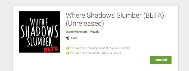
Where Shadows Slumber is now available on Google Play through their BETA program. This free download allows you to play the first seven Levels of our game. We haven’t updated this thing since March, so if you played it back then you’ll definitely want to give the BETA another shot!

Remember that the purpose of this test is to help us with our upcoming Android launch. If you were hoping for more than seven Levels, we’re sorry! The team is more focused on solving hardware problems than providing a fun experience. (You’ll have to buy the full game for that…) There are 2,500 Android devices in current use, across six different functioning operating system versions. A ton of people still use Android 5.0, but Google is already up to version 9.0! There are so many combinations to test, we can’t possibly handle this on our own.

The BETA will allow you to see if the game runs on your old phone, see how well it performs, get a sense of the game’s controls and puzzles, and experience a tiny snippet of the game’s story. That’s all you need right now!

When you complete the BETA (which should only take 10 minutes) be sure to fill out the survey in the app description. For your convenience, here’s the link:

Google Survey

Happy testing, everyone!


3275


What’s The Plan?

Currently, we have 3,275 people enrolled in the Google BETA, which is awesome! There’s just one problem: Google doesn’t let you let people download your BETA for free if your game costs money. Our game will be $4.99 on Google Play, just like it is on the App Store. So the way we handled this issue was by splitting our game across two store pages. It’s not ideal, but it means that when the full game launches on Android, the BETA will still be hanging out and it will still be free. I guess it will serve as a kind of extra demo until we take it down? This is in addition to our current Demo, which has been on the store since 2016. How confusing!

Our hope is that having three different entries on the Google Play store directing people toward the full game will be better than having just one. It’s a shame we can’t bring all the BETA people directly over to the final game later, but we assume that those who care will follow our prompt when the game launches. We’re thinking of updating the BETA one last time with something that says “ok, the game is out, go buy it!” Whether it will still be playable at that point is still up in the air.

Stay tuned for more news about our upcoming Google Play release. I can’t promise a concrete date just yet, but we are certainly striving to get the game on Android before 2018 ends. That’s all I can say right now!


= = = = = = = = = = = = = = = = = = = = = = = = = = = = = = = = = = = =

Where Shadows Slumber is now available on the App Store! bit.ly/WSS-iOS

Find out more about our game at WhereShadowsSlumber.com, ask us on Twitter (@GameRevenant), Facebookitch.io, or Twitch, and feel free to email us directly at contact@GameRevenant.com.

Frank DiCola is the founder of Game Revenant and the artist for Where Shadows Slumber.

All About App Icons

As the completion date of Where Shadows Slumber draws near, Jack and I are coming to terms with just how much work it takes to finish a game. This means we’re revisiting old tasks that we didn’t have to deal with for a while, including the game’s app icon.

It may seem like a small detail, but your game’s icon is very important. It isn’t exactly the same as your game’s logo, but in certain contexts it plays the same role. The app icon is the rounded square button on your customer’s phone menu that they have to press to start playing your game. More importantly, this icon is on prominent display on marketplaces like the App Store and is often a potential customer’s first impression of your game.

Viewed through that lens, the app icon is immensely important and I regret not working on it sooner. It’s just a small graphic, though… how difficult could it be?

Fortunately, I’ve been researching this topic for a little while now. Below, I’ve compiled a gallery of some of my favorite app icons. We’ll also discuss in this blog post my personal “do’s and don’ts” for these graphics, inspired by both previous iterations of the Where Shadows Slumber app icon.


Inspiring Icons

I played a lot of mobile games during the creation of Where Shadows Slumber. That’s not because I’m lazy! I wanted to see what successful mobile games did. I spent a long time looking at their store listings, reading reviews, poring over their descriptions, and – of course – checking out app icons. It wouldn’t be a Where Shadows Slumber blog post if we didn’t gush over Monument Valley, so let’s start there.

AppIcon-Monument-Valley.JPG

The app icon for Monument Valley is really beautiful and shows off what the in-game art looks like. When you look at the icon on your device, the scale of Ida here probably matches her scale in the game. That makes this graphic one of the most honest app icons in the business! From a distance, you can clearly make out her shape because her white body contrasts starkly with the green backdrop. I also love that this picture shows the isometric angle and color shading that they use in the game. Sadly, this image does not communicate the game’s M.C. Escher inspired puzzles… but how the heck could you even show that? Maybe I shouldn’t worry too much about showing “shadow puzzles” in a tiny square image. It would just never fit!

AppIcon-Monument-Valley-2

The app icon for Monument Valley 2 was constrained somewhat by the first. The artist likely felt the need to match the style of the previous icon. Now that they’ve got a pattern established, expect to see something like this if they ever make Monument Valley 3. Still, the fact that this icon communicates the relationship between a mother and daughter tells you a lot about the game’s story and mechanics.

AppIcon-Sneaky.png

The real reason I bring up Monument Valley 2 is because of something I noticed when I was in an Apple Store the other day, getting a new iPad for my Dad. On their demo devices, the game is labeled simply as “Monument 2,” because the name is too long. Notice also that the game Alto’s Odyssey is just named “Odyssey.” I’ve wondered what Jack and I should do with our lengthy title Where Shadows Slumber… should it be listed as “Slumber,” “Shadows Slumber,” or “Shadows?”

AppIcon-AltosAdventure

Speaking of Alto’s Odyssey, both games in the Alto series have very beautiful app icons. However, it seems to me that the original is better because it actually communicates the mechanics of the game. Take a look at the icon above, and then look at Alto’s Odyssey below. Remember that these games have identical gameplay: both are side-scrolling snowboarding simulators. Notice anything?

AppIcon-AltosOdyssey.JPG

Alto’s Odyssey doesn’t have an image of a dude flipping over a windmill like the first game did! That’s pretty important because the whole game is about jumping over stuff, getting airtime, and doing tricks. But when I see the icon above for Alto’s Odyssey, I imagine a different game where I can actually go into some of those ruins or fly in that hot air balloon. It doesn’t set up expectations the way you might expect. Even so, the image is gorgeous and communicates the art style faithfully.

AppIcon-Prune

Of all the games I researched, my favorite app icon is probably the one for Prune. Look at this beautiful picture! Since I played the game, I happen to know that this app icon is actually a perfect rendition of what every Level looks like, too. Now that’s honesty! Prune is a game where you swipe away branches from a tree to help it grow the right way. I think you wanted to avoid the big red suns because they killed your tree. It’s a beautiful game, and the simple nature of this app icon does it justice.

We’ve looked at a lot of great artwork, but I don’t feel like comparing them to a list of “bad examples” in this blog post. I feel uncomfortable putting down other people’s work besides my own. There is no point in searching the App Store for apps that performed poorly and then ripping their icons apart. Instead, let’s just criticize the two icons I made earlier in the project cycle!


AppIcon-Gallery.png

Learning From My Mistakes

If you’ve ever played our free iOS Demo before, or if you are one of our beta testers, or even if you’re just a diehard follower of this blog, you’ve seen one of our app icons before. We aren’t going to use either of these for the final game’s release, so I’d like to write about them in this space.

AppIcon-WSS-2016.JPG

Our first app icon was created just for the Demo. I whipped this up in Adobe Illustrator over a year ago. The idea was to show a silhouette of Obe in a doorway, with the lantern clearly visible. Looking back on it now, this fails for a variety of reasons:

  1. This image is very detailed, so the intricacies are hard to make out at small sizes
  2. This icon requires pre-existing knowledge about what Obe looks like
  3. The lantern looked weirder back then, so it’s not immediately recognizable
  4. This looks like an icon for a horror game, almost like Amnesia for mobile phones
  5. This doesn’t really look like the art in the game at all
  6. This doesn’t really look like an app icon for a mobile puzzle game
  7. This is misleading because Obe’s body never actually casts shadows

I’m not saying I hate it or I regret making it – it seemed cool at the time! Our Demo drew in over 310,000 free installs on Android alone, so we did something right. But I wouldn’t go for this kind of style for the final game. It’s too much of a departure from the real game’s art, tone, and genre.

AppIcon-WSS-2017

Our next app icon was made much faster and was basically an unofficial app icon. I just did this for the beta, and I didn’t put much effort into it. This one fails on two levels – first of all, it’s not very unique or inspiring. It’s just text. Anybody could make this, and it tells customers nothing about our game. Second, it includes English text. That means I’d need to make a different app icon for every language we release the game in! Why bother doing that when I can just create a cool image like ustwo did?

So for the game’s final icon I need one square image that contains no text, but communicates the following to the player:

  • The game’s reflective tone, with some ominous terror looming in the periphery
  • The game’s crisp light shading model
  • The importance of the lantern to the story
  • The idea that this is a puzzle game and not some other genre
  • The idea that this is a mobile game
  • A warning that this game is not for preteen children

Yikes! Wish me luck. I’ll take a shot at this during the week, in between animating the game’s remaining cutscenes and putting out other fires. Jack and I have spoken about our app icon informally in the past, so I have a pretty good idea of what we want. This analysis helped me crystallize my plan going forward.

We’ll have some exciting news to announce in the coming weeks, so stay tuned to this blog and thanks for reading!


= = = = = = = = = = = = = = = = = = = = = = = = = = = = = = = = = = = =

We hope you enjoyed this update about the game’s graphic design. Have a question about aesthetics that wasn’t mentioned here? You can find out more about our game at WhereShadowsSlumber.com, ask us on Twitter (@GameRevenant), Facebookitch.io, or Twitch, and feel free to email us directly at contact@GameRevenant.com.

Frank DiCola is the founder of Game Revenant and the artist for Where Shadows Slumber.